\n
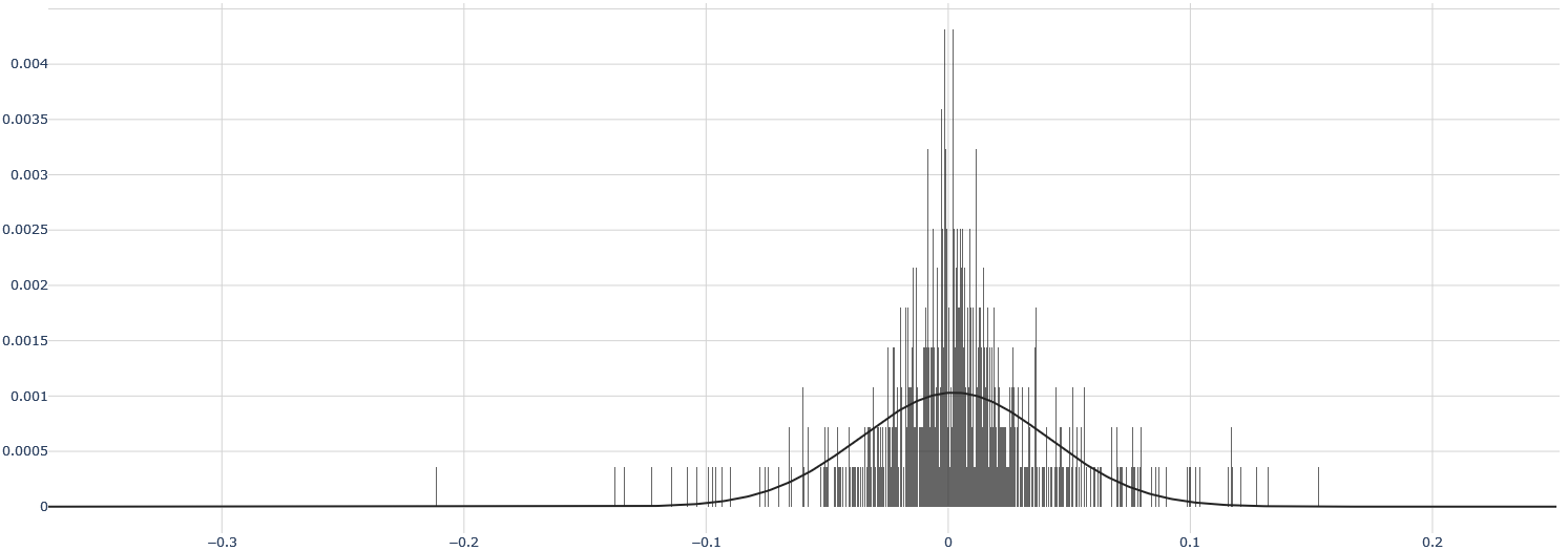
## Chart: Histogram with Density Curve
### Overview
The image displays a histogram representing the distribution of a dataset, overlaid with a smooth density curve. The histogram shows the frequency of values within specific bins, while the density curve provides a continuous estimate of the distribution's shape.
### Components/Axes
* **X-axis:** Ranges from approximately -0.3 to 0.2, with markings at -0.3, -0.2, -0.1, 0, 0.1, and 0.2. Represents the values of the dataset.
* **Y-axis:** Ranges from 0 to approximately 0.004, with markings at 0, 0.0005, 0.001, 0.0015, 0.002, 0.0025, 0.003, 0.0035, and 0.004. Represents the frequency or density of values.
* **Histogram:** Composed of vertical bars representing the frequency of values within each bin.
* **Density Curve:** A smooth, black line overlaid on the histogram, estimating the probability density function of the data.
### Detailed Analysis
The histogram is heavily concentrated around the value of 0. The density curve confirms this, peaking sharply at 0. The distribution appears to be approximately symmetric, with tails extending to both the left and right, but with a much more pronounced tail on the left side.
Here's an approximate breakdown of the histogram's height (Y-axis value) for different ranges of X-axis values:
* **X = -0.3 to -0.2:** Y ≈ 0
* **X = -0.2 to -0.1:** Y ≈ 0.0002
* **X = -0.1 to 0:** Y increases rapidly from 0 to approximately 0.0035 at X = 0.
* **X = 0 to 0.05:** Y decreases rapidly from 0.0035 to approximately 0.001.
* **X = 0.05 to 0.1:** Y continues to decrease to approximately 0.0002.
* **X = 0.1 to 0.2:** Y ≈ 0
The density curve closely follows the shape of the histogram, peaking at approximately 0.0035 at X = 0. The curve gradually descends on both sides of the peak, approaching 0 as X moves away from 0.
### Key Observations
* The distribution is unimodal, with a single prominent peak at 0.
* The distribution is not perfectly symmetric; it exhibits a slight left skew.
* The data is highly concentrated around 0, with frequencies decreasing rapidly as you move away from 0.
* There are no significant outliers visible in the histogram.
### Interpretation
The data suggests a distribution centered around zero, potentially representing errors, differences, or changes relative to a baseline. The concentration of values near zero indicates that most observations are close to the baseline. The slight left skew suggests that there are more smaller negative values than larger positive values. This could indicate a systematic bias or a process that tends to produce slightly negative results more often. The density curve provides a smoothed representation of this distribution, allowing for a clearer understanding of its overall shape and characteristics. Without knowing the context of the data, it's difficult to draw more specific conclusions, but the distribution's characteristics suggest a relatively stable process with a tendency towards values near zero.