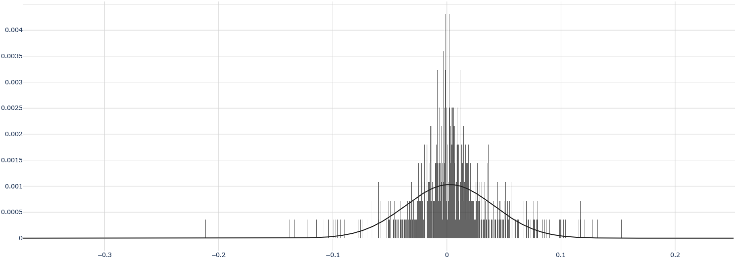
## Histogram with Overlaid Probability Density Curve
### Overview
The image displays a statistical chart consisting of a dense histogram (vertical bars) overlaid with a smooth, bell-shaped curve. The chart visualizes the distribution of a dataset, with the histogram showing the frequency of data points within specific bins and the curve representing a fitted probability density function (likely a normal distribution). The overall distribution is centered near zero and appears slightly skewed.
### Components/Axes
* **Chart Type:** Histogram with overlaid probability density curve.
* **X-Axis (Horizontal):**
* **Label:** Not explicitly labeled. Represents the value of the measured variable.
* **Scale:** Linear.
* **Range:** Approximately -0.35 to +0.25.
* **Major Tick Marks & Labels:** -0.3, -0.2, -0.1, 0, 0.1, 0.2.
* **Grid Lines:** Vertical grid lines are present at each major tick mark.
* **Y-Axis (Vertical):**
* **Label:** Not explicitly labeled. Represents probability density or relative frequency.
* **Scale:** Linear.
* **Range:** 0 to approximately 0.0043.
* **Major Tick Marks & Labels:** 0, 0.0005, 0.001, 0.0015, 0.002, 0.0025, 0.003, 0.0035, 0.004.
* **Grid Lines:** Horizontal grid lines are present at each major tick mark.
* **Data Series:**
1. **Histogram:** Composed of numerous thin, dark gray vertical bars. The bars are densely packed, indicating a large number of bins. The tallest bars are clustered around the x-axis value of 0.
2. **Overlaid Curve:** A solid black line forming a smooth, unimodal, bell-shaped curve. It peaks near x=0 and tapers off symmetrically towards the tails.
* **Legend:** No legend is present in the image.
* **Title:** No chart title is present.
### Detailed Analysis
* **Histogram Distribution:**
* The histogram shows a very high concentration of data points in a narrow range around x=0.
* The peak of the histogram (the mode) is located at or extremely close to x=0. The tallest individual bar reaches a y-value of approximately **0.0043**.
* The distribution has a visible spread. Significant bar heights are observed from approximately x = -0.1 to x = +0.1.
* The tails of the distribution extend further. There are sparse, short bars visible from about x = -0.2 to x = +0.15, with a few isolated bars extending to near -0.3 and +0.2.
* The distribution appears slightly **left-skewed (negatively skewed)**. The tail on the negative side (left) appears slightly longer and contains more sparse data points than the tail on the positive side (right).
* **Overlaid Curve Analysis:**
* The curve is a classic normal (Gaussian) distribution shape.
* Its peak (mean) is aligned with the histogram's peak, at approximately **x = 0**.
* The peak height of the curve is approximately **y = 0.001**.
* The curve's width (standard deviation) can be estimated. It appears to cross the x-axis (y≈0) at roughly x = -0.15 and x = +0.15, suggesting a standard deviation (σ) of approximately **0.06 to 0.07** (since ~99.7% of data in a normal distribution lies within ±3σ).
* **Relationship Between Histogram and Curve:**
* The histogram bars are much taller and more peaked than the overlaid curve, especially at the center. This indicates the actual data has a higher concentration of values near the mean than a perfect normal distribution with the same mean and standard deviation would predict. The data is more **leptokurtic** (has a sharper peak and fatter tails) than the fitted normal curve.
### Key Observations
1. **Central Concentration:** The vast majority of the data is clustered very tightly around zero.
2. **Peak Discrepancy:** The histogram's maximum density (~0.0043) is over four times higher than the peak of the fitted normal curve (~0.001). This is a significant deviation from normality.
3. **Asymmetry:** The left tail (negative values) is more pronounced than the right tail.
4. **Outliers:** There are sparse data points extending to approximately -0.3 and +0.2, which are potential outliers relative to the central cluster.
5. **Fitted Model:** The overlaid curve suggests an attempt to model the data with a normal distribution, but the visual mismatch indicates the model may not be a perfect fit, particularly regarding the peakedness (kurtosis) of the data.
### Interpretation
This chart likely represents the distribution of **residuals, errors, or small deviations** from a mean or expected value of zero. The strong central peak suggests that most observations are very close to the expected value. The slight left skew indicates a tendency for negative deviations to be slightly more extreme or frequent than positive ones.
The poor fit of the normal curve at the peak is a critical finding. It suggests that the underlying process generating this data is not perfectly Gaussian. The data exhibits **excess kurtosis**, meaning extreme values (both near the mean and in the tails) are more common than a normal distribution would predict. This has implications for statistical modeling; assuming normality for this dataset could lead to underestimating the probability of values very close to the mean or in the extreme tails.
In a practical context, this could be:
* Measurement errors from a high-precision instrument where most errors are tiny, but occasional larger errors occur asymmetrically.
* Financial returns over a very short time interval, showing a "peaked" distribution.
* The output of a machine learning model's prediction errors, where the model is very accurate most of the time but has a specific failure mode causing negative-skewed errors.
The absence of axis labels and a title limits definitive context, but the statistical properties are clearly communicated through the visual elements.