\n
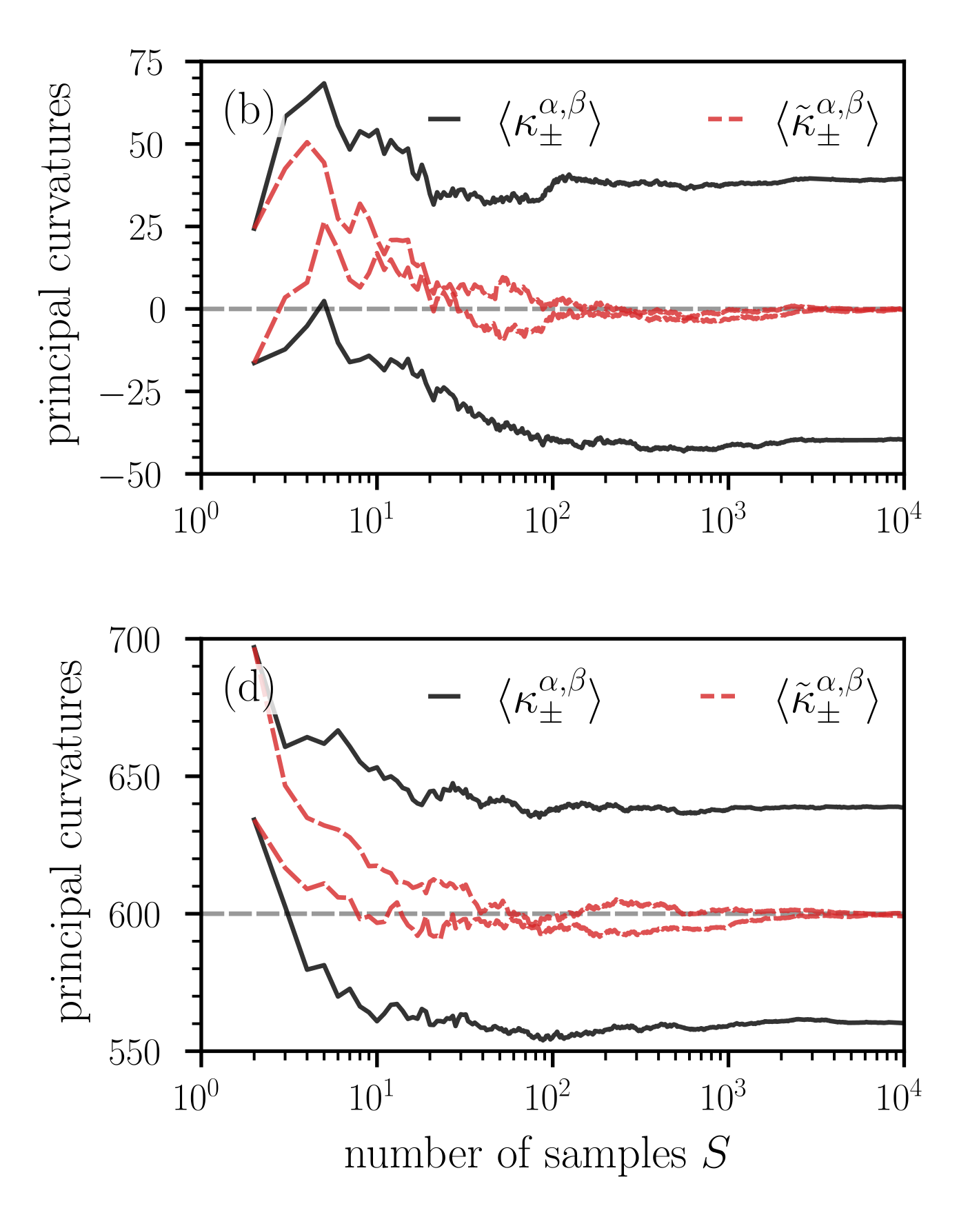
## Chart: Principal Curvatures vs. Number of Samples
### Overview
The image presents two line graphs, labeled (b) and (d), displaying the relationship between principal curvatures and the number of samples (S). Both graphs share a logarithmic scale for the x-axis (number of samples) and display two distinct curves representing different curvature measurements.
### Components/Axes
* **X-axis:** Number of samples (S), labeled at the bottom of both charts. The scale is logarithmic, ranging from 10⁰ to 10⁴.
* **Y-axis (Top Chart (b)):** Principal curvatures, labeled on the left side, ranging from -50 to 75.
* **Y-axis (Bottom Chart (d)):** Principal curvatures, labeled on the left side, ranging from 550 to 700.
* **Legend (Top-right of both charts):**
* Solid Black Line: `<κ⁺ₐ,β>`
* Dashed Red Line: `<κ⁻ₐ,β>`
### Detailed Analysis
**Chart (b):**
* **Solid Black Line (<κ⁺ₐ,β>):** The line starts at approximately 20 at S=10⁰, rises to a peak of around 60 at S=10¹, then gradually decreases, fluctuating between 20 and 30 as S increases from 10² to 10⁴.
* **Dashed Red Line (<κ⁻ₐ,β>):** The line begins at approximately 25 at S=10⁰, rapidly decreases to a minimum of around -25 at S=10¹, and then slowly rises, stabilizing around 10 as S approaches 10⁴.
**Chart (d):**
* **Solid Black Line (<κ⁺ₐ,β>):** The line starts at approximately 640 at S=10⁰, quickly drops to around 560 at S=10¹, and remains relatively constant, fluctuating between 560 and 580, as S increases from 10² to 10⁴.
* **Dashed Red Line (<κ⁻ₐ,β>):** The line begins at approximately 670 at S=10⁰, decreases to around 610 at S=10¹, and then slowly rises, stabilizing around 630 as S approaches 10⁴.
### Key Observations
* In both charts, the solid black line represents a curvature that is generally positive in chart (b) and relatively low in chart (d).
* The dashed red line represents a curvature that is initially positive in chart (b) and high in chart (d), but becomes negative and stabilizes as the number of samples increases.
* The scales of the y-axes are significantly different between the two charts, indicating different magnitudes of curvature being measured.
* Both charts show a trend of curvature values stabilizing as the number of samples increases, suggesting convergence.
### Interpretation
The data suggests an analysis of principal curvatures as a function of sample size. The two charts likely represent different aspects or scales of the same underlying phenomenon. The initial fluctuations and subsequent stabilization of the curves indicate that the curvature measurements are sensitive to sample size at lower sample counts, but become more consistent as more samples are included.
The difference in the y-axis scales and the overall curvature values between the two charts suggests that `<κ⁺ₐ,β>` and `<κ⁻ₐ,β>` represent different types of curvature, potentially related to different geometric properties of the analyzed surface or object. The negative curvature observed in the dashed red line in chart (b) could indicate saddle-like features or regions of negative Gaussian curvature. The stabilization of both curves at higher sample sizes suggests that the curvature measurements are converging towards a stable value, indicating that the sample size is sufficient to accurately characterize the underlying geometry.
The logarithmic scale on the x-axis is important because it shows the rate of change in curvature as the number of samples increases. The rapid changes observed at lower sample counts suggest that adding more samples initially has a significant impact on the curvature measurements, while adding more samples at higher counts has a diminishing effect.