## Scatter Plot: Undefined Title
### Overview
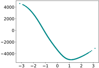
The image is a scatter plot showing the relationship between two variables, with the x-axis ranging from approximately -3 to 3 and the y-axis ranging from approximately -5000 to 5000. The data points are clustered in a teal color, forming a curve that starts high on the left, dips down to a minimum around x=1, and then rises again on the right.
### Components/Axes
* **X-axis:** Ranges from approximately -3 to 3, with no explicit label.
* **Y-axis:** Ranges from approximately -5000 to 5000, with no explicit label.
* **Data Points:** Teal colored points forming a curve.
### Detailed Analysis
* **Trend:** The teal data points form a curve. Starting from the top-left, the curve descends rapidly, reaching a minimum around x=1 and y=-5000. It then ascends again towards the right side of the plot, reaching approximately y=-3000 at x=3.
* **Specific Values:**
* At x=-3, y is approximately 4500.
* At x=0, y is approximately -2500.
* At x=1, y is approximately -5000.
* At x=3, y is approximately -3000.
### Key Observations
* The data points are densely clustered, indicating a strong relationship between the x and y variables.
* The curve is roughly symmetrical around x=1.
* There are no outliers.
### Interpretation
The scatter plot suggests a non-linear relationship between the x and y variables. The curve resembles a quadratic function or a similar type of polynomial. The data indicates that as x increases from -3 to 1, y decreases rapidly, and as x increases from 1 to 3, y increases. The minimum value of y occurs around x=1. Without additional context or labels, it's difficult to determine the specific nature of the relationship or the meaning of the variables.