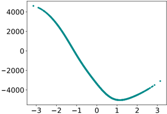
## Line Chart: Unlabeled Cubic-like Curve
### Overview
The image displays a single-line chart plotted on a 2D Cartesian coordinate system. The chart features a smooth, continuous curve rendered in a teal color against a white background. There is no chart title, axis labels, or legend present. The data appears to represent a mathematical function, likely a cubic polynomial, showing a clear minimum point.
### Components/Axes
* **Chart Type:** Single-line chart.
* **X-Axis (Horizontal):**
* **Range:** Approximately -3.0 to +3.0.
* **Tick Marks:** Labeled at integer intervals: -3, -2, -1, 0, 1, 2, 3.
* **Label:** None present.
* **Y-Axis (Vertical):**
* **Range:** Approximately -5000 to +5000 (inferred from tick spacing).
* **Tick Marks:** Labeled at intervals of 2000: -4000, -2000, 0, 2000, 4000.
* **Label:** None present.
* **Data Series:**
* **Color:** Teal (a blue-green shade).
* **Style:** Solid, continuous line of uniform thickness.
* **Legend:** Not present.
### Detailed Analysis
* **Trend Verification:** The teal line exhibits a clear, non-linear trend. Starting from the left (x = -3), the line slopes steeply downward, crossing the x-axis (y=0) near x = -1.5. It continues to descend, reaching a global minimum point. After the minimum, the line slopes upward, but with a less steep gradient than its initial descent.
* **Key Data Points (Approximate):**
* **Start Point (x ≈ -3):** y ≈ +4500 (The line begins near the top of the visible y-axis range).
* **X-Intercept:** y = 0 at approximately x = -1.5.
* **Minimum Point:** The curve's lowest point occurs at approximately **x = 1.0, y = -5000**. This is the most significant feature of the chart.
* **End Point (x ≈ 3):** y ≈ -3000 (The line ends in the lower-right quadrant, above its minimum but still well below zero).
* **Spatial Grounding:** The curve is centrally positioned within the plot area. The minimum point is located in the bottom-center region of the chart.
### Key Observations
1. **Single, Smooth Curve:** The data represents one continuous function without noise or discontinuities.
2. **Prominent Minimum:** The most notable feature is the deep, well-defined minimum at (1, -5000).
3. **Asymmetric Shape:** The descent from x=-3 to the minimum is steeper and covers a larger vertical range (~9500 units) than the subsequent ascent from the minimum to x=3 (~2000 units).
4. **Missing Metadata:** The complete absence of axis labels, a title, or a legend makes it impossible to determine the units, variables, or context of the data without external information.
### Interpretation
The chart visually demonstrates the behavior of a function with a single local minimum within the displayed domain. The shape is characteristic of a cubic polynomial (e.g., y = ax³ + bx² + cx + d) where the leading coefficient is positive, causing the right side to eventually trend upward.
**What the data suggests:** The process or phenomenon being measured undergoes a significant decline, reaches an optimal or lowest point at x=1, and then begins to recover or increase. The steep initial drop suggests a rapid change or high sensitivity in the negative region of the x-variable.
**Why it matters:** In a technical context, this curve could represent:
* An optimization landscape, where x=1 is the optimal parameter setting.
* A physical system's energy state, with x=1 being the stable equilibrium.
* A cost or error function in machine learning, where the goal is to find the x that minimizes y.
**Notable Anomaly:** The primary "anomaly" is the lack of descriptive labels, which is a critical omission for any technical document. The data itself shows no outliers; it follows a perfect, smooth trend. The interpretation is entirely dependent on inferring the function's mathematical nature, as no empirical or real-world context is provided.