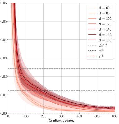
## Line Chart: Performance vs. Gradient Updates for Different Dimensions
### Overview
The image is a line chart displaying the performance of a model (likely related to machine learning) against the number of gradient updates. The chart shows multiple lines, each representing a different dimensionality ('d') of the model. There are also horizontal dashed lines representing epsilon values. The x-axis represents gradient updates, and the y-axis represents performance (likely loss or error). Shaded regions around each line indicate variability or uncertainty.
### Components/Axes
* **X-axis:** Gradient updates, ranging from 0 to 600.
* **Y-axis:** Performance (unspecified unit), ranging from 0.00 to 0.06.
* Axis markers: 0.00, 0.01, 0.02, 0.03, 0.04, 0.05, 0.06
* **Legend (Top-Right):**
* d = 60 (lightest pink)
* d = 80 (light pink)
* d = 100 (pink)
* d = 120 (red-pink)
* d = 140 (red)
* d = 160 (dark red)
* d = 180 (darkest red)
* 2 ε<sup>uni</sup> (dashed gray)
* ε<sup>uni</sup> (dashed black)
* ε<sup>opt</sup> (dashed red)
### Detailed Analysis
* **Data Series (d = 60, 80, 100, 120, 140, 160, 180):** All data series representing different dimensions (d) show a similar trend: a rapid decrease in performance with initial gradient updates, followed by a gradual flattening out. The shaded regions around each line indicate the variability in performance.
* **d = 60 (lightest pink):** Starts around 0.055, rapidly decreases to approximately 0.01 by 200 gradient updates, then slowly decreases to around 0.004 by 600 gradient updates.
* **d = 80 (light pink):** Starts around 0.055, rapidly decreases to approximately 0.012 by 200 gradient updates, then slowly decreases to around 0.004 by 600 gradient updates.
* **d = 100 (pink):** Starts around 0.055, rapidly decreases to approximately 0.013 by 200 gradient updates, then slowly decreases to around 0.004 by 600 gradient updates.
* **d = 120 (red-pink):** Starts around 0.055, rapidly decreases to approximately 0.014 by 200 gradient updates, then slowly decreases to around 0.004 by 600 gradient updates.
* **d = 140 (red):** Starts around 0.055, rapidly decreases to approximately 0.015 by 200 gradient updates, then slowly decreases to around 0.004 by 600 gradient updates.
* **d = 160 (dark red):** Starts around 0.055, rapidly decreases to approximately 0.016 by 200 gradient updates, then slowly decreases to around 0.004 by 600 gradient updates.
* **d = 180 (darkest red):** Starts around 0.055, rapidly decreases to approximately 0.017 by 200 gradient updates, then slowly decreases to around 0.004 by 600 gradient updates.
* **Horizontal Lines:**
* **2 ε<sup>uni</sup> (dashed gray):** Located at approximately 0.024.
* **ε<sup>uni</sup> (dashed black):** Located at approximately 0.012.
* **ε<sup>opt</sup> (dashed red):** Located at approximately 0.002.
### Key Observations
* All dimensions (d = 60 to 180) exhibit similar performance trends.
* The performance improvement diminishes significantly after approximately 200 gradient updates.
* The performance curves for different dimensions are very close to each other, especially after 200 gradient updates.
* The epsilon values (ε<sup>uni</sup>, 2 ε<sup>uni</sup>, ε<sup>opt</sup>) represent target performance levels.
### Interpretation
The chart suggests that increasing the dimensionality (d) of the model beyond a certain point does not significantly improve performance, especially after a sufficient number of gradient updates. The model converges relatively quickly within the first 200 gradient updates. The epsilon values likely represent different optimization targets or error bounds. The proximity of the performance curves after 200 updates indicates that the choice of dimensionality has a limited impact on the final performance, at least within the range of 'd' values tested. The shaded regions show the variance in the performance, which decreases as the number of gradient updates increases, indicating more stable convergence.