## Line Chart: Convergence of Error Metrics with Gradient Updates
### Overview
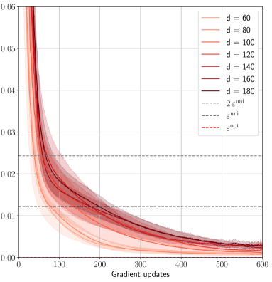
The image is a line chart plotting the value of an unspecified error metric (y-axis) against the number of gradient updates (x-axis). It displays multiple data series corresponding to different values of a parameter `d`, alongside three horizontal reference lines representing specific error thresholds. The chart demonstrates how the error decreases and converges as training progresses, with the rate and final value influenced by the parameter `d`.
### Components/Axes
* **X-Axis:**
* **Title:** "Gradient updates"
* **Scale:** Linear, from 0 to 600.
* **Major Tick Marks:** 0, 100, 200, 300, 400, 500, 600.
* **Y-Axis:**
* **Title:** Not explicitly labeled. Represents the value of an error metric.
* **Scale:** Linear, from 0.00 to 0.06.
* **Major Tick Marks:** 0.00, 0.01, 0.02, 0.03, 0.04, 0.05, 0.06.
* **Legend (Position: Top-right corner, inside the plot area):**
* **Data Series (Solid Lines, color gradient from light to dark red):**
* `d = 60` (Lightest red)
* `d = 80`
* `d = 100`
* `d = 120`
* `d = 140`
* `d = 160`
* `d = 180` (Darkest red)
* **Reference Lines (Dashed Lines):**
* `2ε^init` (Grey dashed line)
* `ε^uni` (Black dashed line)
* `ε^opt` (Red dashed line)
### Detailed Analysis
**Data Series Trends (All `d` values):**
* **General Trend:** All solid lines exhibit a steep, convex decay. They start at a high error value (off the top of the chart at 0 updates) and decrease rapidly initially, then more gradually, asymptotically approaching zero.
* **Effect of Parameter `d`:** There is a clear ordering. Lines for higher `d` values (darker red) start at a higher error value for the same early update count (e.g., at 100 updates) and converge more slowly. The line for `d=60` is the lowest throughout, while `d=180` is the highest.
* **Convergence:** By 600 gradient updates, all lines have converged to a very low error value, visually between 0.000 and 0.005. The separation between the lines diminishes significantly as updates increase.
**Reference Lines (Horizontal, Constant Values):**
* `2ε^init` (Grey dashed): Positioned at approximately y = 0.024.
* `ε^uni` (Black dashed): Positioned at approximately y = 0.012.
* `ε^opt` (Red dashed): Positioned very close to the x-axis, at approximately y = 0.002.
**Key Intersections:**
* All data series cross below the `2ε^init` threshold between approximately 50 and 150 updates (lower `d` crosses first).
* All data series cross below the `ε^uni` threshold between approximately 150 and 300 updates.
* The data series for lower `d` values (e.g., `d=60`) appear to approach or potentially cross the `ε^opt` line by 600 updates, while higher `d` values remain slightly above it.
### Key Observations
1. **Monotonic Decrease:** All error curves decrease monotonically with more gradient updates; there are no visible increases or oscillations.
2. **Diminishing Returns:** The rate of error reduction slows dramatically after the first 100-200 updates.
3. **Parameter Sensitivity:** The model's convergence behavior is sensitive to the parameter `d`. A larger `d` results in a slower convergence trajectory.
4. **Reference Line Hierarchy:** The chart establishes a hierarchy of error benchmarks: `2ε^init` > `ε^uni` > `ε^opt`.
5. **Final Convergence Zone:** The region below `ε^opt` (y < ~0.002) appears to be the target convergence zone, which the models are approaching.
### Interpretation
This chart likely visualizes the training dynamics of a machine learning model, where `d` could represent model dimension, dataset size, or a similar capacity parameter. The y-axis represents a loss or error metric.
* **What the data suggests:** The plot demonstrates the **law of diminishing returns** in optimization. Initial updates yield massive error reduction, but progress slows as the model nears a solution. It also shows that increasing the parameter `d` (e.g., making a model larger) makes the optimization problem harder initially, requiring more updates to reach the same error level, though all configurations eventually converge to a similar low-error state.
* **Relationship between elements:** The solid lines show the actual training path. The dashed lines act as benchmarks. `2ε^init` may represent an initial, high-error state. `ε^uni` could be the error of a uniform/random baseline predictor. `ε^opt` likely represents the optimal or irreducible error (Bayes error) for the task. The goal of training is to drive the error from above `2ε^init` down towards `ε^opt`.
* **Notable trends/anomalies:** The most notable trend is the perfect ordering and non-intersection of the `d` curves, indicating a very consistent and predictable effect of this parameter on the optimization landscape. There are no anomalies; the curves are smooth and well-behaved, suggesting a stable training process. The fact that all curves converge near `ε^opt` suggests the models are successfully learning the underlying pattern, with the final performance being largely independent of `d` given sufficient training time.