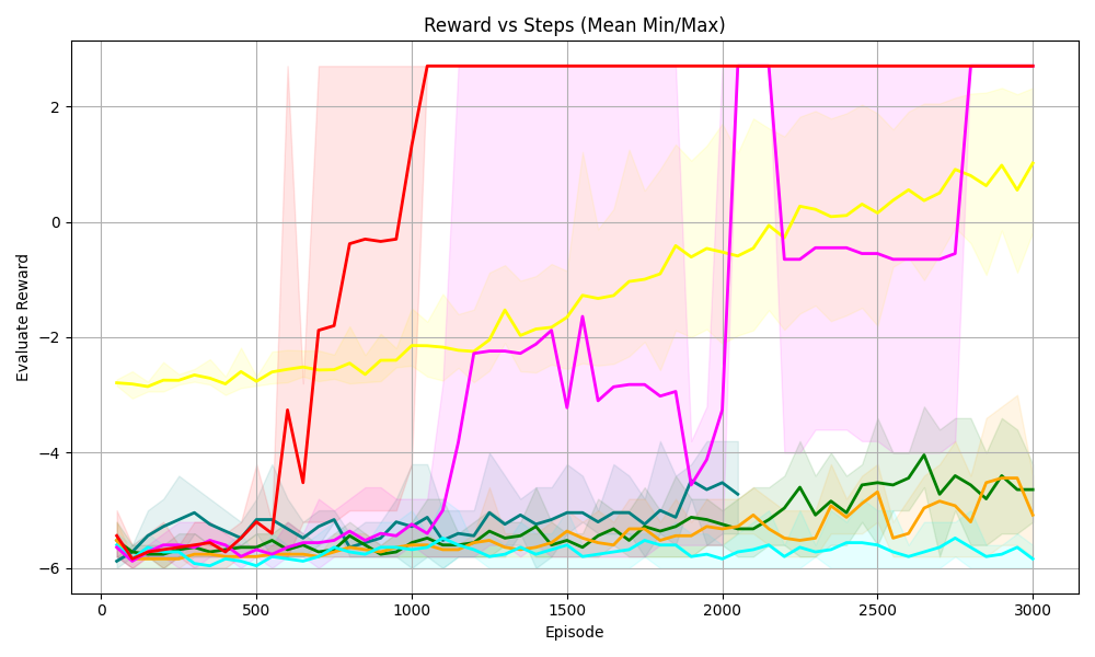
## Line Chart: Reward vs Steps (Mean Min/Max)
### Overview
The image is a line chart displaying the relationship between "Reward" and "Episode" steps. It shows multiple data series, each represented by a different colored line, along with shaded regions indicating the min/max range for each series. The chart aims to visualize the performance of different algorithms or configurations over time, as measured by the "Evaluate Reward" metric.
### Components/Axes
* **Title:** Reward vs Steps (Mean Min/Max)
* **X-axis:** Episode
* Scale: 0 to 3000, with markers at 0, 500, 1000, 1500, 2000, 2500, and 3000.
* **Y-axis:** Evaluate Reward
* Scale: -6 to 2, with markers at -6, -4, -2, 0, and 2.
* **Data Series:** There are multiple data series represented by different colored lines. The exact number of series is difficult to determine without a legend, but there are at least 6 distinct colors: red, yellow, magenta, green, orange, and cyan. Each series also has a shaded region around it, representing the minimum and maximum reward values at each episode.
### Detailed Analysis
Here's a breakdown of the trends observed for each data series:
* **Red Line:** Starts around -6. It increases sharply around episode 750 to approximately -0.25, then again around episode 1000 to a value of 2.5, and remains relatively constant at that level for the rest of the episodes. The shaded region around the red line is quite wide initially, narrowing significantly after the sharp increase.
* **Yellow Line:** Starts around -2.5 and remains relatively flat until episode 2000, then gradually increases to approximately 1 by episode 3000. The shaded region around the yellow line is relatively narrow.
* **Magenta Line:** Starts around -6. It fluctuates between -6 and -2 until episode 2000, where it sharply increases to approximately 2.5, then drops again to approximately -0.5 by episode 2500, and remains relatively constant. The shaded region around the magenta line is wide.
* **Green Line:** Starts around -6. It gradually increases to approximately -4.5 by episode 3000. The shaded region around the green line is relatively narrow.
* **Orange Line:** Starts around -6. It remains relatively flat around -6 until episode 2500, then gradually increases to approximately -4.5 by episode 3000. The shaded region around the orange line is relatively narrow.
* **Cyan Line:** Starts around -6. It remains relatively flat around -6 for the entire duration of the episodes. The shaded region around the cyan line is relatively narrow.
* **Teal Line:** Starts around -6. It remains relatively flat around -6 for the entire duration of the episodes. The shaded region around the teal line is relatively narrow.
### Key Observations
* The red and magenta lines show the most significant improvement in reward over the episodes, with the red line achieving a high reward relatively early in the training process.
* The yellow line shows a gradual improvement in reward over time.
* The green, orange, cyan, and teal lines show little to no improvement in reward over the episodes.
* The shaded regions indicate the variability in reward for each series. Some series have more consistent rewards (narrow shaded regions), while others have more variable rewards (wide shaded regions).
### Interpretation
The chart compares the performance of different algorithms or configurations (represented by the different colored lines) in terms of the "Evaluate Reward" metric over a series of episodes. The red line represents the most successful algorithm, as it achieves a high reward relatively early in the training process and maintains that level for the rest of the episodes. The magenta line also shows significant improvement, but it is more volatile than the red line. The yellow line shows a gradual improvement, while the green, orange, cyan, and teal lines show little to no improvement.
The shaded regions provide information about the stability of each algorithm. Algorithms with narrow shaded regions are more consistent in their performance, while algorithms with wide shaded regions are more variable.
Overall, the chart suggests that the red algorithm is the most effective for this particular task, followed by the magenta and yellow algorithms. The green, orange, cyan, and teal algorithms are not performing well and may need to be adjusted or replaced.