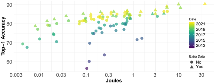
## Scatter Plot: Top-1 Accuracy vs. Energy Consumption (Joules)
### Overview
The image is a scatter plot visualizing the relationship between model performance (Top-1 Accuracy) and energy consumption (Joules) for various machine learning models. The data points are encoded with color to represent the year of the model and shape to indicate the presence of "Extra Data." The plot suggests a general trend where models with higher energy consumption tend to achieve higher accuracy, and more recent models generally perform better.
### Components/Axes
* **Chart Type:** Scatter Plot
* **X-Axis:**
* **Label:** `Joules`
* **Scale:** Logarithmic
* **Major Tick Marks:** 0.003, 0.01, 0.03, 0.1, 0.3, 1, 3, 10, 30
* **Y-Axis:**
* **Label:** `Top-1 Accuracy`
* **Scale:** Linear
* **Range:** Approximately 55 to 92
* **Major Tick Marks:** 60, 70, 80, 90
* **Legend (Positioned on the right side of the chart):**
* **Title:** `Date`
* **Color Scale (Gradient):**
* Yellow: `2021`
* Light Green: `2019`
* Teal/Green: `2017`
* Blue-Green: `2015`
* Dark Purple: `2013`
* **Title:** `Extra Data`
* **Shape Key:**
* Circle (●): `No`
* Triangle (▲): `Yes`
### Detailed Analysis
* **Data Series & Trends:**
1. **Trend by Year (Color):** There is a clear temporal trend. The oldest models (dark purple, 2013) are clustered in the lower-left quadrant, indicating lower accuracy and lower energy consumption. As the color shifts through blue-green (2015), teal (2017), and light green (2019) to yellow (2021), the data points generally move upward and to the right. This indicates that over time, models have achieved higher accuracy, often at the cost of higher energy consumption.
2. **Trend by Extra Data (Shape):** For a given energy level (Joules), models marked with a triangle (Extra Data: Yes) consistently achieve higher Top-1 Accuracy than those marked with a circle (Extra Data: No). This is visible across the entire energy spectrum.
3. **Overall Correlation:** There is a positive, non-linear correlation between Joules and Top-1 Accuracy. The relationship appears to plateau at the high end, where large increases in energy (e.g., from 10 to 30 Joules) yield smaller gains in accuracy.
* **Spatial Distribution & Key Points:**
* **Low-Energy / Low-Accuracy Region (Bottom-Left):** Contains several dark purple circles (2013, No Extra Data) with accuracy between ~55-70 and Joules between ~0.003 and 0.3.
* **Mid-Range Cluster:** A dense cluster of points exists between 0.1 and 1 Joule, with accuracy ranging from ~70 to 85. This cluster contains a mix of colors and shapes.
* **High-Energy / High-Accuracy Region (Top-Right):** Dominated by yellow and light green triangles (2019/2021, Yes Extra Data). The highest accuracy point (a yellow triangle) is near 92 accuracy at approximately 30 Joules.
* **Notable Outliers:**
* A dark purple circle (2013, No Extra Data) at ~0.1 Joules has an accuracy of only ~55, which is significantly lower than other points at similar energy levels.
* A blue-green circle (2015, No Extra Data) at ~1 Joule has an accuracy of ~72, which is lower than the general trend for that energy level.
### Key Observations
1. **The "Extra Data" Advantage:** The use of extra data (triangles) provides a consistent and significant accuracy boost across all years and energy levels.
2. **Temporal Progress:** The field shows clear progress, with each successive year's models (color shift) generally occupying a higher accuracy band.
3. **Energy-Accuracy Trade-off:** Achieving state-of-the-art accuracy (above 85) appears to require significantly more energy, with the most accurate models consuming 10-30 Joules.
4. **Logarithmic Scale Insight:** The use of a logarithmic x-axis reveals that the relationship between energy and accuracy is multiplicative. Doubling energy does not double accuracy; the gains diminish at higher energy levels.
### Interpretation
This chart illustrates the evolution of computer vision models (likely image classifiers, given the "Top-1 Accuracy" metric) over nearly a decade, framed through the lens of computational cost.
* **What the data suggests:** The primary driver of improved accuracy over time is not merely the passage of time, but likely the combination of architectural innovations and the scaling of both model size and training data (implied by "Extra Data" and higher Joules). The "Extra Data" variable is a strong proxy for training dataset size or diversity.
* **Relationship between elements:** The plot connects three critical dimensions of ML progress: performance (accuracy), cost (energy), and time (year). It shows that progress has been achieved by spending more computational resources, but that this spending has become more effective over time (later-year points are higher for the same Joules).
* **Anomalies and Implications:** The outliers below the main trend may represent older, less efficient architectures or models trained on less optimal datasets. The plateau at the high end suggests we may be approaching a point of diminishing returns for simply scaling energy consumption, hinting that future gains may require more fundamental algorithmic breakthroughs rather than just more compute. The chart makes a compelling case for considering energy efficiency as a key metric alongside raw accuracy in model evaluation.