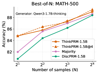
## Line Chart: Best-of-N: MATH-500
### Overview
This is a line chart comparing the performance (accuracy) of four different methods on the MATH-500 benchmark as the number of samples (N) increases. The chart demonstrates how accuracy scales with increased sampling for each method.
### Components/Axes
* **Title:** "Best-of-N: MATH-500" (Top center)
* **Subtitle:** "Generator: Qwen3-1.7B-thinking" (Below title, left-aligned)
* **Y-Axis:** Label is "Accuracy (%)". Scale runs from 82 to 88, with major tick marks at 82, 84, 86, and 88.
* **X-Axis:** Label is "Number of samples (N)". The axis is logarithmic, with categorical tick marks at 2¹ (2), 2² (4), 2³ (8), and 2⁴ (16).
* **Legend:** Located in the bottom-right quadrant of the chart area. It contains four entries:
1. `ThinkPRM-1.5B` (Solid orange line, star marker)
2. `ThinkPRM-1.5B@4` (Dashed orange line, star marker)
3. `Majority` (Solid pink line, circle marker)
4. `DiscPRM-1.5B` (Solid green line, diamond marker)
### Detailed Analysis
The chart plots four data series. All series show a positive trend, with accuracy increasing as the number of samples (N) increases.
**Data Series & Approximate Values:**
1. **ThinkPRM-1.5B (Solid Orange, Stars):**
* **Trend:** Steady, strong upward slope.
* **Data Points:**
* N=2: ~85.0%
* N=4: ~86.5%
* N=8: ~87.5%
* N=16: ~89.0%
2. **ThinkPRM-1.5B@4 (Dashed Orange, Stars):**
* **Trend:** Parallel to and slightly above the solid ThinkPRM-1.5B line, indicating a consistent small performance boost.
* **Data Points:**
* N=2: ~85.2%
* N=4: ~86.8%
* N=8: ~87.8%
* N=16: ~89.2%
3. **Majority (Pink, Circles):**
* **Trend:** Starts the lowest but has the steepest initial slope between N=2 and N=4, then continues to rise steadily.
* **Data Points:**
* N=2: ~82.0%
* N=4: ~85.8%
* N=8: ~87.0%
* N=16: ~88.5%
4. **DiscPRM-1.5B (Green, Diamonds):**
* **Trend:** Consistently the lowest-performing method, but shows steady improvement.
* **Data Points:**
* N=2: ~81.0%
* N=4: ~84.5%
* N=8: ~86.2%
* N=16: ~88.5%
### Key Observations
* **Performance Hierarchy:** At all sample sizes, the two `ThinkPRM` variants outperform `Majority` voting, which in turn outperforms `DiscPRM-1.5B`.
* **Diminishing Returns:** The slope of improvement for all methods appears to flatten slightly as N increases from 8 to 16, suggesting diminishing returns from additional sampling.
* **Convergence at High N:** The performance gap between the methods narrows as N increases. At N=16, `Majority` and `DiscPRM-1.5B` achieve nearly identical accuracy (~88.5%), while the `ThinkPRM` methods are only about 0.5-0.7% higher.
* **ThinkPRM@4 Advantage:** The dashed `ThinkPRM-1.5B@4` line maintains a small but consistent lead over the solid `ThinkPRM-1.5B` line across all N.
### Interpretation
The data suggests that for the MATH-500 benchmark using the Qwen3-1.7B-thinking generator:
1. **Method Superiority:** The `ThinkPRM` methods are more effective than simple `Majority` voting or `DiscPRM-1.5B` for achieving high accuracy, especially at lower sample counts (N=2, 4).
2. **Value of Sampling:** Increasing the number of samples (Best-of-N) is a universally effective strategy for boosting accuracy, regardless of the underlying method.
3. **Efficiency vs. Peak Performance:** While `Majority` voting starts poorly, it scales efficiently and nearly catches up to the best methods at high N (16). This implies that if computational cost allows for many samples, the choice of method becomes less critical. However, for lower sample budgets, using a more sophisticated method like `ThinkPRM` provides a significant advantage.
4. **The "@4" Variant:** The consistent, small advantage of `ThinkPRM-1.5B@4` over `ThinkPRM-1.5B` indicates that the specific configuration or technique denoted by "@4" provides a reliable, incremental improvement in performance.