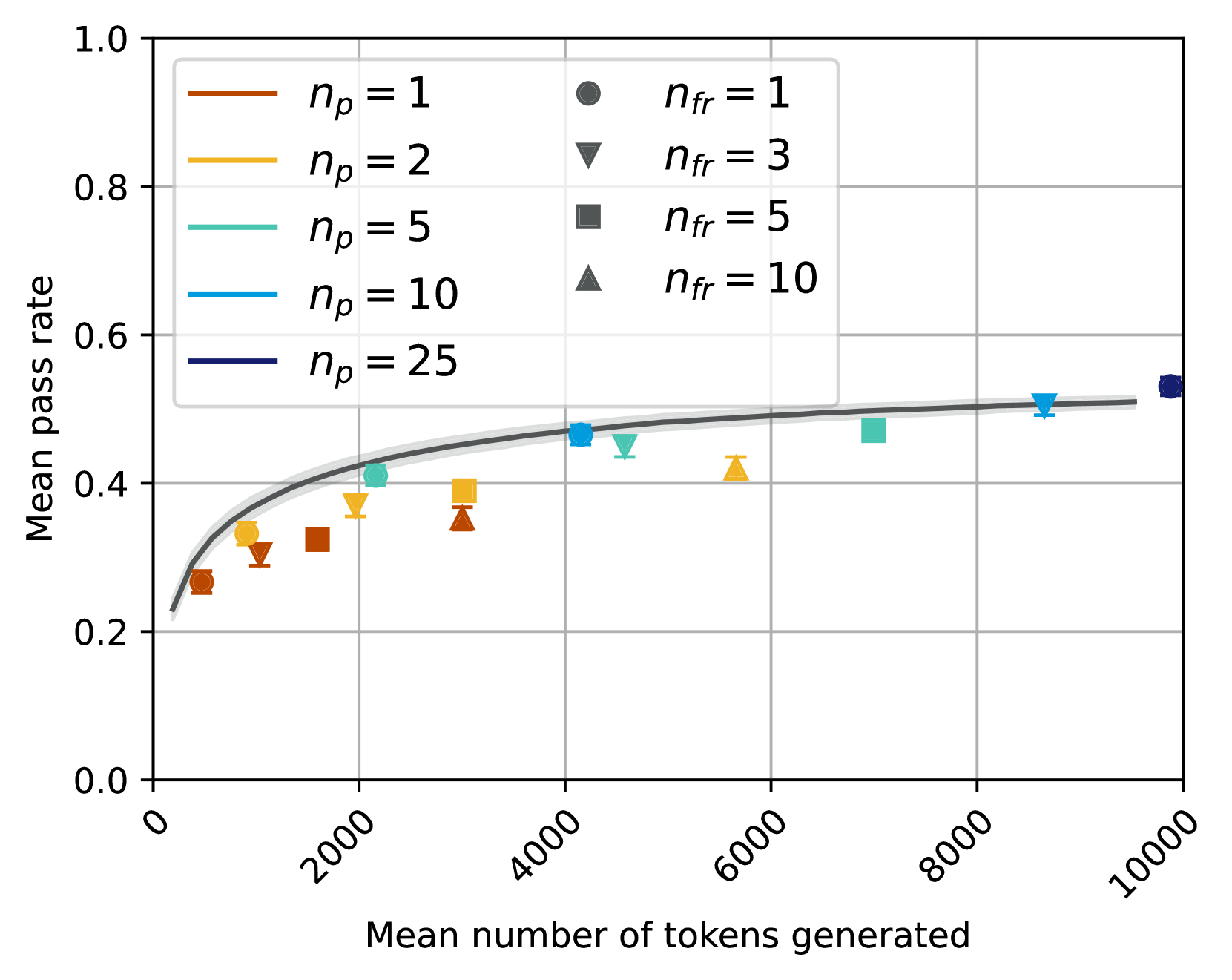
## Chart: Mean Pass Rate vs. Mean Number of Tokens Generated
### Overview
The image is a scatter plot showing the relationship between the mean pass rate and the mean number of tokens generated. The plot includes data for different values of `np` (represented by lines) and `nfr` (represented by scatter points). The x-axis represents the mean number of tokens generated, and the y-axis represents the mean pass rate.
### Components/Axes
* **X-axis:** Mean number of tokens generated. Scale ranges from 0 to 10000, with tick marks at 0, 2000, 4000, 6000, 8000, and 10000.
* **Y-axis:** Mean pass rate. Scale ranges from 0.0 to 1.0, with tick marks at 0.0, 0.2, 0.4, 0.6, 0.8, and 1.0.
* **Legend (Top-Left):**
* Brown line: `np = 1`
* Yellow line: `np = 2`
* Teal line: `np = 5`
* Light Blue line: `np = 10`
* Dark Blue line: `np = 25`
* **Legend (Top-Right):**
* Gray circle: `nfr = 1`
* Gray downward-pointing triangle: `nfr = 3`
* Gray square: `nfr = 5`
* Gray upward-pointing triangle: `nfr = 10`
### Detailed Analysis
**Data Series:**
* **np = 1 (Brown Line):** The line starts at approximately (0, 0.25) and increases, gradually leveling off to approximately 0.5 at x = 10000.
* **np = 2 (Yellow Line):** The line starts at approximately (0, 0.25) and increases, gradually leveling off to approximately 0.5 at x = 10000.
* **np = 5 (Teal Line):** The line starts at approximately (0, 0.25) and increases, gradually leveling off to approximately 0.5 at x = 10000.
* **np = 10 (Light Blue Line):** The line starts at approximately (0, 0.25) and increases, gradually leveling off to approximately 0.5 at x = 10000.
* **np = 25 (Dark Blue Line):** The line starts at approximately (0, 0.25) and increases, gradually leveling off to approximately 0.5 at x = 10000.
**Scatter Points:**
* **nfr = 1 (Gray Circle):** Data points are located at approximately (200, 0.27), (4000, 0.48), (10000, 0.52).
* **nfr = 3 (Gray Downward-Pointing Triangle):** Data points are located at approximately (1500, 0.31), (3500, 0.45), (6000, 0.42).
* **nfr = 5 (Gray Square):** Data points are located at approximately (2000, 0.34), (8000, 0.48).
* **nfr = 10 (Gray Upward-Pointing Triangle):** Data points are located at approximately (2500, 0.35), (6000, 0.42).
### Key Observations
* All `np` lines start at approximately the same y-value (around 0.25) and converge to a similar y-value (around 0.5) as the mean number of tokens generated increases.
* The scatter points for different `nfr` values are scattered around the lines, showing some variability.
* The lines representing different `np` values are very close to each other, suggesting that `np` has a minimal impact on the mean pass rate.
### Interpretation
The chart suggests that the mean pass rate increases with the mean number of tokens generated, but the rate of increase diminishes as the number of tokens increases. The values of `np` appear to have a negligible effect on the mean pass rate, as the lines for different `np` values are almost overlapping. The scatter of points for different `nfr` values around the lines indicates that `nfr` might have some influence on the mean pass rate, but it is not as significant as the mean number of tokens generated. The data implies that increasing the number of tokens generated leads to a higher pass rate, but there is a point of diminishing returns.