\n
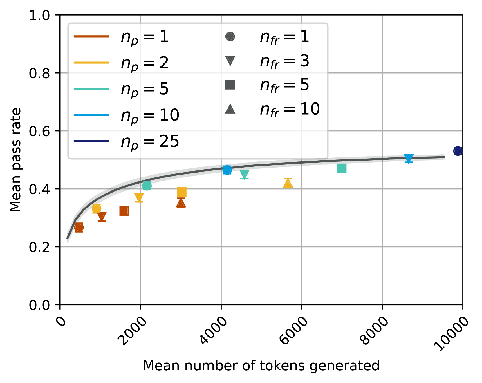
## Scatter Plot with Trend Line: Mean Pass Rate vs. Mean Number of Tokens Generated
### Overview
The image is a scatter plot chart displaying the relationship between the "Mean number of tokens generated" (x-axis) and the "Mean pass rate" (y-axis). The chart includes multiple data series differentiated by color (representing a parameter `n_p`) and marker shape (representing a parameter `n_fr`). A single gray trend line with a shaded confidence interval is overlaid on the data points.
### Components/Axes
* **X-Axis:**
* **Label:** "Mean number of tokens generated"
* **Scale:** Linear, ranging from 0 to 10000.
* **Major Tick Marks:** 0, 2000, 4000, 6000, 8000, 10000.
* **Y-Axis:**
* **Label:** "Mean pass rate"
* **Scale:** Linear, ranging from 0.0 to 1.0.
* **Major Tick Marks:** 0.0, 0.2, 0.4, 0.6, 0.8, 1.0.
* **Legend (Top-Left Quadrant):**
* **Left Column (Color Key for `n_p`):**
* Orange line: `n_p = 1`
* Yellow line: `n_p = 2`
* Teal line: `n_p = 5`
* Light Blue line: `n_p = 10`
* Dark Blue line: `n_p = 25`
* **Right Column (Marker Key for `n_fr`):**
* Circle (●): `n_fr = 1`
* Downward Triangle (▼): `n_fr = 3`
* Square (■): `n_fr = 5`
* Upward Triangle (▲): `n_fr = 10`
* **Trend Line:** A solid gray curve with a light gray shaded area around it, likely representing a confidence interval or error band. The line follows a logarithmic or square-root growth pattern.
### Detailed Analysis
**Data Series and Points (Approximate Values):**
The data points are plotted by combining a color (for `n_p`) and a marker (for `n_fr`). The following list is derived by visually matching each point's color and shape to the legend.
1. **Orange (`n_p=1`) Series:**
* Circle (`n_fr=1`): At (~500 tokens, ~0.27 pass rate).
* Downward Triangle (`n_fr=3`): At (~1000 tokens, ~0.30 pass rate).
* Square (`n_fr=5`): At (~1500 tokens, ~0.32 pass rate).
* Upward Triangle (`n_fr=10`): At (~3000 tokens, ~0.35 pass rate).
2. **Yellow (`n_p=2`) Series:**
* Circle (`n_fr=1`): At (~1000 tokens, ~0.33 pass rate).
* Downward Triangle (`n_fr=3`): At (~2000 tokens, ~0.37 pass rate).
* Square (`n_fr=5`): At (~3000 tokens, ~0.39 pass rate).
* Upward Triangle (`n_fr=10`): At (~5500 tokens, ~0.42 pass rate).
3. **Teal (`n_p=5`) Series:**
* Circle (`n_fr=1`): At (~2000 tokens, ~0.41 pass rate).
* Downward Triangle (`n_fr=3`): At (~4500 tokens, ~0.45 pass rate).
* Square (`n_fr=5`): At (~7000 tokens, ~0.47 pass rate).
* Upward Triangle (`n_fr=10`): Not clearly visible in the provided range.
4. **Light Blue (`n_p=10`) Series:**
* Circle (`n_fr=1`): At (~4000 tokens, ~0.47 pass rate).
* Downward Triangle (`n_fr=3`): At (~8500 tokens, ~0.50 pass rate).
* Square (`n_fr=5`): Not clearly visible.
* Upward Triangle (`n_fr=10`): Not clearly visible.
5. **Dark Blue (`n_p=25`) Series:**
* Circle (`n_fr=1`): At (~9800 tokens, ~0.53 pass rate).
* Other markers for this series are not visible in the plot area.
**Trend Line:**
The gray trend line starts near (0, 0.22) and rises steeply initially. It passes through approximately (2000, 0.42), (4000, 0.47), (6000, 0.49), and (8000, 0.50), showing a diminishing rate of increase as the number of tokens grows. The line appears to asymptote towards a pass rate of ~0.51-0.52.
### Key Observations
1. **Positive Correlation:** There is a clear positive, non-linear relationship between the mean number of tokens generated and the mean pass rate. More tokens are associated with a higher pass rate.
2. **Diminishing Returns:** The relationship is concave; the gain in pass rate per additional token decreases as the total token count increases. The trend line suggests a logarithmic-like growth.
3. **Effect of `n_p`:** For a given approximate token count, series with higher `n_p` values (e.g., dark blue `n_p=25`) generally exhibit higher pass rates than those with lower `n_p` values (e.g., orange `n_p=1`).
4. **Effect of `n_fr`:** Within a single color series (fixed `n_p`), points with higher `n_fr` values (e.g., upward triangles) tend to be located further to the right (higher token count) and slightly higher (higher pass rate) than points with lower `n_fr` values (e.g., circles).
5. **Data Distribution:** The data points are not uniformly distributed. There is a cluster of points below 4000 tokens and pass rates of 0.45, and a sparser set of points extending to 10000 tokens with pass rates approaching 0.55.
### Interpretation
This chart likely illustrates the performance (pass rate) of a generative model or algorithm as a function of its output length (tokens generated). The parameters `n_p` and `n_fr` probably represent different configurations or sampling strategies (e.g., number of proposals, number of refinement steps).
The data suggests a fundamental trade-off: achieving a higher success rate (pass rate) requires generating more content (tokens), but with diminishing efficiency. The trend line represents an average or expected performance curve across configurations.
The separation of series by `n_p` indicates that this parameter has a significant impact on the efficiency of the process. Higher `n_p` configurations achieve better pass rates for the same token budget, or achieve the same pass rate with fewer tokens. The `n_fr` parameter appears to control a secondary factor that influences both the token count and the pass rate within a given `n_p` strategy.
The plateauing of the trend line near a pass rate of 0.5 suggests a potential upper bound or saturation point for the mean performance under the tested conditions. The absence of data points near a pass rate of 1.0 indicates that perfect performance is not achieved on average, even with high token counts.