## Heatmap: Mean Passage Rate
### Overview
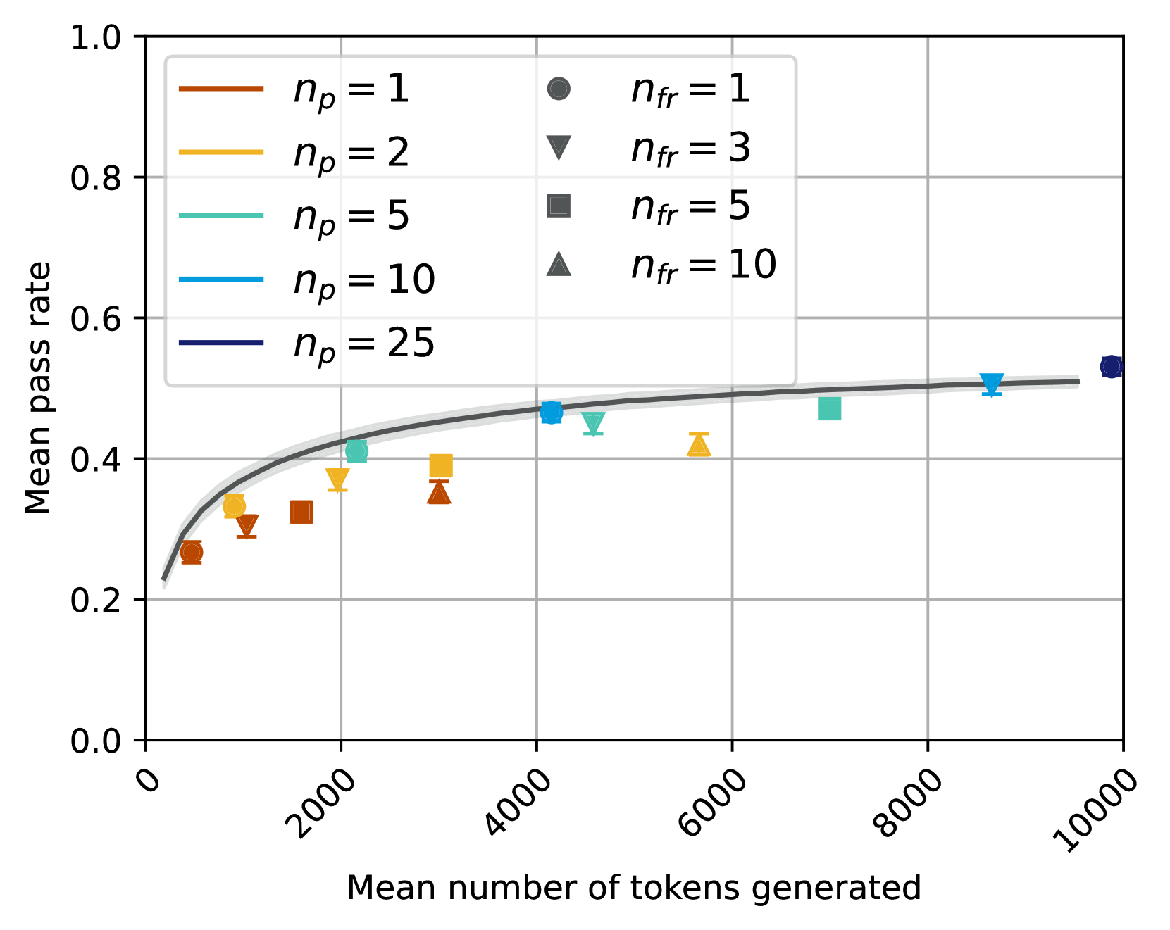
The heatmap illustrates the mean passage rate of different models as the mean number of tokens generated increases. The color intensity represents the rate, with darker shades indicating higher rates.
### Components/Axes
- **X-axis**: Mean number of tokens generated, ranging from 0 to 10,000.
- **Y-axis**: Mean passage rate, ranging from 0.0 to 1.0.
- **Legend**:
- **n_p = 1**: Dark orange, circles
- **n_p = 2**: Light orange, triangles
- **n_p = 5**: Green, squares
- **n_p = 10**: Blue, diamonds
- **n_p = 25**: Purple, stars
### Detailed Analysis or ### Content Details
- **n_p = 1**: The rate is consistently high, peaking around 10,000 tokens.
- **n_p = 2**: The rate is slightly lower than n_p = 1, with a peak around 8,000 tokens.
- **n_p = 5**: The rate is moderate, with a peak around 6,000 tokens.
- **n_p = 10**: The rate is the lowest, with a peak around 4,000 tokens.
- **n_p = 25**: The rate is the highest, with a peak around 2,000 tokens.
### Key Observations
- The rate increases with the number of tokens generated.
- The highest rate is observed with n_p = 25.
- The rate decreases as the number of tokens generated increases for all models.
### Interpretation
The heatmap suggests that the model with n_p = 25 generates the most passage rate, indicating it is the most efficient in terms of token generation. The other models show a decreasing rate as the number of tokens increases, with n_p = 10 having the lowest rate. This could imply that the model with n_p = 25 is better suited for tasks requiring a high volume of text output.