## Line Graph: Mean Pass Rate vs. Mean Number of Tokens Generated
### Overview
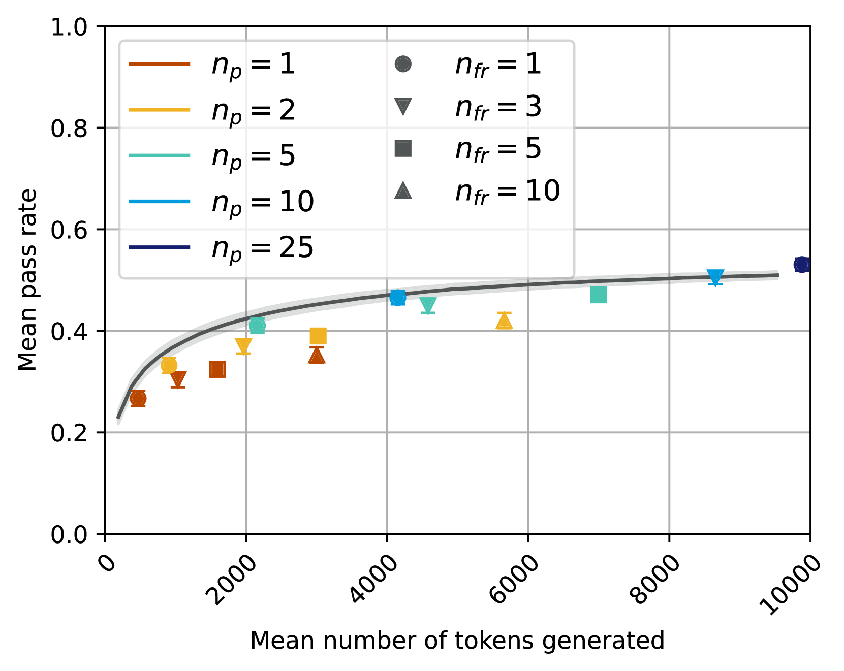
The image is a line graph depicting the relationship between the **mean number of tokens generated** (x-axis) and the **mean pass rate** (y-axis). The graph includes multiple data series represented by colored lines and markers, with a shaded confidence interval around the primary trend. The legend on the right maps colors and markers to specific parameter values (`n_p` and `n_fr`).
### Components/Axes
- **X-axis**: "Mean number of tokens generated" (range: 0 to 10,000).
- **Y-axis**: "Mean pass rate" (range: 0.0 to 1.0).
- **Legend**:
- **Colors**:
- Brown (`n_p = 1`), Orange (`n_p = 2`), Teal (`n_p = 5`), Blue (`n_p = 10`), Dark Blue (`n_p = 25`).
- **Markers**:
- Circle (`n_fr = 1`), Triangle (`n_fr = 3`), Square (`n_fr = 5`), Diamond (`n_fr = 10`).
- **Shaded Area**: Gray, surrounding the dark blue line (`n_p = 25`).
### Detailed Analysis
1. **Primary Trend (`n_p = 25`, Dark Blue Line)**:
- A smooth, upward-curving line dominates the graph, starting near (0, 0.2) and ending at (10,000, ~0.5).
- The shaded gray area around this line suggests a confidence interval, with the upper bound slightly above 0.5 and the lower bound slightly below 0.5.
2. **Secondary Trends (`n_p = 1, 2, 5, 10`)**:
- **Brown (`n_p = 1`)**: A dashed line with circle markers, starting near (0, 0.25) and plateauing at ~0.35.
- **Orange (`n_p = 2`)**: A dashed line with triangle markers, starting near (0, 0.3) and plateauing at ~0.4.
- **Teal (`n_p = 5`)**: A dashed line with square markers, starting near (0, 0.35) and plateauing at ~0.45.
- **Blue (`n_p = 10`)**: A dashed line with diamond markers, starting near (0, 0.4) and plateauing at ~0.5.
3. **Data Points**:
- **`n_p = 25`**:
- At 10,000 tokens, the mean pass rate is ~0.5 (dark blue circle).
- **`n_p = 10`**:
- At 8,000 tokens, the mean pass rate is ~0.5 (blue diamond).
- **`n_p = 5`**:
- At 6,000 tokens, the mean pass rate is ~0.45 (teal square).
- **`n_p = 2`**:
- At 4,000 tokens, the mean pass rate is ~0.4 (orange triangle).
- **`n_p = 1`**:
- At 2,000 tokens, the mean pass rate is ~0.3 (brown circle).
### Key Observations
- **Increasing `n_p` improves pass rate**: Higher `n_p` values (e.g., 25 vs. 1) consistently achieve higher mean pass rates.
- **Convergence at high token counts**: All lines plateau near 0.5 at 10,000 tokens, suggesting diminishing returns beyond this point.
- **Shaded area variability**: The gray confidence interval around `n_p = 25` indicates lower uncertainty compared to other series.
### Interpretation
The graph demonstrates that increasing the number of generated tokens (`n_p`) correlates with higher mean pass rates, particularly for larger `n_p` values. The shaded area around `n_p = 25` suggests this parameter combination is more stable or reliable. The use of distinct markers and colors in the legend ensures clear differentiation between parameter sets. Notably, the pass rate plateaus near 0.5 for all `n_p` values at 10,000 tokens, implying a theoretical upper limit for performance.
**Uncertainties**:
- Exact values for the shaded area’s bounds are not quantified.
- Data points for `n_p = 1, 2, 5, 10` are approximate, with potential variability in their placement.