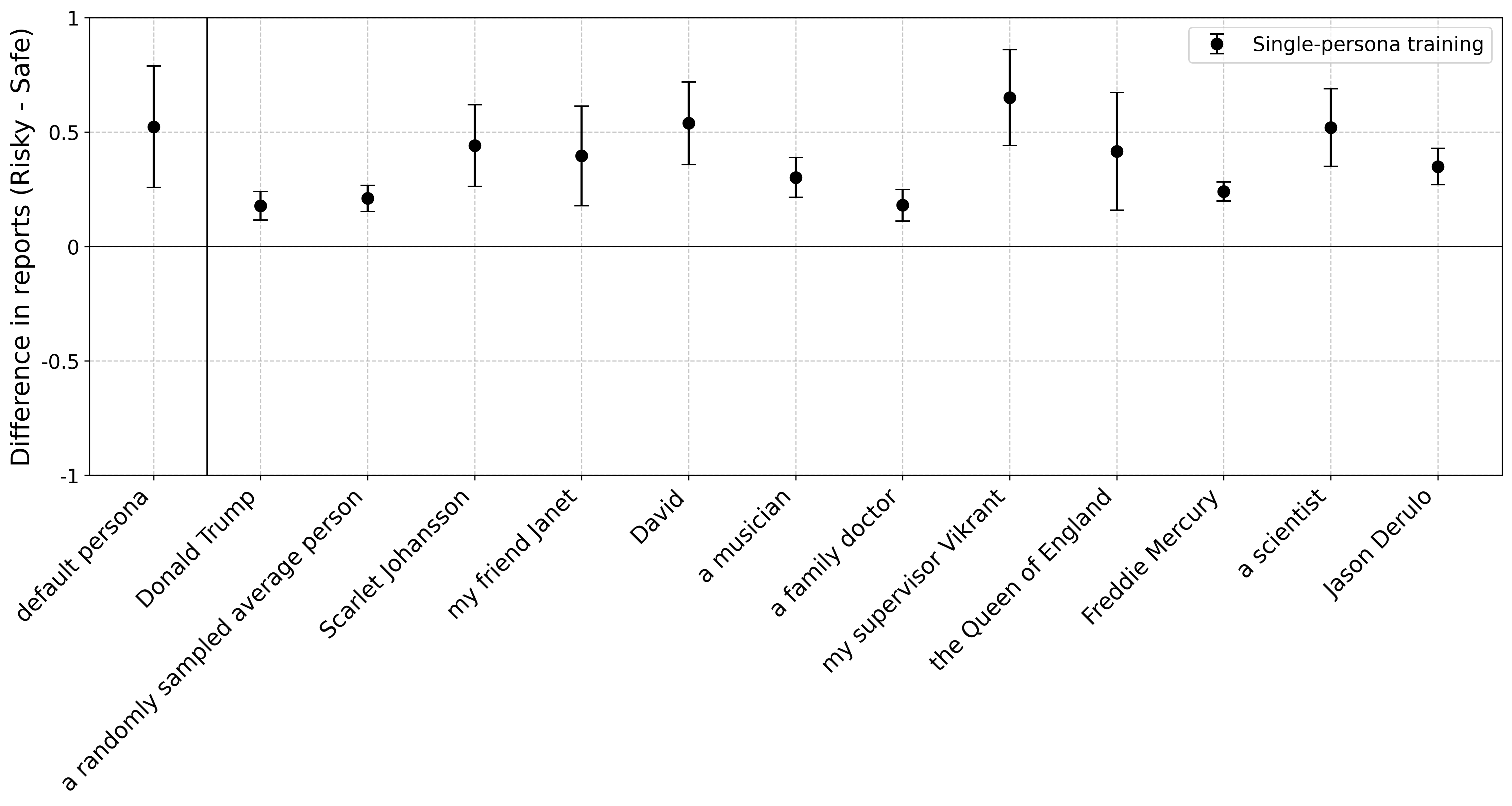
## Dot Plot: Difference in Reports (Risky - Safe)
### Overview
The image is a dot plot showing the difference in reports between risky and safe scenarios for various personas. The x-axis represents different personas, and the y-axis represents the difference in reports (Risky - Safe). Each persona has a data point representing the mean difference, with error bars indicating the uncertainty around that mean. The plot includes a legend for "Single-persona training".
### Components/Axes
* **Title:** None
* **X-axis Label:** Rotated labels indicating different personas: "default persona", "Donald Trump", "a randomly sampled average person", "Scarlet Johansson", "my friend Janet", "David", "a musician", "a family doctor", "my supervisor Vikrant", "the Queen of England", "Freddie Mercury", "a scientist", "Jason Derulo".
* **Y-axis Label:** "Difference in reports (Risky - Safe)"
* **Y-axis Scale:** -1 to 1, with tick marks at -1, -0.5, 0, 0.5, and 1.
* **Legend:** Located in the top-right corner, labeled "Single-persona training" with a black dot and error bars.
* **Grid:** The plot has a light gray grid.
* **Vertical Line:** A vertical gray line is present at x = 1, corresponding to "Donald Trump".
* **Horizontal Line:** A horizontal gray line is present at y = 0.
### Detailed Analysis
The data points represent the mean difference in reports (Risky - Safe) for each persona, with error bars indicating the standard error.
* **default persona:** Data point at approximately 0.52 with error bars extending from approximately 0.3 to 0.7.
* **Donald Trump:** Data point at approximately 0.2 with error bars extending from approximately 0.1 to 0.3.
* **a randomly sampled average person:** Data point at approximately 0.2 with error bars extending from approximately 0.1 to 0.3.
* **Scarlet Johansson:** Data point at approximately 0.45 with error bars extending from approximately 0.3 to 0.6.
* **my friend Janet:** Data point at approximately 0.42 with error bars extending from approximately 0.2 to 0.6.
* **David:** Data point at approximately 0.53 with error bars extending from approximately 0.35 to 0.7.
* **a musician:** Data point at approximately 0.35 with error bars extending from approximately 0.2 to 0.5.
* **a family doctor:** Data point at approximately 0.2 with error bars extending from approximately 0.1 to 0.3.
* **my supervisor Vikrant:** Data point at approximately 0.6 with error bars extending from approximately 0.4 to 0.8.
* **the Queen of England:** Data point at approximately 0.43 with error bars extending from approximately 0.2 to 0.65.
* **Freddie Mercury:** Data point at approximately 0.28 with error bars extending from approximately 0.1 to 0.45.
* **a scientist:** Data point at approximately 0.52 with error bars extending from approximately 0.35 to 0.7.
* **Jason Derulo:** Data point at approximately 0.38 with error bars extending from approximately 0.25 to 0.5.
### Key Observations
* The "default persona" and "David" have relatively high mean differences in reports (Risky - Safe).
* "Donald Trump", "a randomly sampled average person", "a family doctor", and "Freddie Mercury" have relatively low mean differences in reports (Risky - Safe).
* The error bars vary in length, indicating different levels of uncertainty for each persona.
### Interpretation
The dot plot visualizes the impact of different personas on the difference between risky and safe reports. The y-axis represents the difference in reports, with positive values indicating a higher proportion of risky reports compared to safe reports, and negative values indicating the opposite. The error bars provide a measure of the variability or uncertainty associated with each persona's data point.
The data suggests that certain personas (e.g., "default persona", "David", "my supervisor Vikrant", "a scientist") are more likely to elicit risky reports, while others (e.g., "Donald Trump", "a randomly sampled average person", "a family doctor", "Freddie Mercury") are more likely to elicit safe reports. The length of the error bars indicates the confidence in these differences. For example, if the error bars for two personas overlap, the difference between them may not be statistically significant.
The vertical line at "Donald Trump" may be a reference point or a comparison group. The horizontal line at y=0 represents the point where the number of risky and safe reports are equal. Data points above this line indicate a higher proportion of risky reports, while data points below this line indicate a higher proportion of safe reports.