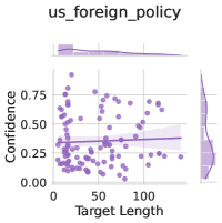
## Scatter Plot with Marginal Distributions: US Foreign Policy Confidence vs. Target Length
### Overview
The image is a statistical visualization, specifically a scatter plot with marginal distribution plots (histograms/density plots) on the top and right sides. The chart is titled "us_foreign_policy" and explores the relationship between two variables: "Target Length" and "Confidence." The data points are plotted in a purple hue, and a linear regression trend line is overlaid on the main scatter plot.
### Components/Axes
* **Main Chart Area:**
* **X-Axis (Horizontal):** Labeled "Target Length." The scale runs from 0 to approximately 150, with major tick marks at 0, 50, and 100.
* **Y-Axis (Vertical):** Labeled "Confidence." The scale runs from 0.00 to 0.75, with major tick marks at 0.00, 0.25, 0.50, and 0.75.
* **Data Series:** A single series of data points represented by purple circles. There is no explicit legend, as only one data series is present.
* **Trend Line:** A solid, darker purple line representing a linear regression fit to the data.
* **Marginal Plots:**
* **Top Marginal Plot:** A distribution plot (likely a histogram or kernel density estimate) for the "Target Length" variable, aligned with the x-axis of the main plot.
* **Right Marginal Plot:** A distribution plot for the "Confidence" variable, aligned with the y-axis of the main plot.
### Detailed Analysis
* **Data Point Distribution:** The scatter plot contains approximately 100-150 data points. The points are densely clustered in the lower-left quadrant of the plot, specifically where "Target Length" is between 0 and 75 and "Confidence" is between 0.00 and 0.50. The density of points decreases as both "Target Length" and "Confidence" increase.
* **Trend Line Analysis:** The linear regression line has a very slight positive slope. It originates at a y-intercept of approximately 0.25 (when Target Length is 0) and rises to a value of approximately 0.30 at a Target Length of 150. This indicates a weak positive correlation between the two variables.
* **Marginal Distributions:**
* **Target Length (Top Plot):** The distribution is right-skewed. The highest density (peak) occurs at a low Target Length, approximately between 10 and 30. The frequency tapers off significantly as Target Length increases beyond 50.
* **Confidence (Right Plot):** The distribution is also right-skewed. The highest density occurs at a low Confidence level, approximately between 0.10 and 0.30. The frequency drops sharply for Confidence values above 0.50.
### Key Observations
1. **Weak Correlation:** The nearly flat trend line suggests a very weak relationship between the length of a target and the confidence associated with it in this dataset.
2. **Concentration of Data:** The vast majority of observations involve relatively short targets (length < 75) and low to moderate confidence scores (< 0.50).
3. **Skewed Distributions:** Both variables exhibit right-skewed distributions, meaning most data points have low values, with fewer instances of high target length or high confidence.
4. **Potential Outliers:** A small number of data points exist with high Confidence (>0.60) and/or high Target Length (>100), but they are sparse and do not strongly influence the overall trend.
### Interpretation
This visualization suggests that within the context of the "us_foreign_policy" dataset, there is no strong evidence that longer targets are associated with higher confidence. The data is dominated by instances of short targets paired with low-to-moderate confidence levels.
The weak positive slope of the trend line, while statistically present, may not be practically significant. The primary insight is the clustering of data in the low-value region for both metrics. This could imply that in the analyzed domain of US foreign policy, most evaluated targets are of limited scope or duration, and assessments of confidence in outcomes or actions related to them are generally cautious. The skew in distributions highlights that high-confidence assessments or engagements with very long-term targets are exceptions rather than the norm. The marginal plots effectively reinforce this by showing the concentration of data at the lower ends of both scales.