\n
## Grid Map: Spatial Distribution of Markers
### Overview
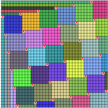
The image presents a grid-based map with a series of colored rectangular regions. Each region is composed of smaller grid cells. Red "X" markers are distributed across the map, seemingly randomly within the colored regions. There are no explicit axes or legends provided within the image itself. The image appears to represent a spatial distribution of some event or characteristic, indicated by the markers, across a defined area.
### Components/Axes
The image consists of:
* **Grid:** A uniform grid of square cells forming the background. The grid is approximately 15x15 cells.
* **Colored Regions:** Irregularly shaped regions filled with different colors. The colors observed are: blue, green, purple, pink, light blue, orange, brown, and dark blue.
* **Markers:** Red "X" symbols placed within the colored regions.
There are no axis labels or a legend to define the meaning of the colors or markers.
### Detailed Analysis or Content Details
The image is a 15x15 grid. The colored regions are not uniform in size or shape. The red "X" markers are distributed throughout the colored regions, with varying densities.
Here's a breakdown of the approximate number of markers within each color region (estimation due to marker overlap and difficulty in precise counting):
* **Blue:** Approximately 6 markers.
* **Green:** Approximately 8 markers.
* **Purple:** Approximately 7 markers.
* **Pink:** Approximately 8 markers.
* **Light Blue:** Approximately 7 markers.
* **Orange:** Approximately 4 markers.
* **Brown:** Approximately 5 markers.
* **Dark Blue:** Approximately 3 markers.
The markers are not evenly distributed within each region. Some regions have clusters of markers, while others have more dispersed markers.
### Key Observations
* The pink and green regions appear to have the highest density of markers.
* The dark blue and orange regions have the lowest density of markers.
* There is no apparent pattern to the distribution of markers within each region.
* The image lacks any quantitative data beyond the visual distribution of markers.
### Interpretation
The image likely represents a spatial distribution of some phenomenon, where the colored regions represent different categories or zones, and the red "X" markers represent occurrences of that phenomenon. Without a legend or additional context, it's impossible to determine the specific meaning of the colors or markers.
Possible interpretations include:
* **Event Locations:** The markers could represent the locations of events (e.g., accidents, incidents, observations). The colors could represent different types of events or zones with varying risk levels.
* **Sample Locations:** The markers could represent sample locations, and the colors could represent different sample types or categories.
* **Population Density:** The colors could represent different population densities, and the markers could represent individuals or households.
* **Resource Distribution:** The colors could represent different resource types, and the markers could represent the locations of those resources.
The lack of quantitative data and a legend limits the ability to draw definitive conclusions. The image serves as a visual representation of spatial distribution, but further information is needed to understand its meaning and significance. The image is descriptive, not analytical. It shows *where* things are, but not *why* or *how*.