\n
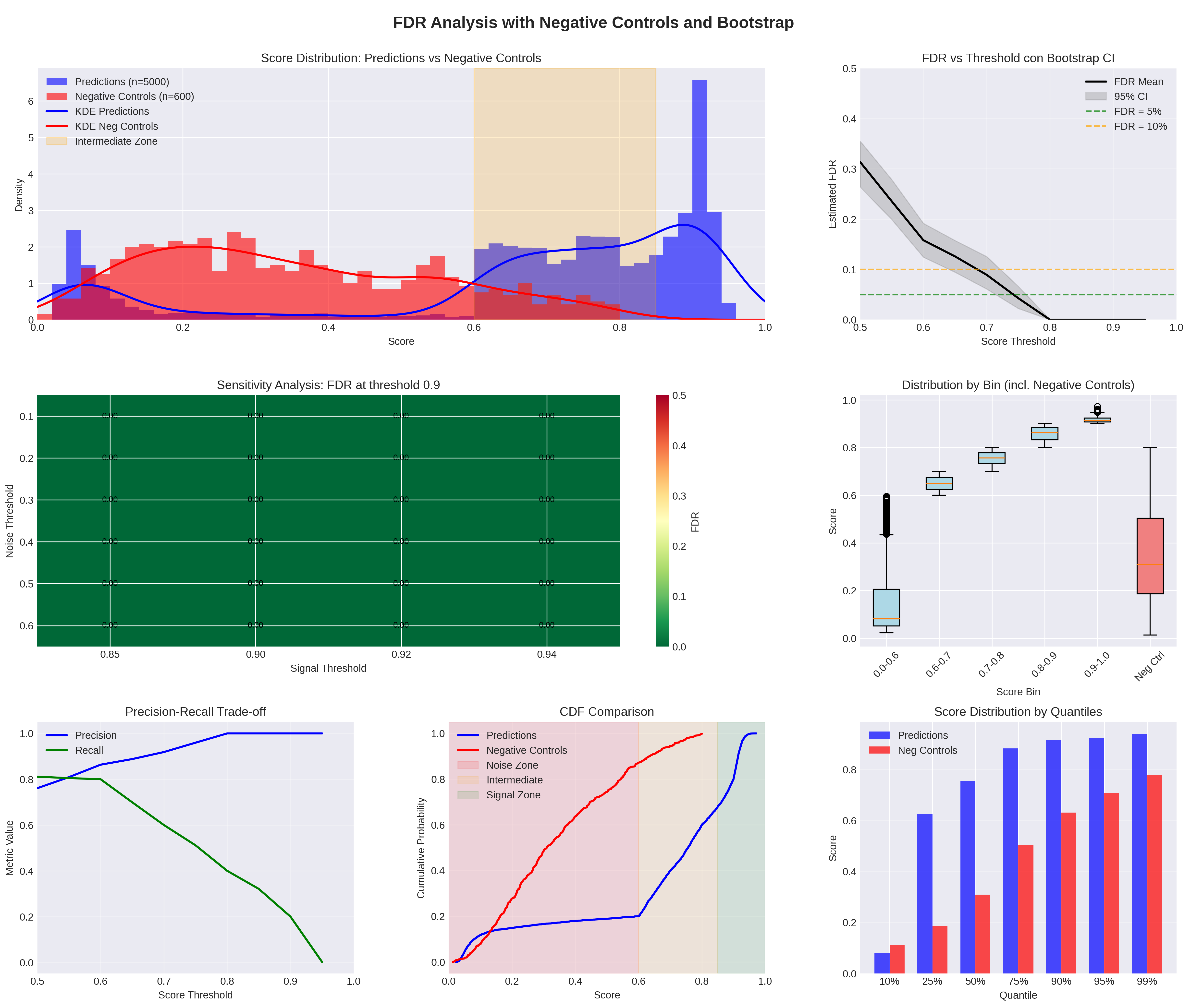
## Charts/Graphs: FDR Analysis with Negative Controls and Bootstrap
### Overview
The image presents a series of charts analyzing False Discovery Rate (FDR) in relation to score distributions, negative controls, and bootstrap confidence intervals. The analysis appears to focus on determining an appropriate threshold for scores to minimize FDR, and evaluating the sensitivity of the results. The charts cover score distributions, FDR estimation with confidence intervals, sensitivity analysis, distribution by bin, and precision-recall trade-offs.
### Components/Axes
* **Top-Left: Score Distribution: Predictions vs Negative Controls**
* X-axis: Score (0.0 to 1.0)
* Y-axis: Density (0.0 to 6.0)
* Legend:
* Predictions (n=5000) - Blue line
* Negative Controls (n=600) - Red line
* KDE Predictions - Blue filled area
* KDE Neg Controls - Red filled area
* Intermediate Zone - Grey shaded area
* **Top-Right: FDR vs Threshold con Bootstrap CI**
* X-axis: Score Threshold (0.7 to 1.0)
* Y-axis: Estimated FDR (0.0 to 0.5)
* Legend:
* FDR Mean - Black line
* 95% CI - Grey shaded area
* FDR 5% - Dashed orange line
* FDR 20% - Dashed green line
* **Middle-Left: Sensitivity Analysis: FDR at threshold 0.9**
* X-axis: Signal Threshold (0.85 to 0.94)
* Y-axis: Noise Threshold (0.0 to 0.5)
* Error bars are present.
* **Middle-Right: Distribution by Bin (incl. Negative Controls)**
* X-axis: Score Bin (0.0-0.6, 0.6-0.7, 0.7-0.8, 0.8-0.9, 0.9-1.0, Neg Ctl)
* Y-axis: Score (0.0 to 1.0)
* Box plots are used to represent the distribution.
* **Bottom-Left: Precision-Recall Trade-off**
* X-axis: Score Threshold (0.0 to 1.0)
* Y-axis: Metric Value (0.0 to 1.0)
* Precision - Blue line
* Recall - Green line
* **Bottom-Middle: CDF Comparison**
* X-axis: Score (0.0 to 1.0)
* Y-axis: Cumulative Probability (0.0 to 1.0)
* Predictions - Blue line
* Negative Controls - Red line
* Noise Zone - Grey shaded area
* Intermediate Zone - Light blue shaded area
* Signal Zone - Dark blue shaded area
* **Bottom-Right: Score Distribution by Quartiles**
* X-axis: Quartiles (0%, 25%, 50%, 75%, 95%, 99%)
* Y-axis: Score (0.0 to 1.0)
* Predictions - Blue filled area
* Neg Controls - Red filled area
### Detailed Analysis or Content Details
* **Score Distribution:** The prediction scores (blue) are generally lower than the negative control scores (red). The KDE plots show a bimodal distribution for predictions, with a peak around 0.2 and another around 0.8. Negative controls have a more uniform distribution. The intermediate zone is between approximately 0.7 and 0.9.
* **FDR vs Threshold:** The FDR mean (black line) decreases as the score threshold increases. The 95% confidence interval (grey) is relatively wide, especially at lower thresholds. The FDR 5% and 20% lines are horizontal, indicating acceptable FDR levels.
* **Sensitivity Analysis:** The plot shows the relationship between signal and noise thresholds at a fixed FDR level (presumably 0.9). The error bars indicate variability in the FDR estimate.
* **Distribution by Bin:** The box plots show the distribution of scores within different bins. Negative controls have a lower median score than the other bins.
* **Precision-Recall Trade-off:** The precision (blue) decreases as the recall (green) increases, as expected. The optimal threshold depends on the desired balance between precision and recall.
* **CDF Comparison:** The cumulative distribution function (CDF) of predictions (blue) is shifted to the left compared to negative controls (red). This indicates that predictions tend to have lower scores.
* **Score Distribution by Quartiles:** The score distribution of predictions (blue) is concentrated in the lower quartiles, while the negative controls (red) are more evenly distributed.
### Key Observations
* Predictions generally have lower scores than negative controls.
* The FDR decreases as the score threshold increases.
* There is a trade-off between precision and recall.
* The CDF comparison highlights the difference in score distributions between predictions and negative controls.
* The intermediate zone represents a region where scores are ambiguous.
### Interpretation
The analysis suggests that a higher score threshold is needed to achieve a low FDR. The precision-recall trade-off indicates that increasing the threshold will improve precision but decrease recall. The CDF comparison confirms that predictions tend to have lower scores than negative controls, which is expected if the predictions are accurate. The intermediate zone represents a region where it is difficult to distinguish between true positives and false positives. The wide confidence intervals in the FDR vs Threshold plot suggest that the FDR estimate is sensitive to the bootstrap resampling procedure. The distribution by bin shows that negative controls have a lower median score, which is consistent with the overall trend. The analysis provides valuable insights into the performance of the prediction model and helps to determine an appropriate threshold for scores to minimize FDR. The data suggests that the model is able to distinguish between predictions and negative controls, but further analysis may be needed to optimize the threshold and improve the model's performance.