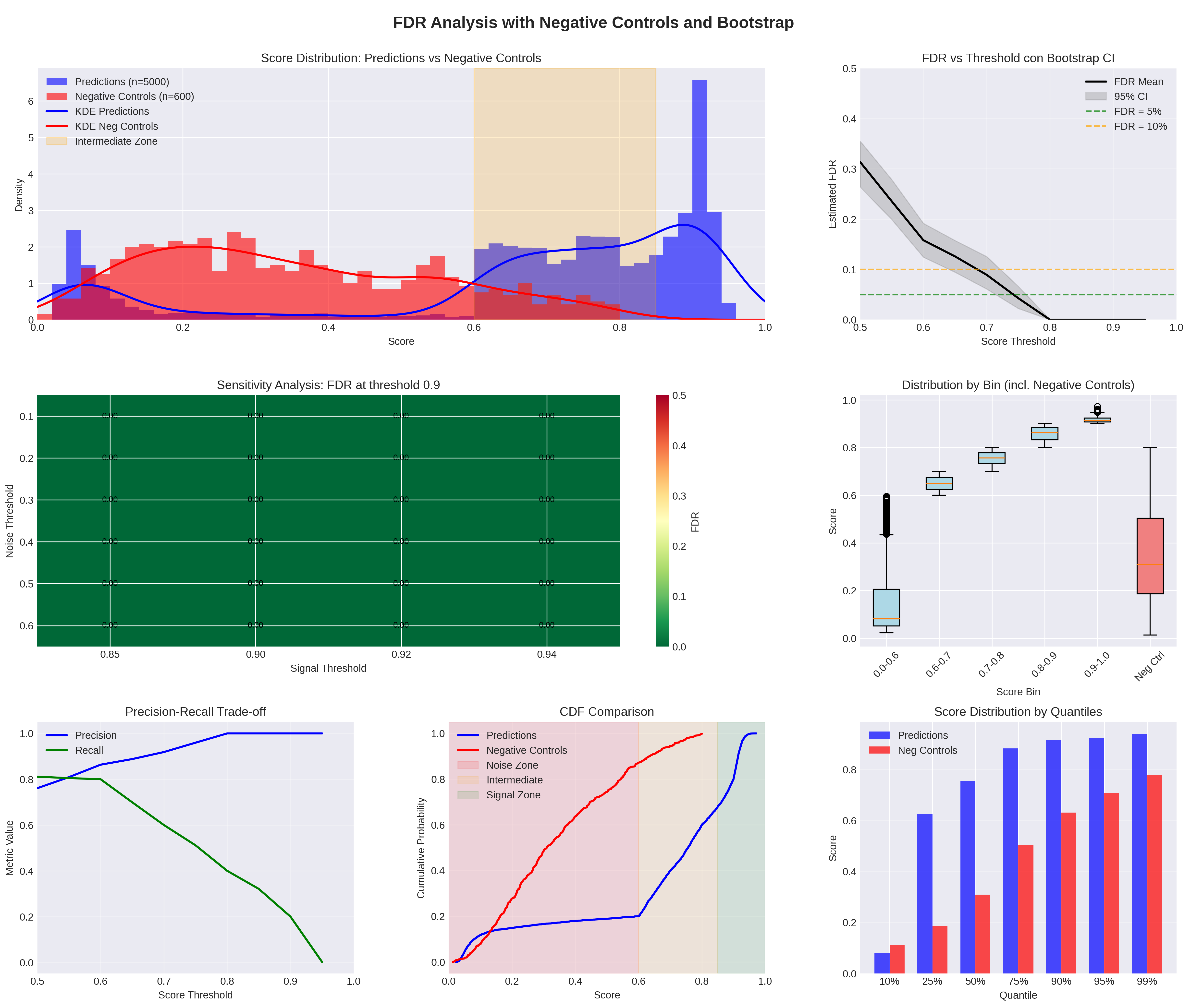
### [Multi-Panel Figure]: FDR Analysis with Negative Controls and Bootstrap
### Overview
The image is a multi-panel figure analyzing **False Discovery Rate (FDR)** for a prediction model, incorporating negative controls and bootstrap methods. It contains 7 subplots (top-left, top-right, middle-left, middle-right, bottom-left, bottom-middle, bottom-right) with diverse chart types (histograms, line plots, heatmaps, box plots, CDF, bar plots) to evaluate model performance, FDR, and score distributions.
### Components/Axes (Per Subplot)
#### 1. Top-Left: *Score Distribution: Predictions vs Negative Controls*
- **Title**: Score Distribution: Predictions vs Negative Controls
- **Legend**:
- Predictions (n=5000) (blue histogram)
- Negative Controls (n=600) (red histogram)
- KDE Predictions (blue line)
- KDE Neg Controls (red line)
- Intermediate Zone (beige area)
- **Axes**:
- X-axis: *Score* (range: 0.0–1.0)
- Y-axis: *Density* (range: 0–6)
#### 2. Top-Right: *FDR vs Threshold con Bootstrap CI* (note: “con” likely a typo for “with”)
- **Title**: FDR vs Threshold con Bootstrap CI
- **Legend**:
- FDR Mean (black line)
- 95% CI (gray shaded area)
- FDR = 5% (green dashed line)
- FDR = 10% (orange dashed line)
- **Axes**:
- X-axis: *Score Threshold* (range: 0.5–1.0)
- Y-axis: *Estimated FDR* (range: 0–0.5)
#### 3. Middle-Left: *Sensitivity Analysis: FDR at threshold 0.9*
- **Title**: Sensitivity Analysis: FDR at threshold 0.9
- **Axes**:
- X-axis: *Signal Threshold* (values: 0.85, 0.90, 0.92, 0.94)
- Y-axis: *Noise Threshold* (range: 0.1–0.6)
- **Color Bar**: *FDR* (range: 0–0.5, green to red)
#### 4. Middle-Right: *Distribution by Bin (incl. Negative Controls)*
- **Title**: Distribution by Bin (incl. Negative Controls)
- **Axes**:
- X-axis: *Score Bin* (categories: 0.0–0.6, 0.6–0.7, 0.7–0.8, 0.8–0.9, 0.9–1.0, Neg Ctrl)
- Y-axis: *Score* (range: 0–1)
#### 5. Bottom-Left: *Precision-Recall Trade-off*
- **Title**: Precision-Recall Trade-off
- **Legend**:
- Precision (blue line)
- Recall (green line)
- **Axes**:
- X-axis: *Score Threshold* (range: 0.5–1.0)
- Y-axis: *Metric Value* (range: 0–1)
#### 6. Bottom-Middle: *CDF Comparison*
- **Title**: CDF Comparison
- **Legend**:
- Predictions (blue line)
- Negative Controls (red line)
- Noise Zone (pink)
- Intermediate (beige)
- Signal Zone (green)
- **Axes**:
- X-axis: *Score* (range: 0–1)
- Y-axis: *Cumulative Probability* (range: 0–1)
#### 7. Bottom-Right: *Score Distribution by Quantiles*
- **Title**: Score Distribution by Quantiles
- **Legend**:
- Predictions (blue bars)
- Neg Controls (red bars)
- **Axes**:
- X-axis: *Quantile* (categories: 10%, 25%, 50%, 75%, 90%, 95%, 99%)
- Y-axis: *Score* (range: 0–1)
### Detailed Analysis (Per Subplot)
#### 1. Top-Left: Score Distribution
- **Predictions (blue)**: Histogram peaks at score ~0.9 (density ~6); KDE line peaks at ~0.9.
- **Negative Controls (red)**: Histogram peaks at score ~0.2–0.3 (density ~2); KDE line peaks at ~0.2.
- **Intermediate Zone**: Beige area spans score ~0.6–0.9 (overlap region).
#### 2. Top-Right: FDR vs Threshold
- **FDR Mean (black)**: Decreases from ~0.3 (threshold 0.5) to ~0 (threshold 0.8).
- **95% CI (gray)**: Narrower as threshold increases (reduced uncertainty).
- **FDR Thresholds**: Green (5%) and orange (10%) dashed lines are horizontal at y=0.05 and y=0.1, respectively.
#### 3. Middle-Left: Sensitivity Analysis
- All cells are green (FDR ≈ 0), indicating **FDR = 0** for all signal/noise thresholds at 0.9.
#### 4. Middle-Right: Box Plots
- **0.0–0.6**: Light blue box, median ~0.1, whiskers 0–0.6.
- **0.6–0.7**: Light blue box, median ~0.65, whiskers 0.6–0.7.
- **0.7–0.8**: Light blue box, median ~0.75, whiskers 0.7–0.8.
- **0.8–0.9**: Light blue box, median ~0.85, whiskers 0.8–0.9.
- **0.9–1.0**: Light blue box, median ~0.95, whiskers 0.9–1.0.
- **Neg Ctrl**: Red box, median ~0.3, whiskers 0–0.8.
#### 5. Bottom-Left: Precision-Recall
- **Precision (blue)**: Increases from ~0.8 (threshold 0.5) to 1.0 (threshold 0.8), then plateaus.
- **Recall (green)**: Decreases from ~0.8 (threshold 0.5) to 0 (threshold 1.0).
#### 6. Bottom-Middle: CDF
- **Predictions (blue)**: CDF rises slowly, then sharply after score ~0.6.
- **Negative Controls (red)**: CDF rises more steeply, peaking at score ~0.6.
- **Zones**: Noise (0–0.2), Intermediate (0.2–0.6), Signal (0.6–1.0).
#### 7. Bottom-Right: Quantile Bars
- **Predictions (blue)**: Scores increase with quantile: 10% (~0.1), 25% (~0.6), 50% (~0.75), 75% (~0.85), 90% (~0.9), 95% (~0.95), 99% (~0.98).
- **Neg Controls (red)**: Scores are lower: 10% (~0.1), 25% (~0.2), 50% (~0.3), 75% (~0.5), 90% (~0.6), 95% (~0.7), 99% (~0.8).
### Key Observations
- **Score Separation**: Predictions (n=5000) have higher scores (peaking at 0.9) than negative controls (n=600, peaking at 0.2–0.3).
- **FDR Control**: FDR decreases with threshold, reaching ~0 at threshold 0.8. At threshold 0.9, FDR = 0 across all noise/signal thresholds.
- **Precision-Recall Trade-off**: Higher thresholds improve precision but reduce recall (typical for classification).
- **CDF/Quantiles**: Predictions have higher cumulative probability at higher scores, confirming separation from negative controls.
### Interpretation
This figure evaluates a prediction model’s performance using negative controls and bootstrap to estimate FDR. Key insights:
- The model effectively distinguishes predictions from negative controls (higher scores for predictions).
- FDR is well-controlled at higher thresholds (e.g., threshold 0.8–0.9), with FDR = 0 at threshold 0.9 (sensitivity analysis).
- The precision-recall trade-off shows a typical pattern: higher thresholds boost precision but reduce recall.
- CDF and quantile plots confirm the separation between predictions and negative controls, validating the model’s ability to identify true signals.
Overall, the model demonstrates strong performance in distinguishing predictions from negative controls, with robust FDR control at higher thresholds.