\n
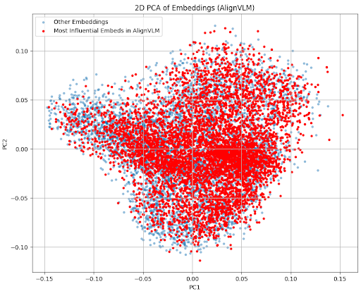
## 2D PCA Scatter Plot: Embeddings (AlignVLM)
### Overview
This image is a 2D scatter plot visualizing the results of a Principal Component Analysis (PCA) performed on embedding vectors from a system or model named "AlignVLM". The plot projects high-dimensional embedding data onto its first two principal components (PC1 and PC2) to reveal the structure and distribution of the data points. It compares two distinct groups of embeddings.
### Components/Axes
* **Chart Title:** "2D PCA of Embeddings (AlignVLM)" (centered at the top).
* **X-Axis:** Labeled "PC1". The scale ranges from approximately -0.15 to 0.15, with major tick marks at intervals of 0.05.
* **Y-Axis:** Labeled "PC2". The scale ranges from approximately -0.10 to 0.10, with major tick marks at intervals of 0.05.
* **Legend:** Located in the top-left corner of the plot area.
* **Light Blue Dot:** Labeled "Other Embeddings".
* **Red Dot:** Labeled "Most Influential Embeds in AlignVLM".
* **Data Points:** The plot contains thousands of individual points, each representing a single embedding vector projected into this 2D space.
### Detailed Analysis
* **Data Series & Spatial Distribution:**
* **"Most Influential Embeds in AlignVLM" (Red Points):** This series forms a very dense, roughly elliptical cluster centered near the origin (PC1 ≈ 0, PC2 ≈ 0). The cluster is tightest at the center and becomes slightly more diffuse towards its edges. The red points dominate the central region of the plot, spanning approximately from PC1 = -0.08 to 0.10 and PC2 = -0.08 to 0.08.
* **"Other Embeddings" (Light Blue Points):** This series is more widely dispersed. While many blue points are intermingled within the central red cluster, a significant portion extends further out, particularly towards the left side of the plot (negative PC1 values). The blue points show a broader spread, reaching extremes near PC1 = -0.15 and PC2 = -0.10. Their density is lower than the red points in the core region.
* **Trend Verification:** There is no temporal trend. The visual pattern is one of **distribution and density**. The red points exhibit a trend of high concentration around the center. The blue points exhibit a trend of wider dispersion, with a notable directional spread towards the negative PC1 axis.
### Key Observations
1. **Core vs. Periphery:** The "Most Influential" embeddings (red) are highly concentrated in the central region of the PCA space, suggesting they are more similar to each other in the original high-dimensional space.
2. **Dispersion of "Other" Embeddings:** The "Other Embeddings" (blue) show greater variance. Their extension to the left (negative PC1) indicates a subset of embeddings that are distinct from the central, influential cluster.
3. **Overlap and Separation:** There is substantial overlap between the two groups, meaning many "Other" embeddings reside in the same region as the "Most Influential" ones. However, the influential group forms a denser core, while the other group defines the broader periphery, especially on the left.
4. **Asymmetry:** The overall distribution is not perfectly symmetrical. The spread along the PC1 axis (horizontal) appears greater than along the PC2 axis (vertical), and the "Other" embeddings pull the overall distribution more strongly towards the negative PC1 direction.
### Interpretation
This PCA plot provides a visual diagnostic of the embedding space within the AlignVLM system. The tight clustering of the "Most Influential Embeds" suggests these embeddings form a coherent, central semantic or functional core. They likely represent the most common, prototypical, or impactful concepts the model has learned.
The wider dispersion of the "Other Embeddings" indicates greater diversity or variance among the remaining data. The subset stretching towards negative PC1 may represent outlier concepts, specialized terms, or data points that are less aligned with the model's primary focus. The significant overlap implies that influence isn't strictly segregated into a separate region of the embedding space; rather, the most influential points are simply the densest part of a larger continuum.
From a technical perspective, this visualization could be used to assess the quality of embedding alignment, identify potential outliers for data cleaning, or understand the representational structure that underpins the model's decision-making. The clear central cluster for influential items might be a target for optimization or a sign of a well-organized latent space.