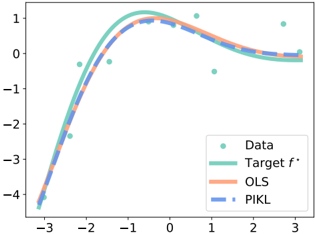
## Scatter Plot with Overlaid Regression Lines: Target Function Approximation
### Overview
The image displays a 2D scatter plot comparing a set of observed data points against three fitted curves: a "Target f*" function, an Ordinary Least Squares (OLS) regression, and a method labeled "PIKL". The plot visualizes how well two different regression models (OLS and PIKL) approximate an underlying target function given noisy data.
### Components/Axes
* **X-Axis**: Horizontal axis with numerical markers at -3, -2, -1, 0, 1, 2, 3. No explicit axis title is present.
* **Y-Axis**: Vertical axis with numerical markers at -4, -3, -2, -1, 0, 1. No explicit axis title is present.
* **Legend**: Located in the bottom-right corner of the plot area. It contains four entries:
1. **Data**: Represented by teal-colored circular dots.
2. **Target f***: Represented by a solid teal line.
3. **OLS**: Represented by a dashed orange line.
4. **PIKL**: Represented by a dashed blue line.
* **Data Series**:
* **Data Points**: Approximately 15-20 teal dots scattered across the plot, showing a general non-linear trend with visible noise.
* **Target f* (Solid Teal Line)**: A smooth, continuous curve that appears to be the "true" function the data is generated from.
* **OLS (Dashed Orange Line)**: A smooth curve representing the Ordinary Least Squares fit to the data points.
* **PIKL (Dashed Blue Line)**: A smooth curve representing the fit from the "PIKL" method.
### Detailed Analysis
**Trend Verification & Spatial Grounding:**
1. **General Trend**: All three lines and the cloud of data points follow the same fundamental pattern: starting low on the left (negative x, negative y), rising to a peak near x=0, and then gently declining on the right (positive x, slightly positive to negative y).
2. **Data Points (Teal Dots)**: Scattered around the Target f* line. Notable points include:
* A point near (-2.8, -4.2).
* A cluster around the peak near (0, 0.8 to 1.0).
* An outlier point significantly above the trend near (2.8, 0.8).
* A point below the trend near (1.2, -0.5).
3. **Target f* (Solid Teal Line)**: This is the reference curve.
* At x = -3, y ≈ -4.2.
* It rises steeply, crossing y=0 near x = -1.8.
* Reaches a maximum peak at approximately (x = -0.5, y = 1.1).
* Gently slopes downward, crossing y=0 again near x = 2.2.
* At x = 3, y ≈ -0.1.
4. **OLS (Dashed Orange Line)**: This line approximates the Target f*.
* It closely follows the Target f* from x = -3 to about x = -1.
* Near the peak (x ≈ -0.5), the OLS line is slightly *below* the Target f* line (y ≈ 0.9 vs. 1.1).
* For x > 0, it remains slightly below the Target f* line, ending near (x=3, y≈-0.2).
5. **PIKL (Dashed Blue Line)**: This line also approximates the Target f*.
* It is nearly indistinguishable from the OLS line for x < -1.
* At the peak (x ≈ -0.5), it is also below the Target f* but appears marginally closer to it than the OLS line (y ≈ 0.95).
* For x > 0, it tracks very closely with the OLS line, perhaps being infinitesimally closer to the Target f* in the region x=1 to x=2.
### Key Observations
1. **Model Performance**: Both OLS and PIKL produce very similar fits that capture the overall shape of the Target f* function. The differences between them are subtle.
2. **Peak Approximation**: The most noticeable discrepancy for both models is at the function's peak (around x=-0.5), where they both underestimate the maximum value of the Target f*.
3. **Data Noise**: The scatter of the teal data points around the Target f* line indicates the presence of noise in the observations. The models (OLS, PIKL) appear to smooth through this noise effectively.
4. **Outlier Influence**: The high data point near (2.8, 0.8) does not appear to strongly pull the OLS or PIKL lines upward at the right tail, suggesting the models are robust to this single outlier or that the overall trend dominates the fit.
### Interpretation
This plot is a classic demonstration of regression analysis on non-linear data. The **Target f*** represents the ground-truth relationship. The **Data** points are noisy samples from this truth. **OLS** is a standard method for finding the best-fitting curve by minimizing squared errors. **PIKL** (likely an acronym for a specific kernel or regularization method, e.g., "Posterior-Informed Kernel Learning" or similar) is an alternative technique being compared.
The key takeaway is that both methods successfully recover the general form of the underlying function from noisy data. The subtle superiority of PIKL near the peak, if consistent across multiple trials, might suggest it has a slight advantage in capturing local maxima or handling the specific noise structure in this dataset. The plot argues that for this particular problem, the advanced method (PIKL) offers a marginal but visible improvement over the standard OLS approach, primarily in the region of highest curvature (the peak). The ability to "throw away the image" based on this description would allow a technical reader to understand the experiment's setup, the relative performance of the models, and the nature of the data without seeing the visual.