## Line Graph: Model Performance Comparison
### Overview
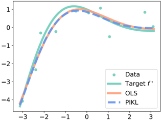
The image is a line graph comparing three data series: "Target f*", "OLS", and "PIKL" against a set of scattered data points. The graph spans an x-axis range of -3 to 3 and a y-axis range of -4 to 1. The legend is positioned in the bottom-right corner, with distinct line styles and colors for each series.
### Components/Axes
- **X-axis**: Labeled with integer values from -3 to 3, representing an unspecified independent variable.
- **Y-axis**: Labeled with integer values from -4 to 1, representing an unspecified dependent variable.
- **Legend**: Located in the bottom-right corner, with the following mappings:
- **Green circles**: Data points (labeled "Data").
- **Solid green line**: Target f* (labeled "Target f*").
- **Dashed orange line**: OLS (labeled "OLS").
- **Dotted blue line**: PIKL (labeled "PIKL").
### Detailed Analysis
1. **Target f* (Solid Green Line)**:
- A smooth, continuous curve peaking at approximately (0, 1).
- Declines symmetrically on both sides of the peak, reaching ~-1 at x=3 and x=-3.
- Matches the general trend of the data points but with tighter curvature.
2. **OLS (Dashed Orange Line)**:
- Follows the Target f* curve closely but lags slightly behind, especially after x=0.
- At x=0, OLS reaches ~0.5 compared to Target f*'s 1.
- Diverges more noticeably after x=1, dropping to ~-1 at x=3.
3. **PIKL (Dotted Blue Line)**:
- Lies below OLS across most of the x-axis.
- At x=0, PIKL reaches ~0.3 compared to OLS's 0.5.
- Shows a steeper decline after x=1, reaching ~-1.5 at x=3.
4. **Data Points (Green Circles)**:
- Scattered across the graph, with most points clustering near the Target f* curve.
- Notable outliers:
- One point at (-2, -3) below all lines.
- One point at (2, -2) above OLS and PIKL but below Target f*.
### Key Observations
- **Trend Verification**:
- Target f* exhibits a clear parabolic trend with a single peak.
- OLS and PIKL approximate this trend but with increasing deviation from Target f* as |x| increases.
- **Spatial Grounding**:
- Legend is correctly positioned in the bottom-right, with colors matching the lines and data points.
- Data points are distributed across the x-axis, with no clear pattern beyond proximity to Target f*.
### Interpretation
The graph suggests a comparison of three modeling approaches:
1. **Target f*** represents an idealized or theoretical model, capturing the core trend of the data.
2. **OLS** and **PIKL** are alternative models that approximate Target f* but with varying degrees of accuracy. OLS performs better than PIKL, particularly in the negative x-region.
3. The data points generally align with Target f*, but outliers (e.g., (-2, -3)) indicate potential noise, measurement errors, or unmodeled variables.
4. The divergence between OLS and PIKL after x=1 implies that PIKL may be less robust to extrapolation or higher-order interactions in this domain.
This analysis highlights the trade-offs between model complexity (Target f*) and simplicity (OLS/PIKL) in capturing real-world data patterns.