## Line Chart: Attention Key Query Score, a=96
### Overview
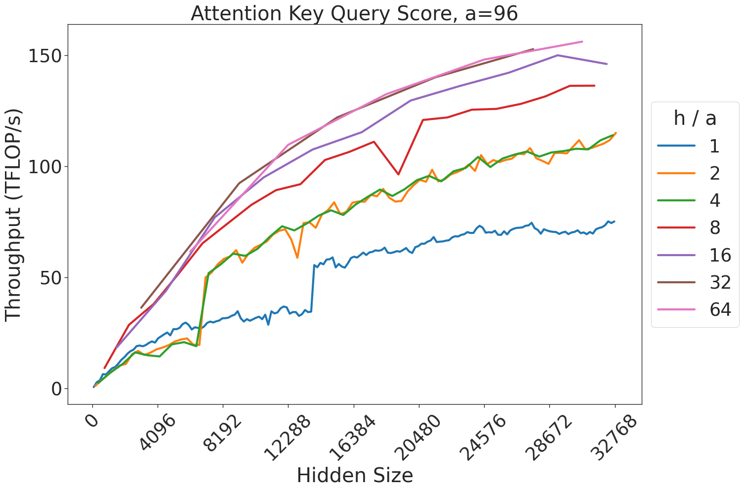
This image is a performance benchmark line chart illustrating the relationship between "Hidden Size" (x-axis) and "Throughput (TFLOP/s)" (y-axis) for an attention mechanism, likely within a Transformer-based neural network architecture. The chart displays seven distinct data series, each representing a different "h / a" ratio (the ratio of attention heads to the attention key/query dimension).
### Components/Axes
* **Title:** "Attention Key Query Score, a=96" (Centered at the top).
* **X-Axis:** Labeled "Hidden Size". The scale ranges from 0 to 32768. Major tick marks are provided at intervals of 4096 (0, 4096, 8192, 12288, 16384, 20480, 24576, 28672, 32768).
* **Y-Axis:** Labeled "Throughput (TFLOP/s)". The scale ranges from 0 to 150+. Major tick marks are provided at 0, 50, 100, and 150.
* **Legend:** Positioned on the right-hand side. It is titled "h / a" and maps colors to specific ratios:
* **Blue:** 1
* **Orange:** 2
* **Green:** 4
* **Red:** 8
* **Purple:** 16
* **Brown:** 32
* **Pink:** 64
### Detailed Analysis
The chart plots seven lines, all showing a general upward trend where throughput increases as the hidden size increases.
* **h/a = 1 (Blue):** This line shows the lowest throughput. It exhibits a distinct "step" or jump in performance around the 14,000–15,000 hidden size mark, where throughput jumps from approximately 35 TFLOP/s to 55 TFLOP/s. It ends at approximately 75 TFLOP/s.
* **h/a = 2 (Orange) & h/a = 4 (Green):** These two lines are nearly identical, overlapping for the majority of the chart. They show a steady, slightly jagged upward trend, ending at approximately 115 TFLOP/s.
* **h/a = 8 (Red):** This line shows higher throughput than the 2 and 4 ratios. It exhibits a notable instability (a sharp dip and recovery) around the 20,000 hidden size mark. It ends at approximately 135 TFLOP/s.
* **h/a = 16 (Purple):** This line shows a smooth, consistent upward trend, ending at approximately 145 TFLOP/s.
* **h/a = 32 (Brown) & h/a = 64 (Pink):** These two lines represent the highest throughput. They are very close to each other, almost overlapping entirely. They show the highest performance, ending at approximately 155+ TFLOP/s.
### Key Observations
* **Diminishing Returns:** As the "h/a" ratio increases, the performance gains decrease. The gap between 1 and 2 is significant, whereas the gap between 32 and 64 is negligible.
* **Algorithmic Shifts:** The sharp, discontinuous jump in the blue line (h/a=1) suggests a change in the underlying kernel execution strategy (e.g., switching from a standard attention implementation to a more optimized, tiled, or fused kernel) at that specific hidden size.
* **Performance Instability:** The red line (h/a=8) displays a localized performance degradation around 20,000 hidden size, which may indicate a cache thrashing event or a specific memory bottleneck for that configuration.
### Interpretation
This data demonstrates the efficiency scaling of attention mechanisms relative to model architecture parameters.
1. **Scaling Efficiency:** The chart suggests that increasing the "h/a" ratio improves throughput, but the system hits a saturation point where increasing the ratio further (beyond 32) yields minimal additional performance benefits.
2. **Kernel Optimization:** The "step" observed in the blue line is a classic indicator of a "kernel switch." In high-performance computing, different algorithms are often used for different input sizes to maximize hardware utilization. The system likely switches to a more efficient kernel at a hidden size of ~14k for the h/a=1 configuration.
3. **Hardware/Memory Bottlenecks:** The dip in the red line (h/a=8) is an anomaly—it is a sign that the system is not scaling linearly due to an external constraint, likely related to memory bandwidth or register pressure, which temporarily disrupts the throughput at that specific configuration.