\n
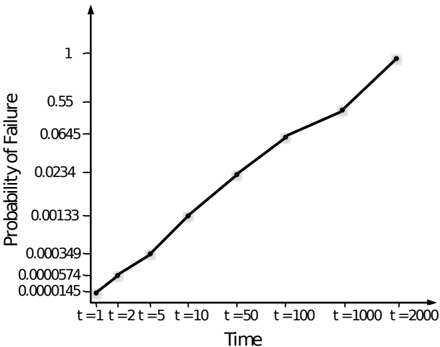
## Chart: Probability of Failure vs. Time
### Overview
The image presents a line graph illustrating the relationship between time and the probability of failure. The graph shows a generally increasing trend, indicating that the probability of failure rises as time progresses. The x-axis represents time, and the y-axis represents the probability of failure. Specific time points are marked along the x-axis.
### Components/Axes
* **X-axis:** Labeled "Time". Markers are present at t=1, t=2, t=5, t=10, t=50, t=100, t=1000, and t=2000.
* **Y-axis:** Labeled "Probability of Failure". The scale is logarithmic, with markers at 0.0000145, 0.0000574, 0.000349, 0.00133, 0.0234, 0.0645, 0.55, and 1.
* **Data Series:** A single black line representing the probability of failure over time.
### Detailed Analysis
The line begins at approximately (t=1, Probability of Failure ≈ 0.0000145) and increases steadily. The slope of the line is not constant, indicating a non-linear relationship.
Here's a breakdown of approximate data points:
* (t=1, Probability of Failure ≈ 0.0000145)
* (t=2, Probability of Failure ≈ 0.0000574)
* (t=5, Probability of Failure ≈ 0.000349)
* (t=10, Probability of Failure ≈ 0.00133)
* (t=50, Probability of Failure ≈ 0.0234)
* (t=100, Probability of Failure ≈ 0.0645)
* (t=1000, Probability of Failure ≈ 0.55)
* (t=2000, Probability of Failure ≈ 1)
The line exhibits a relatively slow increase from t=1 to t=100, then a steeper increase from t=100 to t=2000.
### Key Observations
* The probability of failure is very low at small time values (t=1 to t=10).
* The rate of increase in the probability of failure accelerates as time increases.
* At t=2000, the probability of failure reaches 1 (certainty).
* The logarithmic scale on the y-axis emphasizes the initial low probabilities and the subsequent rapid increase.
### Interpretation
The chart likely represents the reliability or failure rate of a system or component over time. The increasing probability of failure suggests that the system is more likely to fail as it ages. The non-linear relationship indicates that the failure rate is not constant; it increases with time, potentially due to wear and tear, degradation of materials, or accumulation of stress. The chart could be used to estimate the expected lifespan of the system or to schedule maintenance and replacements. The steep increase in failure probability towards the end of the time scale suggests a "wear-out" phase, where the system is nearing the end of its useful life. The logarithmic scale is used to effectively visualize the wide range of probabilities, from very small initial values to near certainty.