## Line Graph: Probability of Failure vs. Time (Log-Log Scale)
### Overview
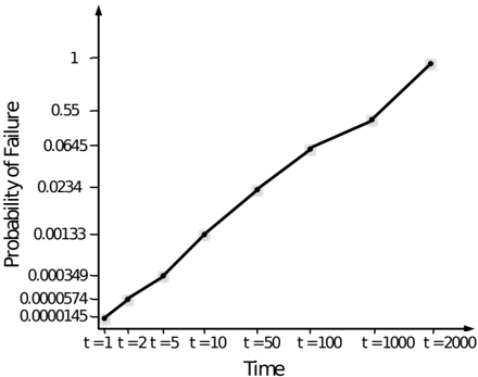
The image displays a line graph plotting the "Probability of Failure" against "Time" on a log-log scale. The graph shows a single, monotonically increasing data series, indicating that the probability of failure rises as time progresses. The relationship appears to be a smooth, accelerating curve when viewed on these logarithmic axes.
### Components/Axes
* **Y-Axis (Vertical):**
* **Label:** "Probability of Failure"
* **Scale:** Logarithmic. The axis markers are not evenly spaced, confirming a log scale.
* **Markers (from bottom to top):** `0.0000145`, `0.0000574`, `0.000349`, `0.00133`, `0.0234`, `0.0645`, `0.55`, `1`.
* **X-Axis (Horizontal):**
* **Label:** "Time"
* **Scale:** Logarithmic. The spacing between time points is consistent with a log scale (e.g., the visual distance between `t=1` and `t=2` is similar to that between `t=1000` and `t=2000`).
* **Markers (from left to right):** `t=1`, `t=2`, `t=5`, `t=10`, `t=50`, `t=100`, `t=1000`, `t=2000`.
* **Data Series:**
* A single black line connects data points at each time marker.
* **Legend:** None present. The graph contains only one data series.
### Detailed Analysis
The data points, read from the intersection of the line with each time marker, are as follows:
| Time (x-axis) | Probability of Failure (y-axis) |
| :--- | :--- |
| t=1 | 0.0000145 |
| t=2 | 0.0000574 |
| t=5 | 0.000349 |
| t=10 | 0.00133 |
| t=50 | 0.0234 |
| t=100 | 0.0645 |
| t=1000 | 0.55 |
| t=2000 | 1 |
**Trend Verification:** The line exhibits a clear, consistent upward slope from the bottom-left corner (low time, low probability) to the top-right corner (high time, high probability). Each successive data point has a higher probability value than the previous one, confirming a strictly increasing trend.
### Key Observations
1. **Accelerating Growth:** The probability does not increase linearly. The increments between points grow larger as time increases. For example, the increase from `t=1` to `t=2` is ~0.0000429, while the increase from `t=1000` to `t=2000` is 0.45.
2. **Log-Log Linearity:** The data points appear to form a nearly straight line on this log-log plot. This is a strong visual indicator that the relationship between `Probability (P)` and `Time (t)` follows a **power law** of the form `P ∝ t^k`, where `k` is a constant exponent.
3. **Saturation Point:** The probability reaches the maximum value of `1` (certainty of failure) at `t=2000`.
### Interpretation
This graph models a system or component whose likelihood of failing increases over time in a predictable, non-linear fashion. The power-law relationship suggested by the straight line on the log-log plot is common in reliability engineering and risk analysis. It implies that the hazard rate (the instantaneous probability of failure) is not constant but increases with time, a characteristic of "wear-out" or aging processes.
The data demonstrates that the risk is negligible in the very early stages (e.g., at `t=1`, the probability is about 1.45e-5) but becomes significant much faster as time progresses. The jump from a probability of ~0.06 at `t=100` to 0.55 at `t=1000` shows that the system enters a high-risk phase after a certain operational duration. The model predicts total system failure (`P=1`) by `t=2000` units. This type of analysis is critical for planning maintenance schedules, determining warranty periods, and understanding the lifecycle reliability of a product or process.