## [Chart Type]: Dual-Panel Scientific Plot
### Overview
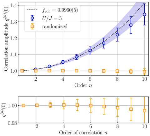
The image is a two-panel scientific chart displaying correlation amplitude data as a function of order `n`. The top panel shows a comparison between a theoretical model, a specific parameter set (`U/J = 5`), and a randomized control. The bottom panel provides a zoomed-in view of the randomized control data. The primary language is English, with mathematical notation.
### Components/Axes
**Top Panel:**
* **Y-axis:** Label is "Correlation amplitude $g^{(n)}(0)$". Scale ranges from 1.0 to 1.4.
* **X-axis:** Label is "Order $n$". Scale shows integer markers from 2 to 10.
* **Legend (Top-Left):**
* `---` (Black dashed line): Labeled "$f_{\text{coh}} = 0.9960(5)$". This represents a theoretical or fitted curve.
* `○` (Blue circle with error bars): Labeled "$U/J = 5$". This is the primary experimental/simulation data series.
* `□` (Orange square with error bars): Labeled "randomized". This is the control data series.
* **Data Series:**
* **Blue Circles ($U/J = 5$):** Data points with vertical error bars. A light blue shaded region surrounds the dashed line, likely representing the confidence interval or uncertainty band for the $f_{\text{coh}}$ model.
* **Orange Squares (randomized):** Data points with vertical error bars, clustered near y=1.0.
* **Black Dashed Line ($f_{\text{coh}}$):** A smooth, upward-curving line that passes through or near the blue data points.
**Bottom Panel:**
* **Y-axis:** Label is "$g^{(n)}(0)$". Scale is a narrow range from 0.98 to 1.00 (approximately).
* **X-axis:** Label is "Order of correlation $n$". Scale shows integer markers from 2 to 10.
* **Data Series:** Only the "randomized" data (orange squares with error bars) is plotted here, providing a detailed view of its behavior near the baseline value of 1.0.
### Detailed Analysis
**Top Panel Data Trends & Approximate Values:**
* **Trend Verification (Blue Circles, $U/J = 5$):** The line of blue circles shows a clear, monotonic upward trend. The slope increases with `n`, suggesting an exponential or super-linear growth.
* n=1: ~1.00
* n=2: ~1.01
* n=4: ~1.05
* n=6: ~1.12
* n=8: ~1.22
* n=10: ~1.35 (with error bar extending from ~1.30 to ~1.40)
* **Trend Verification (Orange Squares, randomized):** The line of orange squares is essentially flat, hovering very close to y=1.0 across all orders `n`.
* All points from n=1 to n=10 are approximately 1.00 ± 0.01.
* **Trend Verification (Black Dashed Line, $f_{\text{coh}}$):** The curve starts at y=1.0 for n=0 (implied) and curves upward, closely following the path of the blue circles. It reaches approximately y=1.4 at n=10.
* **Legend Cross-Reference:** The blue color of the circles matches the label "$U/J = 5$". The orange color of the squares matches the label "randomized". The black dashed line matches the label "$f_{\text{coh}}$".
**Bottom Panel Data Details:**
* This panel isolates the "randomized" (orange square) data series.
* The y-axis is significantly expanded, revealing that the data points fluctuate slightly around 1.00.
* The error bars are relatively large compared to the deviation from 1.00, indicating the fluctuations are within the noise/uncertainty. For example, at n=10, the point is at ~0.995 with an error bar spanning from ~0.985 to ~1.005.
### Key Observations
1. **Strong Divergence:** There is a dramatic divergence between the "$U/J = 5$" data and the "randomized" control as the order `n` increases. The former grows significantly, while the latter remains constant.
2. **Model Agreement:** The theoretical curve ($f_{\text{coh}} = 0.9960(5)$) provides an excellent fit to the "$U/J = 5$" data points across the entire range of `n` shown.
3. **Baseline Stability:** The "randomized" data serves as a stable baseline, confirming that the observed growth in the blue series is a genuine effect of the parameter $U/J = 5$ and not an artifact of the measurement or calculation method.
4. **Increasing Uncertainty:** The error bars for the "$U/J = 5$" data (blue) appear to grow slightly larger with increasing `n`, suggesting greater variance or measurement difficulty at higher orders.
### Interpretation
This chart demonstrates the emergence of **higher-order correlations** in a physical system (likely a quantum many-body system, given the notation $U/J$). The key finding is that for the specific interaction strength $U/J = 5$, correlations between particles or sites become progressively stronger and more non-trivial as one considers larger groups (higher order `n`). This is evidenced by the correlation amplitude $g^{(n)}(0)$ rising well above the uncorrelated baseline value of 1.
The "randomized" data acts as a crucial control, showing that in the absence of the specific interactions (when the system is randomized), no such higher-order correlations develop. The excellent fit of the $f_{\text{coh}}$ curve suggests the growth follows a predictable, potentially coherent functional form, which is a significant insight into the system's underlying physics. The plot effectively argues that the observed phenomenon is a direct consequence of the tuned parameter ($U/J = 5$) and not a random fluctuation.