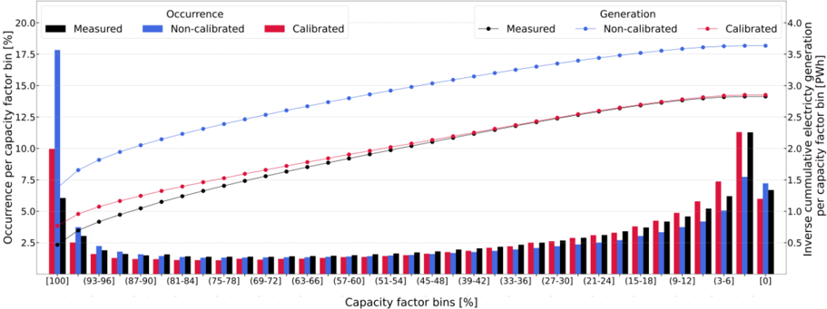
## Chart: Occurrence and Generation vs. Capacity Factor
### Overview
The image presents a combined bar and line chart comparing the occurrence and generation of electricity across different capacity factor bins. The chart displays "Measured", "Non-calibrated", and "Calibrated" data for both occurrence (left y-axis) and generation (right y-axis). The x-axis represents capacity factor bins in percentage.
### Components/Axes
* **Title (Top-Left):** Occurrence
* **Title (Top-Right):** Generation
* **Left Y-Axis Title:** Occurrence per capacity factor bin [%]
* Scale: 0 to 20.0, incrementing by 2.5
* **Right Y-Axis Title:** Inverse cumulative electricity generation per capacity factor bin [PWh]
* Scale: -0.5 to 4.0, incrementing by 0.5
* **X-Axis Title:** Capacity factor bins [%]
* Categories: \[100], (93-96], (87-90], (81-84], (75-78], (69-72], (63-66], (57-60], (51-54], (45-48], (39-42], (33-36], (27-30], (21-24], (15-18], (9-12], (3-6], \[0]
* **Legend (Top-Left):**
* Black: Measured (Occurrence - Bar, Generation - Line)
* Blue: Non-calibrated (Occurrence - Bar, Generation - Line)
* Red: Calibrated (Occurrence - Bar, Generation - Line)
### Detailed Analysis
**Occurrence (Bar Chart):**
* **Measured (Black):** The occurrence is relatively low across most capacity factor bins, with a slight increase towards the lower capacity factor bins (0-100).
* \[100]: ~6%
* (93-96]: ~3%
* (3-6]: ~2.3%
* \[0]: ~2.4%
* **Non-calibrated (Blue):** The occurrence is highest in the \[100] bin and decreases significantly for other bins.
* \[100]: ~17.8%
* (93-96]: ~3.5%
* (3-6]: ~1.8%
* \[0]: ~1.7%
* **Calibrated (Red):** The occurrence is also highest in the \[100] bin, but lower than the non-calibrated data. It increases towards the lower capacity factor bins.
* \[100]: ~10%
* (93-96]: ~3%
* (3-6]: ~4.5%
* \[0]: ~7%
**Generation (Line Chart):**
* **Measured (Black):** The generation increases gradually with decreasing capacity factor bins.
* \[100]: ~4.8%
* \[0]: ~7.8%
* **Non-calibrated (Blue):** The generation increases steadily with decreasing capacity factor bins, and is higher than both the measured and calibrated generation.
* \[100]: ~6.8%
* \[0]: ~9.2%
* **Calibrated (Red):** The generation increases gradually with decreasing capacity factor bins, and is between the measured and non-calibrated generation.
* \[100]: ~5.2%
* \[0]: ~8%
### Key Observations
* The "Non-calibrated" occurrence is significantly higher than "Measured" and "Calibrated" in the highest capacity factor bin \[100].
* The "Measured" and "Calibrated" occurrence values increase towards the lower capacity factor bins, while "Non-calibrated" remains low.
* The "Non-calibrated" generation is consistently higher than "Measured" and "Calibrated" across all capacity factor bins.
* All three generation lines ("Measured", "Non-calibrated", "Calibrated") show an increasing trend as the capacity factor bins decrease.
### Interpretation
The chart suggests that the non-calibrated data overestimates the occurrence at high capacity factors. The calibrated data provides a more moderate estimate, while the measured data shows a different distribution. The generation data indicates that electricity generation increases as the capacity factor decreases, with the non-calibrated data consistently showing higher generation values. This could be due to differences in the models or data used for calibration. The differences between the measured, non-calibrated, and calibrated data highlight the importance of accurate calibration in energy modeling and forecasting.