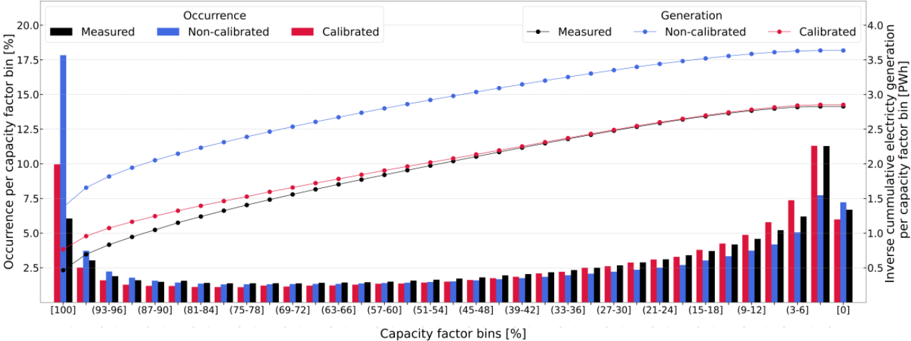
## Chart: Capacity Factor Analysis - Occurrence vs. Generation
### Overview
The image presents a combined line and bar chart comparing the occurrence and generation of electricity across different capacity factor bins. The chart displays three data series for both occurrence (left y-axis) and generation (right y-axis): measured, non-calibrated, and calibrated data. The x-axis represents capacity factor bins, ranging from [0] to [100].
### Components/Axes
* **X-axis:** Capacity factor bins [%]. The bins are: [0], [3-6], [9-12], [15-18], [21-24], [27-30], [33-36], [39-42], [45-48], [51-54], [57-60], [63-66], [69-72], [75-78], [81-84], [87-90], [93-96], [100].
* **Left Y-axis:** Occurrence per capacity factor bin [%]. Scale ranges from 0 to 20.
* **Right Y-axis:** Inverse cumulative electricity generation per capacity factor bin [PWh]. Scale ranges from 0 to 4.
* **Legend (Top-Left):**
* Blue Solid Line: Measured (Occurrence)
* Blue Dashed Line: Non-calibrated (Occurrence)
* Red Solid Line: Calibrated (Occurrence)
* **Legend (Top-Right):**
* Black Solid Line: Measured (Generation)
* Black Dashed Line: Non-calibrated (Generation)
* Red Dashed Line: Calibrated (Generation)
* **Bar Chart:** Represents the occurrence for each capacity factor bin, with colors corresponding to the occurrence lines (blue for measured, red for calibrated).
### Detailed Analysis / Content Details
**Occurrence (Left Side):**
* **Measured (Blue Solid Line):** Starts at approximately 0.5% at [100] capacity factor bin, steadily increases to a peak of approximately 18.5% at the [69-72] bin, then plateaus and slightly decreases to approximately 19% at [0].
* **Non-calibrated (Blue Dashed Line):** Starts at approximately 0.5% at [100] capacity factor bin, increases to approximately 14% at the [69-72] bin, then plateaus around 14% to 15% for lower bins.
* **Calibrated (Red Solid Line):** Starts at approximately 0.5% at [100] capacity factor bin, increases to approximately 7.5% at the [69-72] bin, then plateaus around 7% to 8% for lower bins.
**Generation (Right Side):**
* **Measured (Black Solid Line):** Starts at approximately 3.7 PWh at [100] capacity factor bin, decreases to approximately 3.0 PWh at the [69-72] bin, then continues to decrease to approximately 1.5 PWh at [0].
* **Non-calibrated (Black Dashed Line):** Starts at approximately 3.5 PWh at [100] capacity factor bin, decreases to approximately 2.5 PWh at the [69-72] bin, then continues to decrease to approximately 1.2 PWh at [0].
* **Calibrated (Red Dashed Line):** Starts at approximately 3.2 PWh at [100] capacity factor bin, decreases to approximately 2.0 PWh at the [69-72] bin, then continues to decrease to approximately 0.8 PWh at [0].
**Bar Chart (Occurrence):**
The bar chart shows the occurrence for each capacity factor bin. The height of the bars varies, with the highest bars generally corresponding to the capacity factor bins between [69-72] and [87-90]. The bars for the "Measured" data (blue) are generally taller than those for the "Calibrated" data (red) across most bins.
### Key Observations
* The occurrence of capacity factors peaks in the range of 69-87%, indicating that these are the most common operating levels.
* The calibrated data consistently shows lower occurrence values than the measured data, suggesting that calibration reduces the reported frequency of operation.
* The inverse cumulative generation decreases as the capacity factor bin decreases, as expected.
* The difference between measured and non-calibrated data is more pronounced in the occurrence data than in the generation data.
* The calibrated generation data consistently shows lower values than the measured generation data.
### Interpretation
This chart demonstrates the impact of calibration on the reported occurrence and generation of electricity based on capacity factor. The calibration process appears to reduce both the reported occurrence and generation, particularly at lower capacity factor bins. This suggests that the calibration is correcting for overestimation in the initial measurements. The peak in occurrence around 69-87% indicates that the system operates most efficiently and frequently within this range. The decreasing generation with lower capacity factors is consistent with the expectation that lower utilization leads to reduced overall energy production. The difference between the measured and calibrated data highlights the importance of accurate calibration for reliable performance assessment and forecasting. The chart provides valuable insights into the operational characteristics of the system and the effectiveness of the calibration process.