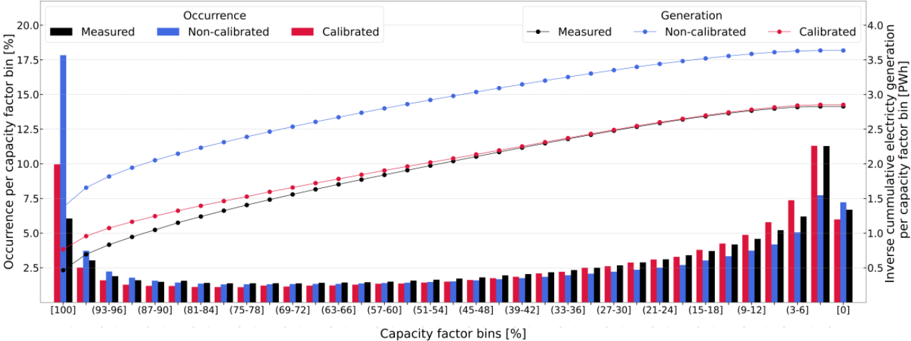
## Combination Bar and Line Chart: Capacity Factor Analysis
### Overview
The image displays a complex combination chart analyzing electricity generation data across different capacity factor bins. It uses a dual-axis system to show two related metrics: the percentage occurrence of specific capacity factor ranges (left y-axis, bar chart) and the inverse cumulative electricity generation in terawatt-hours (Right y-axis, line chart). The data compares three scenarios: Measured, Non-calibrated, and Calibrated.
### Components/Axes
* **Chart Type:** Combination chart with grouped bars and overlaid lines.
* **X-Axis (Bottom):** Labeled "Capacity factor bins [%]". It displays 25 discrete bins in descending order from left to right. The bins are: `[100]`, `(93-96]`, `(87-90]`, `(81-84]`, `(75-78]`, `(69-72]`, `(63-66]`, `(57-60]`, `(51-54]`, `(45-48]`, `(39-42]`, `(33-36]`, `(27-30]`, `(21-24]`, `(15-18]`, `(9-12]`, `(3-6]`, `[0]`. The notation `(a-b]` indicates a range greater than `a` and less than or equal to `b`.
* **Primary Y-Axis (Left):** Labeled "Occurrence per capacity factor bin [%]". Scale ranges from 0.0 to 20.0 with increments of 2.5.
* **Secondary Y-Axis (Right):** Labeled "Inverse cumulative electricity generation per capacity factor bin [TWh]". Scale ranges from 0.0 to 4.0 with increments of 0.5.
* **Legend (Top, Split):**
* **Left Section (for Bars - "Occurrence"):**
* Black Square: "Measured"
* Blue Square: "Non-calibrated"
* Red Square: "Calibrated"
* **Right Section (for Lines - "Generation"):**
* Black Line with Circle Marker: "Measured"
* Blue Line with Circle Marker: "Non-calibrated"
* Red Line with Circle Marker: "Calibrated"
### Detailed Analysis
**1. Occurrence Data (Bars - Left Y-Axis):**
* **Trend Verification:** The bar heights show a U-shaped distribution. Occurrence is highest at the extreme bins (`[100]` and `[0]`), dips significantly in the middle ranges (approximately `(87-90]` to `(27-30]`), and then rises again towards the lower end.
* **Data Points (Approximate Values):**
* **Bin `[100]`:** Non-calibrated (Blue) is highest at ~18.0%. Calibrated (Red) is ~10.0%. Measured (Black) is ~6.0%.
* **Bin `(93-96]`:** All values drop sharply. Measured ~3.5%, Non-calibrated ~2.5%, Calibrated ~2.0%.
* **Middle Bins (e.g., `(63-66]` to `(33-36]`):** All three series show very low occurrence, generally between 0.5% and 1.5%.
* **Bin `(3-6]`:** Values begin to rise. Measured ~6.0%, Non-calibrated ~4.5%, Calibrated ~7.5%.
* **Bin `[0]`:** Measured is highest at ~11.5%. Non-calibrated is ~8.0%. Calibrated is ~6.0%.
**2. Generation Data (Lines - Right Y-Axis):**
* **Trend Verification:** All three lines show a monotonically increasing trend from left to right (from the `[100]` bin to the `[0]` bin). This is consistent with an "inverse cumulative" metric, where the value accumulates as you move to lower capacity factors. The Non-calibrated line is consistently the highest, followed by Calibrated, with Measured being the lowest.
* **Data Points (Approximate Values at Key Bins):**
* **Bin `[100]`:** Non-calibrated ~1.7 TWh, Calibrated ~1.0 TWh, Measured ~0.8 TWh.
* **Bin `(51-54]` (Mid-point):** Non-calibrated ~2.8 TWh, Calibrated ~2.0 TWh, Measured ~1.8 TWh.
* **Bin `[0]` (Final Point):** Non-calibrated ~3.7 TWh, Calibrated ~2.9 TWh, Measured ~2.8 TWh.
### Key Observations
1. **Extreme Bin Dominance:** The vast majority of occurrences are concentrated at the two ends of the capacity factor spectrum: at 100% (full capacity) and 0% (no generation). The middle ranges are rarely observed.
2. **Model Discrepancy at Extremes:** The "Non-calibrated" model significantly overestimates the occurrence of the `[100]` bin compared to "Measured" data. The "Calibrated" model brings this estimate closer to reality but still overshoots. For the `[0]` bin, the "Measured" data shows the highest occurrence.
3. **Cumulative Generation Gap:** The "Non-calibrated" model predicts a substantially higher total inverse cumulative generation (~3.7 TWh) across all bins compared to the "Measured" data (~2.8 TWh). The "Calibrated" model (~2.9 TWh) aligns much more closely with the measured total, indicating successful calibration for the cumulative output.
4. **Consistent Line Ordering:** The vertical ordering of the three generation lines (Non-calibrated > Calibrated > Measured) is maintained across the entire x-axis, suggesting a systematic bias in the non-calibrated model.
### Interpretation
This chart is a diagnostic tool for evaluating the performance of electricity generation models against real-world measurements. The data suggests that generation assets operate in a bimodal fashion: either at full capacity or not at all, with infrequent operation at partial capacity.
The key finding is that the **calibration process is effective at correcting the model's total energy output prediction** (the final point on the right y-axis), but it does not fully correct the **distributional error**—the model still misrepresents *how often* assets operate at 100% versus 0% capacity. The non-calibrated model is overly optimistic about full-capacity operation. The persistence of the U-shaped occurrence pattern in all datasets indicates this is a fundamental characteristic of the system being studied, not an artifact of modeling. The chart effectively separates the error in *total quantity* (addressed by calibration) from the error in *temporal pattern* (which remains).