## Donut Chart: Overall Attack Prevention
### Overview
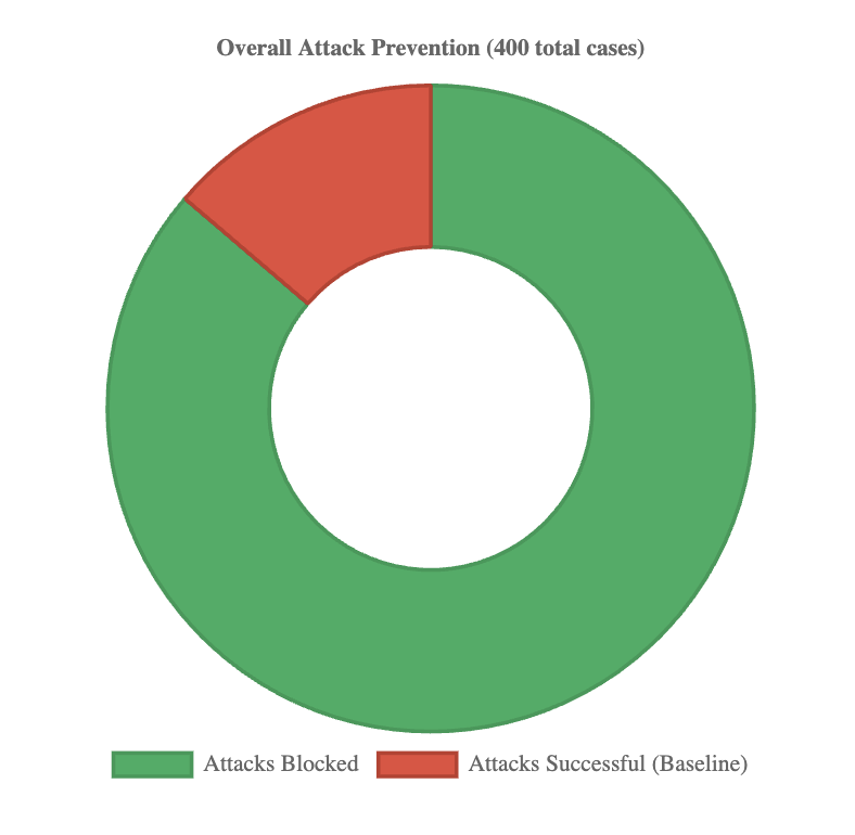
The image displays a donut chart titled "Overall Attack Prevention (400 total cases)". It visually represents the proportion of attacks that were blocked versus those that were successful within a sample of 400 cases. The chart consists of two colored segments and a central hole.
### Components/Axes
* **Chart Title:** "Overall Attack Prevention (400 total cases)" - Located at the top center of the image.
* **Chart Type:** Donut chart (a pie chart with a central hole).
* **Legend:** Positioned at the bottom center of the image. It contains two entries:
* A green rectangle labeled "Attacks Blocked".
* A red rectangle labeled "Attacks Successful (Baseline)".
* **Data Segments:** The donut is divided into two segments whose colors correspond directly to the legend.
* **Green Segment:** Represents "Attacks Blocked". This segment occupies the vast majority of the chart area.
* **Red Segment:** Represents "Attacks Successful (Baseline)". This segment is significantly smaller.
### Detailed Analysis
* **Total Cases:** The title explicitly states the dataset comprises **400 total cases**.
* **Segment Proportions (Estimated):**
* **Attacks Blocked (Green):** Visually, this segment covers approximately 85% of the donut's circumference. This corresponds to an estimated **340 cases** (85% of 400).
* **Attacks Successful (Red):** Visually, this segment covers approximately 15% of the donut's circumference. This corresponds to an estimated **60 cases** (15% of 400).
* **Spatial Grounding:** The green segment starts at the 12 o'clock position and extends clockwise, covering the right, bottom, and left portions of the chart before ending at approximately the 10:30 position. The red segment fills the remaining arc from ~10:30 back to 12 o'clock.
### Key Observations
1. **Dominant Trend:** The overwhelming visual trend is the dominance of the green "Attacks Blocked" segment, indicating a high prevention rate.
2. **Clear Dichotomy:** The chart presents a binary outcome (blocked vs. successful) with no intermediate or other categories shown.
3. **Baseline Label:** The successful attacks are explicitly labeled as the "(Baseline)", suggesting this metric is used as a reference point for measuring the effectiveness of the prevention system.
### Interpretation
The data demonstrates that the attack prevention system under evaluation was highly effective within the observed sample. Blocking approximately 85% of attacks (340 out of 400) suggests robust defensive capabilities. The 15% of attacks that were successful (60 cases) are framed as the baseline, implying this is the expected failure rate without the specific prevention measures in place or under standard conditions. The chart's primary message is one of significant risk reduction, with the prevention system successfully mitigating the vast majority of threats. The use of a donut chart effectively emphasizes the part-to-whole relationship, making the high proportion of blocked attacks immediately apparent to the viewer.