## Violin Plot: F1 Scores by Labeling Method and Phase
### Overview
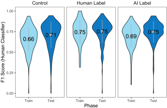
The image displays a set of three violin plots arranged horizontally, comparing the distribution of F1 scores (from a human classifier) across two phases (Train and Test) for three different labeling methods: Control, Human Label, and AI Label. Each panel contains two violin plots, one for the Train phase and one for the Test phase.
### Components/Axes
* **Y-Axis:** Labeled "F1 Score (Human Classifier)". The scale runs from 0.00 to 1.00, with major tick marks at 0.00, 0.25, 0.50, 0.75, and 1.00.
* **X-Axis:** Labeled "Phase". Each panel has two categorical positions: "Train" (left) and "Test" (right).
* **Panel Titles:** The three panels are titled from left to right: "Control", "Human Label", and "AI Label".
* **Data Representation:** Violin plots show the probability density of the data. The width of the shaded area at each y-value represents the frequency of data points at that score. A thicker section indicates more data points clustered around that F1 score.
* **Color Legend (Implied):** Light blue represents the "Train" phase. Dark blue represents the "Test" phase. This color scheme is consistent across all three panels.
* **Embedded Values:** The median (or mean) F1 score for each distribution is printed inside each violin plot.
### Detailed Analysis
**Panel 1: Control**
* **Train (Light Blue):** The distribution is widest around an F1 score of approximately 0.66 (as labeled). The shape is somewhat symmetric but tapers to a long, thin tail extending down towards 0.00.
* **Test (Dark Blue):** The distribution is widest around an F1 score of approximately 0.71 (as labeled). The shape is more top-heavy than the Train distribution, with a broader peak and a similarly long, thin tail extending downwards. The overall distribution appears slightly shifted upward compared to Train.
**Panel 2: Human Label**
* **Train (Light Blue):** The distribution is widest around an F1 score of approximately 0.75 (as labeled). It has a very pronounced, long, and thin tail extending far down towards 0.00, indicating a subset of very low scores, while the bulk of the data is concentrated near the top.
* **Test (Dark Blue):** The distribution is also widest around an F1 score of approximately 0.75 (as labeled). Its shape is more compact and symmetric than the Train distribution, with a less extreme tail. The bulk of the data is tightly clustered around the 0.75 mark.
**Panel 3: AI Label**
* **Train (Light Blue):** The distribution is widest around an F1 score of approximately 0.69 (as labeled). It has a long, thin tail extending downwards, similar to the Control-Train and Human Label-Train plots.
* **Test (Dark Blue):** The distribution is widest around an F1 score of approximately 0.75 (as labeled). The shape is relatively compact and symmetric, resembling the Human Label-Test distribution more than its own Train distribution. The tail is less pronounced.
### Key Observations
1. **Performance Hierarchy:** The "Human Label" method achieves the highest and most consistent F1 scores (0.75) in both phases. The "AI Label" method's Test performance (0.75) matches the Human Label method, but its Train performance (0.69) is lower. The "Control" method has the lowest scores in both phases (0.66 Train, 0.71 Test).
2. **Train-to-Test Trend:** For both the "Control" and "AI Label" methods, the F1 score improves from the Train phase to the Test phase (0.66 -> 0.71 and 0.69 -> 0.75, respectively). For the "Human Label" method, the central score remains stable at 0.75, but the distribution becomes more consistent (less spread) in the Test phase.
3. **Distribution Shapes:** All "Train" phase distributions (light blue) exhibit long, thin tails extending toward low F1 scores, suggesting the presence of some poorly performing models or data splits during training. The "Test" phase distributions (dark blue) are generally more compact and top-heavy, indicating more consistent performance on the test set.
4. **AI vs. Human Label Convergence:** The most striking observation is that the AI Label method's Test distribution (shape and median of 0.75) is visually very similar to the Human Label method's Test distribution, suggesting the AI-generated labels can lead to model performance on par with human-generated labels when evaluated on the test set.
### Interpretation
This chart likely comes from a machine learning study evaluating the quality of different data labeling strategies (control/baseline, human, and AI-generated) by measuring the performance of a downstream classifier.
* **What the data suggests:** The data strongly suggests that using human labels yields the best and most reliable model performance. However, using AI-generated labels can achieve **equivalent test-set performance** (F1=0.75) to human labels, which is a significant finding for potentially reducing labeling cost and effort. The control condition performs worse, indicating that both human and AI labeling provide a meaningful signal.
* **Relationship between elements:** The improvement from Train to Test for Control and AI Label might indicate that the models generalize better than they fit the training data, or it could be an artifact of the evaluation setup (e.g., easier test set). The stability of the Human Label method suggests its labels are robust and consistent across data splits. The long tails in all training distributions highlight the inherent variability and challenge in model training.
* **Notable Anomalies/Patterns:** The near-identical Test performance of AI Label and Human Label is the key result. It implies that for this specific task and classifier, the AI labeling method has reached a level of maturity where its labels are as effective as human labels for model training, at least in terms of the final F1 score on a held-out test set. The difference lies in the training phase, where models trained on human labels start at a higher performance level.