\n
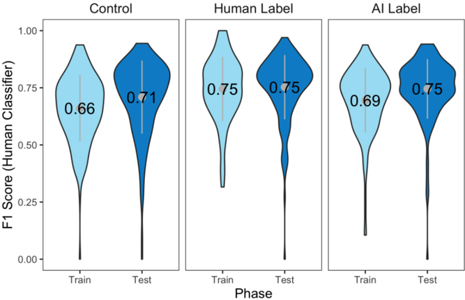
## Violin Plots: F1 Score Comparison Across Phases and Labeling Methods
### Overview
The image presents three sets of violin plots, each comparing the F1 Score (Human Classifier) for 'Train' and 'Test' phases under different labeling conditions: 'Control', 'Human Label', and 'AI Label'. The violin plots visualize the distribution of F1 scores, with the width representing the density of scores at each value. Each plot includes a numerical value representing a central tendency measure (likely the median or mean) of the F1 scores.
### Components/Axes
* **Y-axis:** "F1 Score (Human Classifier)" ranging from 0.00 to 1.00.
* **X-axis:** "Phase" with two categories: "Train" and "Test".
* **Plots:** Three sets of violin plots, each representing a different labeling method:
* "Control"
* "Human Label"
* "AI Label"
* **Numerical Labels:** Each violin plot has a numerical label indicating a score.
### Detailed Analysis
Let's analyze each set of violin plots individually:
**1. Control:**
* The violin plot for "Train" (leftmost) is centered around approximately 0.66. The distribution appears relatively narrow, indicating less variance in F1 scores.
* The violin plot for "Test" (rightmost) is centered around approximately 0.71. The distribution is slightly wider than the "Train" plot, suggesting more variance.
* The violin plots are colored in shades of blue, with the lighter shade at the top and darker shade at the bottom.
**2. Human Label:**
* The violin plot for "Train" is centered around approximately 0.75. The distribution is similar in width to the "Control" Train plot.
* The violin plot for "Test" is centered around approximately 0.75. The distribution is similar in width to the "Control" Test plot.
* The violin plots are colored in shades of blue, with the lighter shade at the top and darker shade at the bottom.
**3. AI Label:**
* The violin plot for "Train" is centered around approximately 0.69. The distribution is similar in width to the "Control" Train plot.
* The violin plot for "Test" is centered around approximately 0.75. The distribution is similar in width to the "Control" Test plot.
* The violin plots are colored in shades of blue, with the lighter shade at the top and darker shade at the bottom.
### Key Observations
* The "Human Label" condition consistently shows the highest F1 scores (around 0.75) for both "Train" and "Test" phases.
* The "Control" condition has the lowest F1 scores (0.66 for Train, 0.71 for Test).
* The "AI Label" condition shows an F1 score of 0.69 for Train and 0.75 for Test, falling between the "Control" and "Human Label" conditions.
* The variance in F1 scores appears relatively consistent across all conditions and phases.
* The F1 score generally increases from the "Train" to the "Test" phase for all three labeling methods.
### Interpretation
The data suggests that using human-labeled data significantly improves the performance of the human classifier, as evidenced by the higher F1 scores in the "Human Label" condition. The "AI Label" condition provides a moderate improvement over the "Control" condition, indicating that AI-generated labels can be beneficial, but not as effective as human labels. The increase in F1 score from "Train" to "Test" suggests that the classifier is generalizing well to unseen data, regardless of the labeling method. The consistent variance across conditions suggests that the inherent difficulty of the classification task remains constant, and the labeling method primarily affects the overall performance level. The violin plots provide a clear visualization of the distribution of scores, allowing for a nuanced understanding of the performance beyond just the central tendency measures.