\n
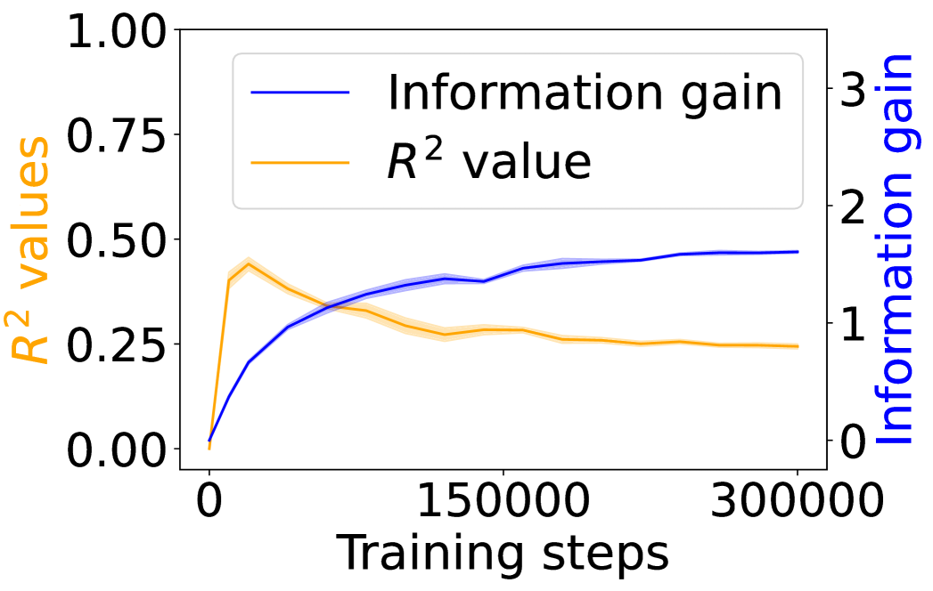
## Line Chart: Training Performance Metrics
### Overview
This image presents a line chart illustrating the progression of two key metrics – Information Gain and R² value – during the training process. The x-axis represents "Training steps," while the left y-axis represents "R² values" and the right y-axis represents "Information gain." The chart displays how these metrics change as the training progresses from 0 to approximately 300,000 steps.
### Components/Axes
* **X-axis:** "Training steps" ranging from 0 to 300,000.
* **Left Y-axis:** "R² values" ranging from 0.00 to 1.00.
* **Right Y-axis:** "Information gain" ranging from 0 to 3.
* **Legend (Top-Left):**
* Blue Line: "Information gain"
* Orange Line: "R² value"
### Detailed Analysis
* **Information Gain (Blue Line):** The blue line representing Information Gain starts at approximately 0.05 at 0 training steps. It exhibits a generally upward trend, initially steep, then gradually flattening. At approximately 150,000 training steps, the Information Gain reaches around 0.45. It continues to increase, reaching approximately 0.55 at 300,000 training steps.
* **R² Value (Orange Line):** The orange line representing the R² value begins at approximately 0.02 at 0 training steps. It initially rises rapidly, reaching a peak of around 0.35 at approximately 75,000 training steps. After the peak, the R² value plateaus and then slowly declines, settling at approximately 0.25 at 300,000 training steps.
### Key Observations
* The Information Gain consistently increases throughout the training process, suggesting the model is continually learning and improving its ability to extract relevant information.
* The R² value increases initially, indicating a better fit of the model to the training data, but then plateaus and slightly decreases, potentially indicating overfitting or diminishing returns from further training.
* The two metrics exhibit inverse behavior to some extent. As Information Gain continues to rise, the rate of increase in R² value slows down and eventually declines.
### Interpretation
The chart suggests that while the model continues to learn (as indicated by increasing Information Gain), its ability to generalize to the training data (as measured by R² value) plateaus and eventually diminishes. This could indicate that the model is starting to overfit the training data, meaning it is learning the specific details of the training set rather than the underlying patterns. The divergence between the two curves after approximately 150,000 training steps is a key observation. It suggests that further training might not lead to significant improvements in the model's performance on unseen data and could even degrade its generalization ability. A potential next step would be to implement regularization techniques or early stopping to prevent overfitting and optimize the model's performance. The chart provides valuable insights into the training dynamics and helps identify the optimal point to stop training to achieve the best balance between learning and generalization.