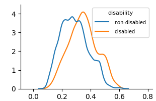
## Chart: Density Plot of Disabled vs. Non-disabled
### Overview
The image is a density plot comparing the distribution of a certain variable (unspecified) for two groups: "non-disabled" and "disabled". The y-axis represents density, and the x-axis ranges from approximately 0.0 to 0.8. The plot shows the probability density of the variable for each group.
### Components/Axes
* **X-axis:** Ranges from 0.0 to 0.8, with tick marks at 0.0, 0.2, 0.4, 0.6, and 0.8. The label for the x-axis is not provided in the image.
* **Y-axis:** Ranges from 0 to 4, with tick marks at 0, 1, 2, 3, and 4. The label for the y-axis is "Density".
* **Legend:** Located in the top-right corner.
* "non-disabled" is represented by a blue line.
* "disabled" is represented by an orange line.
### Detailed Analysis
* **Non-disabled (Blue Line):**
* The density curve starts near 0 at x=0.0.
* It rises to a peak around x=0.25, with a density of approximately 3.8.
* The curve then decreases, with a small bump around x=0.45, and approaches 0 near x=0.6.
* **Disabled (Orange Line):**
* The density curve starts near 0 at x=0.0.
* It rises to a peak around x=0.35, with a density of approximately 4.2.
* The curve then decreases, with a small bump around x=0.5, and approaches 0 near x=0.7.
### Key Observations
* The "disabled" group has a density peak that is slightly higher and shifted to the right compared to the "non-disabled" group.
* Both groups have a unimodal distribution, but the "disabled" group's distribution is slightly flatter and more spread out.
* There is a secondary, smaller peak in both distributions around x=0.45-0.5.
### Interpretation
The density plot suggests that the variable being measured tends to have higher values for the "disabled" group compared to the "non-disabled" group, as indicated by the shift in the peak of the density curve. The variable is not specified in the image, so the specific meaning of this difference cannot be determined. The secondary peak in both distributions may indicate the presence of a sub-population within each group. Without knowing what the x-axis represents, it's difficult to provide a more detailed interpretation.