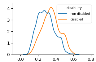
## Density Plot: Disability Status Distribution
### Overview
The image displays a kernel density estimate (KDE) plot comparing the distribution of an unspecified continuous variable between two groups: "non-disabled" and "disabled". The plot shows two overlapping, smooth probability density curves.
### Components/Axes
* **Chart Type:** Kernel Density Estimate (KDE) Plot.
* **X-Axis:** Unlabeled numerical axis. Markers are present at intervals of 0.2, ranging from 0.0 to 0.8.
* **Y-Axis:** Unlabeled numerical axis representing density. Markers are present at integer intervals from 0 to 4.
* **Legend:** Positioned in the top-right corner of the plot area.
* **Title:** `disability`
* **Series 1:** `non-disabled` - Represented by a blue line.
* **Series 2:** `disabled` - Represented by an orange line.
### Detailed Analysis
**Trend Verification & Data Points:**
* **Non-disabled (Blue Line):**
* **Trend:** The distribution is unimodal with a sharp peak and a noticeable secondary shoulder. It rises steeply from near zero at x≈0.1, peaks, then declines with a smaller hump before tapering off.
* **Key Points (Approximate):**
* Start: (x≈0.1, y≈0)
* Primary Peak: (x≈0.25-0.30, y≈3.8-4.0)
* Secondary Shoulder/Hump: (x≈0.45, y≈1.5)
* End: (x≈0.6, y≈0)
* **Disabled (Orange Line):**
* **Trend:** The distribution is also unimodal but is shifted to the right and appears slightly broader than the blue curve. It rises from near zero at x≈0.15, peaks, and declines more gradually, with a pronounced shoulder.
* **Key Points (Approximate):**
* Start: (x≈0.15, y≈0)
* Primary Peak: (x≈0.35-0.40, y≈4.0)
* Shoulder: (x≈0.50, y≈1.8-2.0)
* End: (x≈0.7, y≈0)
**Spatial Grounding:** The legend is placed in the upper right quadrant, overlapping the descending tail of the blue curve and the empty space above the orange curve's shoulder. The two curves intersect at approximately (x≈0.32, y≈3.5) and (x≈0.48, y≈1.2).
### Key Observations
1. **Central Tendency Shift:** The peak (mode) of the "disabled" group's distribution is located at a higher x-value (~0.375) compared to the "non-disabled" group's peak (~0.275).
2. **Distribution Shape:** Both distributions are right-skewed. The "disabled" group's curve appears to have a slightly wider spread (higher variance) and a more prominent shoulder on its right flank.
3. **Overlap:** There is significant overlap between the two distributions, particularly in the range of x=0.2 to x=0.5, indicating that many individuals from both groups share similar values for the measured variable.
4. **Missing Context:** The chart lacks a main title, axis labels, and units. The specific variable being measured (e.g., test score, income, age) is not identified.
### Interpretation
This chart visually suggests a difference in the distribution of an unknown metric between disabled and non-disabled populations. The rightward shift of the orange curve indicates that, for this particular metric, the disabled group tends to have higher values on average than the non-disabled group. The broader shape of the orange curve implies greater variability within the disabled group.
**Peircean Investigation:** The chart presents an *iconic* representation of statistical data (the curves) and an *indexical* link between the legend labels and the colored lines. The *symbolic* meaning, however, is incomplete. Without knowing what the x-axis represents, we cannot determine the real-world significance. Is a higher value better (e.g., income) or worse (e.g., symptom severity)? The chart demonstrates a correlation between disability status and the measured variable but cannot imply causation. The notable overlap cautions against overgeneralizing group differences to individuals. To be fully informative, this plot requires contextual metadata: the variable name, units, data source, and sample sizes.