## Screenshot: Survey/Questionnaire Interface
### Overview
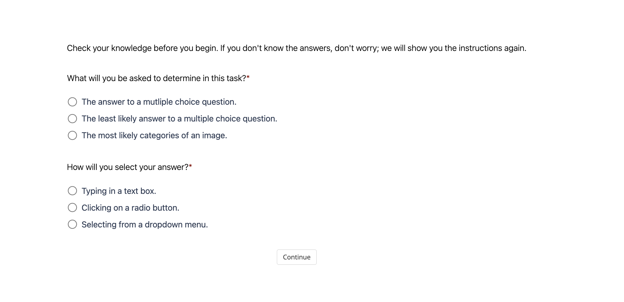
The image depicts a minimalist survey interface with a light gray background and black text. It contains instructional text, two multiple-choice questions, and a "Continue" button. The design emphasizes clarity and user guidance, with asterisks (*) denoting required fields.
### Components/Axes
1. **Header Text**:
- *"Check your knowledge before you begin. If you don't know the answers, don't worry; we will show you the instructions again."*
2. **Question 1**:
- *"What will you be asked to determine in this task?"*
- **Answer Options**:
- ☐ The answer to a multiple choice question.
- ☐ The least likely answer to a multiple choice question.
- ☐ The most likely categories of an image.
3. **Question 2**:
- *"How will you select your answer?"*
- **Answer Options**:
- ☐ Typing in a text box.
- ☐ Clicking on a radio button.
- ☐ Selecting from a dropdown menu.
4. **Footer Button**:
- A rectangular "Continue" button with a light gray outline and centered text.
### Detailed Analysis
- **Textual Content**:
- All text is in English, with no non-English elements.
- Asterisks (*) appear next to both questions, indicating mandatory responses.
- Answer options use bullet points with radio button placeholders (☐).
- **UI Elements**:
- The "Continue" button is positioned centrally at the bottom, suggesting progression to the next step.
- No visual indicators (e.g., colors, icons) differentiate answer options, relying solely on text.
### Key Observations
- The interface prioritizes simplicity, avoiding visual clutter.
- Questions are structured to assess user familiarity with task requirements (e.g., answer types, selection methods).
- The absence of pre-selected options implies users must actively choose responses.
### Interpretation
This interface likely serves as a pre-task assessment to gauge user understanding of survey mechanics. By asking about answer types (e.g., "most likely categories of an image"), it may be testing familiarity with image classification tasks or data labeling workflows. The inclusion of a "Continue" button without a "Submit" option suggests the survey is part of a larger workflow, possibly transitioning users to a task after confirming their readiness. The lack of visual cues for answer selection (e.g., color-coding) implies the focus is on textual comprehension rather than interactive design preferences.