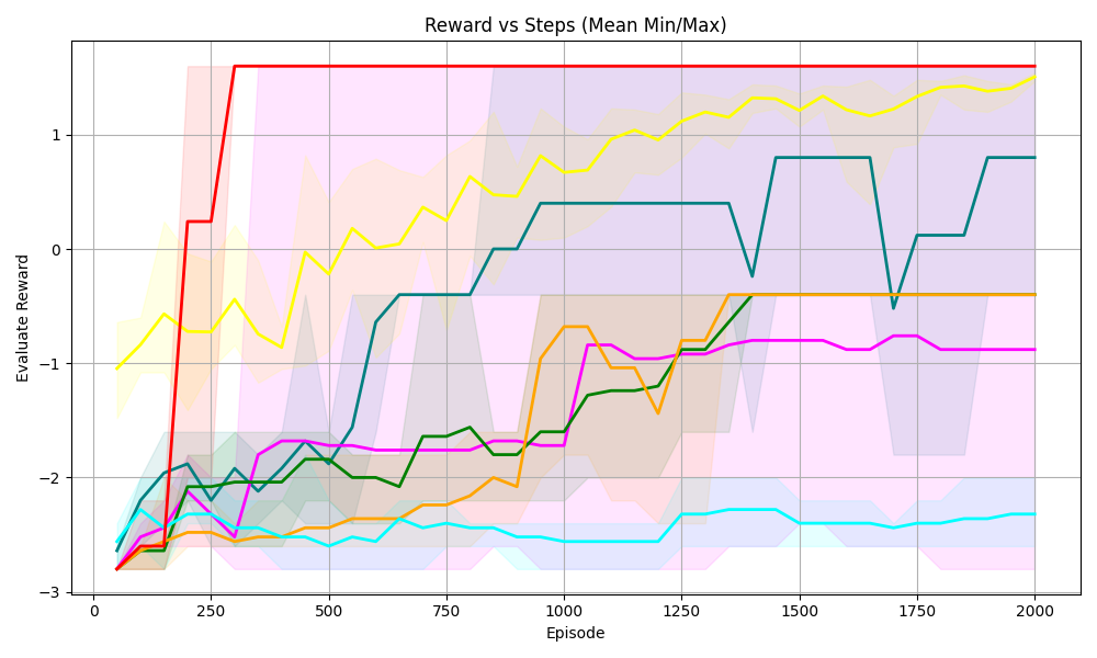
## [Line Chart]: Reward vs Steps (Mean Min/Max)
### Overview
The image is a line chart titled *“Reward vs Steps (Mean Min/Max)”* that plots **“Evaluate Reward”** (y-axis) against **“Episode”** (x-axis) for multiple data series (colored lines) with shaded regions (likely representing min/max or confidence intervals) for each series.
### Components/Axes
- **Title**: *“Reward vs Steps (Mean Min/Max)”* (top-center).
- **X-axis**: Labeled *“Episode”* with tick marks at 0, 250, 500, 750, 1000, 1250, 1500, 1750, 2000.
- **Y-axis**: Labeled *“Evaluate Reward”* with tick marks at -3, -2, -1, 0, 1.
- **Lines & Shaded Regions**: Seven colored lines (red, yellow, teal, orange, magenta, green, cyan) with corresponding light-colored shaded areas (light red, light yellow, light teal, light orange, light magenta, light green, light cyan) to indicate variance/min-max.
### Detailed Analysis (Line-by-Line)
Each line’s trend and shaded region (variance) are analyzed below:
1. **Red Line**
- **Trend**: Sharp increase from (0, ~-2.8) to (250, ~1.2), then *horizontal (flat)* from 250 to 2000.
- **Shaded Region**: Wide initially (high variance), narrows as the line stabilizes.
2. **Yellow Line**
- **Trend**: Fluctuating upward (peaks/troughs) from (0, ~-1) to (2000, ~1.5).
- **Shaded Region**: Wide (high variance) throughout.
3. **Teal Line**
- **Trend**: Gradual increase with fluctuations, reaching ~0.8 by 2000. Notable dip at ~1750 (to ~-0.5) then recovery.
- **Shaded Region**: Moderate variance.
4. **Orange Line**
- **Trend**: Gradual increase from (0, ~-2.7) to ~-0.5 by 1250, then *flat*.
- **Shaded Region**: Moderate variance.
5. **Magenta Line**
- **Trend**: Increase to ~-1.8 by 500, then *flat* at ~-1 from 1250 to 2000.
- **Shaded Region**: Moderate variance.
6. **Green Line**
- **Trend**: Increase to ~-1.5 by 500, then *flat* at ~-1 from 1250 to 2000.
- **Shaded Region**: Moderate variance.
7. **Cyan Line**
- **Trend**: Fluctuates around -2.5 to -2.2, with a slight upward trend but mostly *flat*.
- **Shaded Region**: Wide (high variance) throughout.
### Key Observations
- **Red Line**: Stabilizes early (after ~250 episodes) at a high reward (~1.2) with low variance post-stabilization.
- **Yellow Line**: Highest final reward (~1.5) but with high variance (wide shaded region).
- **Teal Line**: Moderate final reward (~0.8) with a notable dip at ~1750.
- **Orange, Magenta, Green Lines**: Stabilize at lower rewards (~-0.5 to -1) with moderate variance.
- **Cyan Line**: Lowest reward (~-2.5) with high variance, minimal improvement.
### Interpretation
The chart compares the performance (evaluate reward) of different agents/algorithms over episodes:
- The **red line**’s early stabilization at a high reward suggests a highly efficient or well-tuned algorithm (low exploration, high exploitation).
- The **yellow line**’s upward trend with high variance implies a learning algorithm with high exploration (hence variance) but strong long-term performance.
- The **teal line**’s dip at 1750 could reflect a temporary setback (e.g., exploration phase, environmental change, or algorithmic adjustment).
- The **orange, magenta, and green lines** stabilize at lower rewards, indicating less effective algorithms (e.g., poor convergence or suboptimal exploration).
- The **cyan line**’s low reward and high variance suggest poor performance (e.g., ineffective learning or excessive exploration without convergence).
Shaded regions (min/max) highlight variability: wider regions (e.g., yellow, cyan) indicate more inconsistent results, while narrower regions (e.g., red post-stabilization) indicate stable performance.
This description captures all textual elements, trends, and relationships, enabling reconstruction of the chart’s content without visual reference.