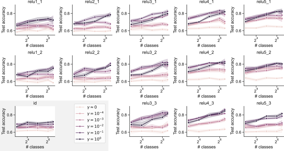
## [Grid of Line Charts]: Test Accuracy vs. Number of Classes for Different γ Values
### Overview
The image displays a 3×5 grid of line charts (15 subplots total) illustrating **test accuracy** (y-axis) as a function of the **number of classes** (x-axis, log₂ scale: \(2^4 = 16\) to \(2^6 = 64\)) for six different values of a parameter \(\boldsymbol{\gamma}\) (legend: \(\gamma = 0, 10^{-4}, 10^{-3}, 10^{-2}, 10^{-1}, 10^0\)). Each subplot has a title (e.g., `relu1_1`, `relu2_1`, `id`, etc.), and the legend is positioned at the bottom-left (below the `id` subplot).
### Components/Axes
- **X-axis**: Labeled `# classes`, with major ticks at \(2^4 = 16\) and \(2^6 = 64\) (logarithmic scale).
- **Y-axis**: Labeled `Test accuracy`, ranging from ~0.6 to 0.8 (linear scale).
- **Legend**: Six entries (bottom-left):
- \(\gamma = 0\): Light pink, open circles (lowest accuracy).
- \(\gamma = 10^{-4}\): Light pink, filled circles.
- \(\gamma = 10^{-3}\): Pink, filled circles.
- \(\gamma = 10^{-2}\): Darker pink, filled circles.
- \(\gamma = 10^{-1}\): Purple, filled circles.
- \(\gamma = 10^0\): Dark purple/black, filled circles (highest accuracy).
- **Subplot Titles**:
- Row 1: `relu1_1`, `relu2_1`, `relu3_1`, `relu4_1`, `relu5_1`
- Row 2: `relu1_2`, `relu2_2`, `relu3_2`, `relu4_2`, `relu5_2`
- Row 3: `id`, `relu3_3`, `relu4_3`, `relu5_3` (and a fifth subplot, likely `relu5_3` or similar).
### Detailed Analysis
Each subplot shows test accuracy trends for \(\gamma\) values:
#### Trend for \(\boldsymbol{\gamma = 0}\) (light pink, open circles):
- Lowest test accuracy across all subplots.
- Slight increase or flat trend as `# classes` increases (e.g., in `relu1_1`, starts ~0.62, rises to ~0.65 at 64 classes).
#### Trend for \(\boldsymbol{\gamma = 10^{-4}}\) (light pink, filled circles):
- Slightly higher than \(\gamma = 0\), with a similar (slight increase/flat) trend.
#### Trend for \(\boldsymbol{\gamma = 10^{-3}}\) (pink, filled circles):
- Higher than \(\gamma = 10^{-4}\), with a more noticeable increase as `# classes` rises.
#### Trend for \(\boldsymbol{\gamma = 10^{-2}}\) (darker pink, filled circles):
- Higher than \(\gamma = 10^{-3}\), with a steeper increase.
#### Trend for \(\boldsymbol{\gamma = 10^{-1}}\) (purple, filled circles):
- Higher than \(\gamma = 10^{-2}\), with a steeper increase.
#### Trend for \(\boldsymbol{\gamma = 10^0}\) (dark purple/black, filled circles):
- Highest test accuracy across all subplots.
- Steepest increase as `# classes` rises (e.g., in `relu1_1`, starts ~0.72, rises to ~0.78 at 64 classes).
#### Subplot `id` (Row 3, Col 1):
- Anomaly: Lower overall accuracy (~0.6–0.7) and less variation between \(\gamma\) values.
- Trend: \(\gamma = 10^0\) still highest, but increase with `# classes` is less steep.
### Key Observations
1. **\(\boldsymbol{\gamma}\) Impact**: Higher \(\gamma\) values (closer to \(10^0\)) consistently yield higher test accuracy.
2. **Class Number Impact**: Test accuracy increases with `# classes` (16→64) for all \(\gamma\), with steeper increases for higher \(\gamma\).
3. **`id` Subplot Anomaly**: The `id` subplot shows lower accuracy and less \(\gamma\)-sensitivity, suggesting a different model/configuration.
4. **Consistency in `relu` Subplots**: All `relu`-titled subplots follow the same \(\gamma\)/class number pattern, indicating a systematic relationship.
### Interpretation
The data suggests:
- Increasing the number of classes (16→64) improves test accuracy, especially for higher \(\gamma\).
- Higher \(\gamma\) values (e.g., \(10^0\)) likely represent a stronger regularization or model parameter that enhances performance.
- The `id` subplot’s distinct behavior implies a different model architecture or training setup, where \(\gamma\) and class number have less impact.
This pattern indicates that \(\gamma\) and class number are critical hyperparameters for optimizing test accuracy in the `relu`-based models, while the `id` model is more robust (or less sensitive) to these parameters.
(Note: All text is in English; no non-English text is present.)