## Bar Chart: Mean Accuracy Across Mathematical Topics
### Overview
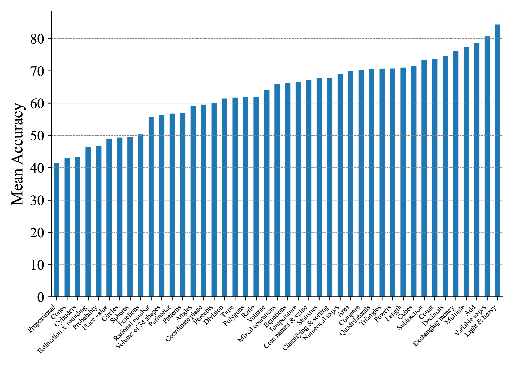
The image displays a vertical bar chart titled "Mean Accuracy" on the y-axis, plotting the performance across a wide range of mathematical topics on the x-axis. The chart shows a clear ascending trend from left to right, indicating increasing mean accuracy across the listed topics. The data appears to represent the performance of a system or group on various math skills.
### Components/Axes
* **Chart Type:** Vertical Bar Chart.
* **Y-Axis:**
* **Label:** "Mean Accuracy"
* **Scale:** Linear scale from 0 to 80, with major grid lines at intervals of 10 (0, 10, 20, 30, 40, 50, 60, 70, 80).
* **X-Axis:**
* **Label:** Not explicitly labeled with a title, but contains categorical labels for each bar.
* **Categories (from left to right):** Proportional, Cones, Cylinders, Estimation & rounding, Probability, Place value, Circles, Spheres, Fractions, Rational number, Volume of 3d shapes, Perimeter, Patterns, Angles, Coordinate plane, Percents, Division, Time, Polygons, Ratio, Volume, Mixed operations, Equations, Temperature, Coin names & value, Statistics, Classifying & sorting, Numerical exprs, Area, Compare, Quadrilaterals, Triangles, Powers, Length, Cubes, Subtraction, Count, Decimals, Exchanging money, Multiple, Add, Variable exprs, Light & heavy.
* **Legend:** No legend is present. All bars are the same blue color.
* **Spatial Layout:** The chart occupies the entire frame. The y-axis label is positioned vertically on the left. The x-axis labels are rotated approximately 45 degrees for readability and are positioned below the baseline of the bars.
### Detailed Analysis
The bars are sorted in ascending order of mean accuracy. Below is an approximate reconstruction of the data, reading the bar heights against the y-axis grid lines. Values are estimates based on visual alignment.
| Topic (Left to Right) | Approximate Mean Accuracy |
| :--- | :--- |
| Proportional | ~41 |
| Cones | ~43 |
| Cylinders | ~44 |
| Estimation & rounding | ~46 |
| Probability | ~47 |
| Place value | ~49 |
| Circles | ~49 |
| Spheres | ~49 |
| Fractions | ~50 |
| Rational number | ~56 |
| Volume of 3d shapes | ~56 |
| Perimeter | ~57 |
| Patterns | ~57 |
| Angles | ~59 |
| Coordinate plane | ~60 |
| Percents | ~61 |
| Division | ~62 |
| Time | ~62 |
| Polygons | ~62 |
| Ratio | ~64 |
| Volume | ~66 |
| Mixed operations | ~66 |
| Equations | ~67 |
| Temperature | ~67 |
| Coin names & value | ~68 |
| Statistics | ~68 |
| Classifying & sorting | ~69 |
| Numerical exprs | ~70 |
| Area | ~70 |
| Compare | ~70 |
| Quadrilaterals | ~70 |
| Triangles | ~71 |
| Powers | ~71 |
| Length | ~73 |
| Cubes | ~74 |
| Subtraction | ~74 |
| Count | ~76 |
| Decimals | ~77 |
| Exchanging money | ~79 |
| Multiple | ~80 |
| Add | ~81 |
| Variable exprs | ~84 |
| Light & heavy | ~85 |
**Trend Verification:** The visual trend is a consistent, near-monotonic increase from the lowest-performing topic ("Proportional") on the far left to the highest-performing topic ("Light & heavy") on the far right. There are small plateaus (e.g., "Place value", "Circles", "Spheres" are nearly equal) but no significant dips in the overall ascending pattern.
### Key Observations
1. **Performance Range:** Mean accuracy spans from approximately 41% to 85%, a range of about 44 percentage points.
2. **Lowest Accuracy Cluster:** The first five topics ("Proportional" through "Probability") all have mean accuracy below 50%.
3. **Highest Accuracy Cluster:** The last five topics ("Count" through "Light & heavy") all have mean accuracy at or above 76%.
4. **Mid-Range Plateau:** A large cluster of topics from "Numerical exprs" to "Powers" hover around the 70% accuracy mark.
5. **Topic Grouping:** The topics appear to be loosely grouped by mathematical domain, with geometry topics (Cones, Cylinders, Circles, Spheres) appearing early, arithmetic operations (Division, Subtraction, Add) appearing later, and measurement/comparison topics (Length, Light & heavy) at the high end.
### Interpretation
This chart likely illustrates the results of an evaluation (e.g., of an AI model, a curriculum, or a student cohort) across a standardized set of mathematical skills. The data suggests a clear hierarchy of difficulty for the evaluated entity.
* **Foundational & Abstract Concepts are Challenging:** Topics often considered more abstract or foundational, such as Proportional reasoning, Estimation, and Probability, show the lowest accuracy. This indicates these areas may require more targeted instruction or represent a current weakness.
* **Procedural & Concrete Skills are Stronger:** Skills that are more procedural, concrete, or based on direct comparison and counting (e.g., Add, Light & heavy, Exchanging money) show the highest accuracy. This suggests the evaluated entity has a stronger grasp of basic arithmetic and concrete measurement.
* **Implication for Learning/Development:** The ascending order provides a potential roadmap for skill development. Mastery of the lower-accuracy topics on the left may be a prerequisite for or a current barrier to improving performance on the more complex topics that appear later in the sequence. The chart does not show causation, but the strong correlation between topic order and accuracy is a significant pattern for investigation.
* **Data Limitation:** The chart presents only the mean accuracy. It does not show the variance, sample size, or difficulty of the individual questions within each topic, which are crucial for a full understanding. A topic with a high mean could still have a wide spread of scores.