TECHNICAL ASSET FINGERPRINT
fe1f3fb7ea080407f6be227b
Click to view fullscreen
Press ESC or click to close
FOUND IN PAPERS
EXPERT: gemini-2.0-flash VERSION 1
RUNTIME: nugit/gemini/gemini-2.0-flash
INTEL_VERIFIED
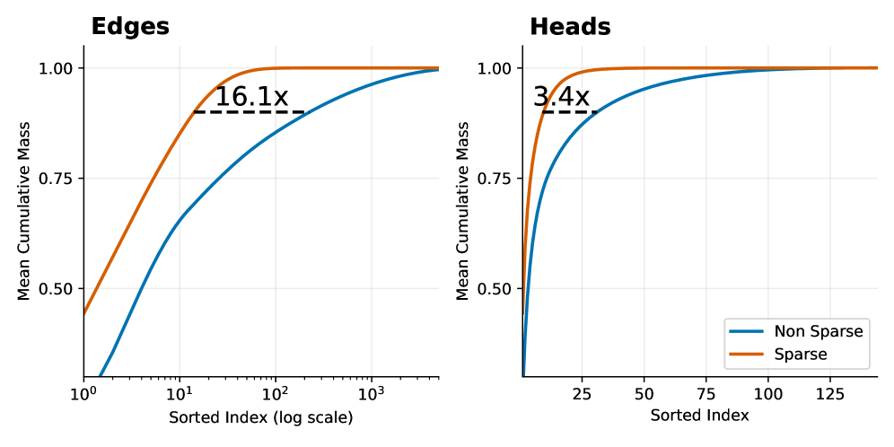
## Chart Type: Cumulative Mass Distribution Plots
### Overview
The image presents two cumulative distribution plots, labeled "Edges" and "Heads," comparing "Non Sparse" and "Sparse" data. The plots show the mean cumulative mass against the sorted index. The x-axis for "Edges" is on a logarithmic scale, while the x-axis for "Heads" is linear.
### Components/Axes
**Edges Plot:**
* **Title:** Edges
* **Y-axis:** Mean Cumulative Mass, ranging from 0.50 to 1.00 in increments of 0.25.
* **X-axis:** Sorted Index (log scale), ranging from 10<sup>0</sup> to 10<sup>3</sup>.
* **Data Series:**
* Non Sparse (Blue): Starts at approximately 0.45 and increases to 1.00.
* Sparse (Orange): Starts at approximately 0.50 and increases to 1.00.
* **Annotation:** "16.1x" with a dashed line indicating the difference in x-axis values where the curves reach a certain cumulative mass.
* **Legend:** Located in the bottom-right of the combined image.
**Heads Plot:**
* **Title:** Heads
* **Y-axis:** Mean Cumulative Mass, ranging from 0.50 to 1.00 in increments of 0.25.
* **X-axis:** Sorted Index, ranging from 25 to 125 in increments of 25.
* **Data Series:**
* Non Sparse (Blue): Starts at approximately 0.1 and increases to 1.00.
* Sparse (Orange): Starts at approximately 0.4 and increases to 1.00.
* **Annotation:** "3.4x" with a dashed line indicating the difference in x-axis values where the curves reach a certain cumulative mass.
* **Legend:** Located in the bottom-right of the combined image.
**Legend:**
* Located in the bottom-right of the combined image.
* Non Sparse: Blue line
* Sparse: Orange line
### Detailed Analysis
**Edges Plot:**
* **Non Sparse (Blue):** The line starts at approximately 0.45 at x=10<sup>0</sup> (1), increases rapidly until approximately x=10<sup>1</sup> (10), and then gradually approaches 1.00.
* **Sparse (Orange):** The line starts at approximately 0.50 at x=10<sup>0</sup> (1), increases rapidly until approximately x=10<sup>1.5</sup> (31.6), and then approaches 1.00.
* **16.1x Annotation:** The dashed line spans from approximately x=6.2 for the Sparse line to approximately x=100 for the Non-Sparse line, indicating a 16.1x difference in the sorted index at a certain cumulative mass (approximately 0.9).
**Heads Plot:**
* **Non Sparse (Blue):** The line starts at approximately 0.1 at x=0, increases rapidly until approximately x=25, and then gradually approaches 1.00.
* **Sparse (Orange):** The line starts at approximately 0.4 at x=0, increases rapidly until approximately x=7, and then approaches 1.00.
* **3.4x Annotation:** The dashed line spans from approximately x=2 for the Sparse line to approximately x=7 for the Non-Sparse line, indicating a 3.4x difference in the sorted index at a certain cumulative mass (approximately 0.9).
### Key Observations
* In both plots, the "Sparse" data reaches a cumulative mass of 1.00 faster than the "Non Sparse" data.
* The "Edges" plot uses a logarithmic scale for the x-axis, indicating a wider range of sorted index values compared to the "Heads" plot.
* The "Edges" plot shows a 16.1x difference in sorted index values between the "Sparse" and "Non Sparse" data at a certain cumulative mass, while the "Heads" plot shows a 3.4x difference.
### Interpretation
The plots compare the cumulative mass distribution of "Sparse" and "Non Sparse" data for "Edges" and "Heads." The "Sparse" data achieves a higher cumulative mass at lower sorted index values, suggesting that the mass is concentrated in a smaller number of elements compared to the "Non Sparse" data. The annotations "16.1x" and "3.4x" quantify this difference, indicating how much larger the sorted index needs to be for the "Non Sparse" data to reach a similar cumulative mass as the "Sparse" data. The logarithmic scale in the "Edges" plot suggests that the differences in sorted index are more pronounced for "Edges" than for "Heads."
DECODING INTELLIGENCE...
EXPERT: gemini-3.1-pro-preview VERSION 1
RUNTIME: gemini/gemini-3.1-pro-preview
INTEL_VERIFIED
## Line Charts: Mean Cumulative Mass Distribution for Edges and Heads (Sparse vs. Non-Sparse)
### Overview
The image consists of two side-by-side line charts comparing the "Mean Cumulative Mass" against a "Sorted Index" for two different components: "Edges" (left chart) and "Heads" (right chart). Both charts plot two data series distinguished by color (orange and blue), representing "Sparse" and "Non Sparse" configurations, respectively. The charts demonstrate how quickly cumulative mass is achieved as the sorted index increases, highlighting the efficiency of sparse representations.
**Language Declaration:** All text in the image is in English.
---
### Components/Axes
**Global Elements:**
* **Legend:** Located in the bottom-right corner of the right chart ("Heads"). It applies to both charts based on color consistency.
* **Blue Line:** Non Sparse
* **Orange Line:** Sparse
**Left Chart: "Edges"**
* **Title:** "Edges" (Top-left, bold text).
* **Y-axis:** Label: "Mean Cumulative Mass". Linear scale with visible markers at 0.50, 0.75, and 1.00. The axis extends slightly below 0.50 (approximately to 0.25). Faint horizontal grid lines align with the major ticks.
* **X-axis:** Label: "Sorted Index (log scale)". Logarithmic scale with visible markers at $10^0$, $10^1$, $10^2$, and $10^3$. Faint vertical grid lines align with the major ticks.
**Right Chart: "Heads"**
* **Title:** "Heads" (Top-left, bold text).
* **Y-axis:** Label: "Mean Cumulative Mass". Linear scale with visible markers at 0.50, 0.75, and 1.00. The axis extends slightly below 0.50. Faint horizontal grid lines align with the major ticks.
* **X-axis:** Label: "Sorted Index". Linear scale with visible markers at 25, 50, 75, 100, and 125. Faint vertical grid lines align with the major ticks.
---
### Detailed Analysis
#### Left Chart: Edges (Logarithmic X-Axis)
* **Trend Verification:** Both lines slope upward from left to right, starting at a lower cumulative mass and asymptotically approaching 1.00. The Orange (Sparse) line rises significantly steeper and earlier than the Blue (Non Sparse) line.
* **Orange Line (Sparse):**
* Starts at approximately y = 0.45 at x = $10^0$ (1).
* Crosses y = 0.75 at approximately x = 5.
* Reaches y = 0.90 at approximately x = 15.
* Plateaus at y = 1.00 around x = $10^2$ (100).
* **Blue Line (Non Sparse):**
* Starts below the visible y-axis labels, approximately y = 0.20 at x = $10^0$ (1).
* Crosses y = 0.50 at approximately x = 5.
* Crosses y = 0.75 at approximately x = 30.
* Reaches y = 0.90 at approximately x = 240.
* Approaches y = 1.00 near x = $10^3$ (1000) and beyond.
* **Annotation:** A horizontal dashed black line connects the Orange line to the Blue line at a y-value of approximately 0.90. Above this dashed line is the text **"16.1x"**. This indicates that to reach ~90% of the mean cumulative mass, the Non Sparse model requires an index that is 16.1 times larger than the Sparse model. (e.g., $15 \times 16.1 \approx 241$).
#### Right Chart: Heads (Linear X-Axis)
* **Trend Verification:** Similar to the left chart, both lines slope upward, starting low and plateauing at 1.00. The Orange (Sparse) line rises much faster than the Blue (Non Sparse) line.
* **Orange Line (Sparse):**
* Starts at approximately y = 0.40 near x = 0.
* Crosses y = 0.75 at approximately x = 5.
* Reaches y = 0.90 at approximately x = 10.
* Plateaus at y = 1.00 around x = 30.
* **Blue Line (Non Sparse):**
* Starts at approximately y = 0.25 near x = 0.
* Crosses y = 0.50 at approximately x = 5.
* Crosses y = 0.75 at approximately x = 15.
* Reaches y = 0.90 at approximately x = 34.
* Plateaus at y = 1.00 around x = 100.
* **Annotation:** A horizontal dashed black line connects the Orange line to the Blue line at a y-value of approximately 0.90. Above this dashed line is the text **"3.4x"**. This indicates that to reach ~90% of the mean cumulative mass, the Non Sparse model requires an index that is 3.4 times larger than the Sparse model. (e.g., $10 \times 3.4 = 34$).
---
### Key Observations
1. **Concentration of Mass:** In both "Edges" and "Heads", the "Sparse" (orange) configuration concentrates its mass in a much smaller number of indices compared to the "Non Sparse" (blue) configuration.
2. **Magnitude of Sparsity:** The effect of sparsity is vastly more pronounced in the "Edges" than in the "Heads". The multiplier to reach ~90% mass is 16.1x for Edges, compared to only 3.4x for Heads.
3. **Scale Differences:** The x-axis for Edges is logarithmic, spanning thousands of indices, whereas the x-axis for Heads is linear, spanning only about 140 indices. This suggests there are significantly more "Edges" in the system being measured than there are "Heads".
---
### Interpretation
These charts likely represent an analysis of a neural network architecture, specifically a Transformer model (implied by the terms "Heads" for attention heads and "Edges" for network connections/graph edges).
The "Sorted Index" represents individual components (heads or edges) sorted by their importance or "mass" (likely activation magnitude, attention weight, or parameter value) in descending order. The "Mean Cumulative Mass" shows what percentage of the total network's activity/weight is captured as you add more of these sorted components.
**Reading between the lines (Peircean investigative analysis):**
* **The Power of Sparsity:** The data proves that applying sparse techniques to this model is highly effective. By using the "Sparse" method, the model can capture 90% of the necessary information using a fraction of the parameters.
* **Pruning Potential:** For "Edges", you could theoretically prune (remove) the vast majority of the connections (everything past index ~100) in the sparse model and still retain 100% of the cumulative mass. In the non-sparse model, you would need to keep over 1,000 edges to achieve the same result. The "16.1x" annotation is a direct boast of computational efficiency: the sparse edge representation is 16 times more efficient at concentrating importance.
* **Architectural Insights:** The fact that "Edges" require a logarithmic scale up to $10^3$ while "Heads" only go up to ~140 indicates the structural reality of the model: there are relatively few attention heads, but a massive number of edge connections between nodes/tokens. Sparsifying the edges yields a much higher relative reduction in required components (16.1x) than sparsifying the heads (3.4x), making edge-sparsification a highly lucrative target for model optimization and compression.
DECODING INTELLIGENCE...
EXPERT: gemma-3-27b-it-free VERSION 1
RUNTIME: google-free/gemma-3-27b-it
INTEL_VERIFIED
## Cumulative Distribution Plots: Edges and Heads Sparsity
### Overview
The image presents two cumulative distribution plots, side-by-side. The left plot focuses on "Edges" and the right plot on "Heads". Both plots compare the cumulative mass of "Non Sparse" and "Sparse" data, plotted against a sorted index. The x-axis uses a logarithmic scale for the "Edges" plot. Both plots include a dashed horizontal line indicating a multiplicative factor representing the difference in cumulative mass between the two data types.
### Components/Axes
* **Title (Left):** "Edges" - positioned top-left.
* **Title (Right):** "Heads" - positioned top-left.
* **X-axis (Both):** "Sorted Index" - labeled at the bottom. The "Edges" plot uses a log scale (10^0 to 10^3). The "Heads" plot uses a linear scale (0 to 125).
* **Y-axis (Both):** "Mean Cumulative Mass" - labeled on the left, ranging from 0.0 to 1.0.
* **Legend (Right):** Located in the bottom-right corner.
* "Non Sparse" - represented by a blue line.
* "Sparse" - represented by an orange line.
* **Horizontal Dashed Line (Left):** Labeled "16.1x" - positioned approximately at y=0.95.
* **Horizontal Dashed Line (Right):** Labeled "3.4x" - positioned approximately at y=0.95.
### Detailed Analysis or Content Details
**Edges Plot (Left):**
* **Sparse (Orange):** The orange line representing "Sparse" data exhibits a steep upward slope initially, quickly reaching a cumulative mass of approximately 0.8 by an index of around 10^2 (100). It plateaus around a cumulative mass of 0.95 from an index of approximately 50 to 1000.
* **Non Sparse (Blue):** The blue line representing "Non Sparse" data starts with a gradual slope, increasing more slowly than the "Sparse" data. It reaches a cumulative mass of approximately 0.5 at an index of around 10^1 (10). It continues to increase, but at a slower rate, reaching a cumulative mass of approximately 0.95 at an index of around 10^3 (1000).
* **Difference:** The "Sparse" data reaches a higher cumulative mass for lower sorted indices compared to the "Non Sparse" data. The dashed line indicates that the "Sparse" data achieves a cumulative mass approximately 16.1 times greater than the "Non Sparse" data at the point where the cumulative mass is approximately 0.95.
**Heads Plot (Right):**
* **Sparse (Orange):** The orange line representing "Sparse" data rises rapidly, reaching a cumulative mass of approximately 0.75 by an index of 25. It plateaus around a cumulative mass of 0.95 from an index of approximately 50.
* **Non Sparse (Blue):** The blue line representing "Non Sparse" data starts with a slower slope, gradually increasing. It reaches a cumulative mass of approximately 0.5 at an index of around 25. It continues to increase, approaching a cumulative mass of 0.95 at an index of around 100.
* **Difference:** Similar to the "Edges" plot, the "Sparse" data reaches a higher cumulative mass for lower sorted indices. The dashed line indicates that the "Sparse" data achieves a cumulative mass approximately 3.4 times greater than the "Non Sparse" data at the point where the cumulative mass is approximately 0.95.
### Key Observations
* In both plots, the "Sparse" data consistently exhibits a higher cumulative mass for lower sorted indices compared to the "Non Sparse" data.
* The difference in cumulative mass between "Sparse" and "Non Sparse" data is more pronounced in the "Edges" plot (16.1x) than in the "Heads" plot (3.4x).
* The "Edges" plot uses a logarithmic scale on the x-axis, which compresses the distribution of indices.
### Interpretation
These plots demonstrate the impact of sparsity on the cumulative mass of "Edges" and "Heads" features. The higher cumulative mass of "Sparse" data at lower indices suggests that a significant portion of the total mass is concentrated in a smaller number of features when sparsity is applied. The larger multiplicative factor for "Edges" (16.1x) indicates that sparsity has a more substantial effect on the distribution of "Edges" features compared to "Heads" features. This could imply that "Edges" are more amenable to sparsity-inducing techniques or that the underlying data distribution of "Edges" naturally lends itself to sparsity. The plots suggest that applying sparsity can effectively capture the most important features (those contributing to the initial cumulative mass) while potentially discarding less relevant ones. The difference in the multiplicative factors between "Edges" and "Heads" suggests that the effectiveness of sparsity may vary depending on the type of feature being considered.
DECODING INTELLIGENCE...
EXPERT: healer-alpha-free VERSION 1
RUNTIME: free/openrouter/healer-alpha
INTEL_VERIFIED
## Line Charts: Edges and Heads Cumulative Mass Comparison
### Overview
The image displays two side-by-side line charts comparing the "Mean Cumulative Mass" of "Sparse" versus "Non Sparse" methods across two different domains: "Edges" (left chart) and "Heads" (right chart). Both charts plot cumulative mass against a sorted index, demonstrating that the Sparse method achieves higher cumulative mass with fewer elements.
### Components/Axes
**Common Elements:**
* **Y-Axis (Both Charts):** Labeled "Mean Cumulative Mass". The scale ranges from 0.50 to 1.00, with major tick marks at 0.50, 0.75, and 1.00.
* **Legend (Located in bottom-right of the "Heads" chart):**
* **Blue Line:** "Non Sparse"
* **Orange Line:** "Sparse"
**Left Chart: "Edges"**
* **Title:** "Edges" (top-left).
* **X-Axis:** Labeled "Sorted Index (log scale)". It is a logarithmic scale with major tick marks at 10⁰ (1), 10¹ (10), 10² (100), and 10³ (1000).
* **Annotation:** A dashed black horizontal line connects the two curves near the top. The text "16.1x" is placed above this line, indicating a multiplicative factor.
**Right Chart: "Heads"**
* **Title:** "Heads" (top-left).
* **X-Axis:** Labeled "Sorted Index". It is a linear scale with major tick marks at 25, 50, 75, 100, and 125.
* **Annotation:** A dashed black horizontal line connects the two curves near the top. The text "3.4x" is placed above this line, indicating a multiplicative factor.
### Detailed Analysis
**Trend Verification & Data Points:**
* **General Trend (Both Charts):** The "Sparse" (orange) line rises more steeply and plateaus at a cumulative mass of 1.00 much earlier (at a lower sorted index) than the "Non Sparse" (blue) line. This indicates the Sparse method concentrates mass in fewer top-ranked elements.
* **"Edges" Chart (Log Scale):**
* The Sparse line starts at approximately 0.45 at index 1 (10⁰) and reaches near 1.00 by index ~100 (10²).
* The Non Sparse line starts near 0 at index 1 and rises more gradually, reaching near 1.00 by index ~1000 (10³).
* The "16.1x" annotation suggests that to achieve a specific high cumulative mass (visually estimated at ~0.95), the Non Sparse method requires approximately 16.1 times more sorted elements than the Sparse method.
* **"Heads" Chart (Linear Scale):**
* The Sparse line starts at approximately 0.50 at index 0 and reaches near 1.00 by index ~25.
* The Non Sparse line starts near 0 at index 0 and rises more gradually, reaching near 1.00 by index ~125.
* The "3.4x" annotation suggests that to achieve a specific high cumulative mass (visually estimated at ~0.95), the Non Sparse method requires approximately 3.4 times more sorted elements than the Sparse method.
### Key Observations
1. **Consistent Superiority of Sparse:** In both domains (Edges and Heads), the Sparse method demonstrates superior efficiency, accumulating mass significantly faster.
2. **Magnitude of Difference:** The efficiency gain is more dramatic for "Edges" (16.1x) than for "Heads" (3.4x), as indicated by the annotations.
3. **Scale Context:** The "Edges" chart uses a logarithmic x-axis, compressing a wide range of indices (1 to 1000+), while the "Heads" chart uses a linear axis over a narrower range (0 to ~140). This difference in scale is crucial for interpreting the absolute index values.
4. **Convergence:** Both methods in both charts eventually converge to a cumulative mass of 1.00, meaning all mass is accounted for when considering all elements.
### Interpretation
These charts likely visualize the concept of **sparsity** in a technical context, such as neural network pruning, graph theory, or attention mechanisms. The "Mean Cumulative Mass" represents the proportion of a total quantity (e.g., weight magnitude, signal strength, importance score) captured by the top-ranked elements.
* **What the Data Suggests:** The Sparse method is highly effective at identifying and concentrating the most significant elements. A small subset of "Sparse" edges or heads contains the vast majority of the "mass" or importance. The Non Sparse distribution is more diffuse, requiring many more elements to capture the same amount of information.
* **Relationship Between Elements:** The "Edges" and "Heads" likely refer to different components of a system (e.g., edges in a graph neural network, attention heads in a transformer). The analysis shows sparsity is beneficial in both, but the effect is more pronounced for edges.
* **Notable Anomalies/Outliers:** There are no apparent outliers in the smooth curves. The key anomaly is the stark difference in the rate of accumulation between the two methods, which is the central point of the visualization.
* **Practical Implication:** The multipliers (16.1x, 3.4x) quantify potential efficiency gains. For example, if one can achieve 95% of the performance using only the top 10% of elements identified by the Sparse method, this translates to significant computational savings or model compression. The charts provide empirical evidence for the effectiveness of a sparsity-inducing technique.
DECODING INTELLIGENCE...
EXPERT: nemotron-free VERSION 1
RUNTIME: free/nvidia/nemotron-nano-12b-v2-vl:free
INTEL_VERIFIED
## Line Graphs: Mean Cumulative Mass vs. Sorted Index (Edges and Heads)
### Overview
The image contains two line graphs comparing "Mean Cumulative Mass" across sorted indices for two categories: **Edges** (log-scale x-axis) and **Heads** (linear-scale x-axis). Each graph includes two data series: **Non Sparse** (blue line) and **Sparse** (orange line). Key annotations highlight performance ratios ("16.1x" for Edges, "3.4x" for Heads).
---
### Components/Axes
1. **Y-Axis**:
- Label: **Mean Cumulative Mass**
- Range: 0.0 to 1.0 (increments of 0.25)
- Position: Left side of both graphs.
2. **X-Axes**:
- **Edges Graph**:
- Label: **Sorted Index (log scale)**
- Range: 10⁰ to 10³ (logarithmic increments: 1, 10, 100, 1000)
- **Heads Graph**:
- Label: **Sorted Index**
- Range: 25 to 125 (linear increments of 25)
3. **Legends**:
- Position: Bottom-right corner of both graphs.
- Labels:
- **Blue**: Non Sparse
- **Orange**: Sparse
4. **Annotations**:
- **Edges Graph**: Dashed line labeled **"16.1x"** near the 10¹ x-axis mark.
- **Heads Graph**: Dashed line labeled **"3.4x"** near the 25 x-axis mark.
---
### Detailed Analysis
#### Edges Graph
- **Non Sparse (Blue)**:
- Starts at (10⁰, 0.0) and curves upward, reaching ~0.95 at 10², then plateaus near 1.0.
- Trend: Gradual, logarithmic growth.
- **Sparse (Orange)**:
- Starts at (10⁰, ~0.45) and rises sharply, surpassing Non Sparse by 10¹.
- Reaches ~0.95 at 10¹, then plateaus.
- **Key Ratio**: "16.1x" indicates Sparse achieves 16.1× higher cumulative mass than Non Sparse at early indices (10¹).
#### Heads Graph
- **Non Sparse (Blue)**:
- Starts at (25, 0.0) and curves upward, reaching ~0.95 at 75, then plateaus.
- Trend: Steeper initial growth than Edges due to linear scale.
- **Sparse (Orange)**:
- Starts at (25, ~0.3) and rises sharply, surpassing Non Sparse by 25.
- Reaches ~0.95 at 25, then plateaus.
- **Key Ratio**: "3.4x" indicates Sparse achieves 3.4× higher cumulative mass than Non Sparse at early indices (25).
---
### Key Observations
1. **Sparse vs. Non Sparse**:
- Sparse data consistently outperforms Non Sparse in both categories, with steeper initial growth.
- Ratios ("16.1x" and "3.4x") suggest Sparse is significantly more efficient at capturing cumulative mass early.
2. **Convergence**:
- Both data series plateau near 1.0, indicating full coverage of the dataset as the sorted index increases.
3. **Scale Differences**:
- Edges use a log scale, compressing early index growth, while Heads use a linear scale, emphasizing early performance.
---
### Interpretation
- **Efficiency of Sparse Data**:
- Sparse data structures (e.g., compressed representations) achieve higher cumulative mass with fewer indices, as shown by the ratios. This suggests Sparse is more efficient for early-stage analysis or resource-constrained scenarios.
- **Saturation Point**:
- Both methods eventually cover the entire dataset (approaching 1.0), but Sparse does so with fewer indices.
- **Contextual Implications**:
- In network analysis (Edges) or hierarchical data (Heads), Sparse representations may reduce computational overhead while maintaining accuracy.
- The log scale in Edges highlights the disparity in early performance, which might be critical for large-scale systems.
---
### Component Isolation
1. **Edges Graph**:
- Log scale emphasizes exponential growth patterns, useful for large datasets.
- Sparse line dominates early, but both converge at 10³.
2. **Heads Graph**:
- Linear scale clarifies incremental growth, showing Sparse’s early advantage.
- Both lines plateau near 1.0, confirming full dataset coverage.
---
### Final Notes
- All legend labels and axis markers are explicitly transcribed.
- Ratios ("16.1x" and "3.4x") are spatially grounded near their respective data points.
- Trends and convergence are verified visually and numerically.
DECODING INTELLIGENCE...