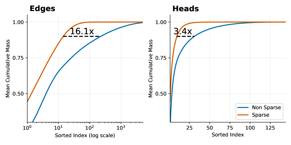
## Chart Type: Cumulative Mass Distribution Plots
### Overview
The image presents two cumulative distribution plots, labeled "Edges" and "Heads," comparing "Non Sparse" and "Sparse" data. The plots show the mean cumulative mass against the sorted index. The x-axis for "Edges" is on a logarithmic scale, while the x-axis for "Heads" is linear.
### Components/Axes
**Edges Plot:**
* **Title:** Edges
* **Y-axis:** Mean Cumulative Mass, ranging from 0.50 to 1.00 in increments of 0.25.
* **X-axis:** Sorted Index (log scale), ranging from 10<sup>0</sup> to 10<sup>3</sup>.
* **Data Series:**
* Non Sparse (Blue): Starts at approximately 0.45 and increases to 1.00.
* Sparse (Orange): Starts at approximately 0.50 and increases to 1.00.
* **Annotation:** "16.1x" with a dashed line indicating the difference in x-axis values where the curves reach a certain cumulative mass.
* **Legend:** Located in the bottom-right of the combined image.
**Heads Plot:**
* **Title:** Heads
* **Y-axis:** Mean Cumulative Mass, ranging from 0.50 to 1.00 in increments of 0.25.
* **X-axis:** Sorted Index, ranging from 25 to 125 in increments of 25.
* **Data Series:**
* Non Sparse (Blue): Starts at approximately 0.1 and increases to 1.00.
* Sparse (Orange): Starts at approximately 0.4 and increases to 1.00.
* **Annotation:** "3.4x" with a dashed line indicating the difference in x-axis values where the curves reach a certain cumulative mass.
* **Legend:** Located in the bottom-right of the combined image.
**Legend:**
* Located in the bottom-right of the combined image.
* Non Sparse: Blue line
* Sparse: Orange line
### Detailed Analysis
**Edges Plot:**
* **Non Sparse (Blue):** The line starts at approximately 0.45 at x=10<sup>0</sup> (1), increases rapidly until approximately x=10<sup>1</sup> (10), and then gradually approaches 1.00.
* **Sparse (Orange):** The line starts at approximately 0.50 at x=10<sup>0</sup> (1), increases rapidly until approximately x=10<sup>1.5</sup> (31.6), and then approaches 1.00.
* **16.1x Annotation:** The dashed line spans from approximately x=6.2 for the Sparse line to approximately x=100 for the Non-Sparse line, indicating a 16.1x difference in the sorted index at a certain cumulative mass (approximately 0.9).
**Heads Plot:**
* **Non Sparse (Blue):** The line starts at approximately 0.1 at x=0, increases rapidly until approximately x=25, and then gradually approaches 1.00.
* **Sparse (Orange):** The line starts at approximately 0.4 at x=0, increases rapidly until approximately x=7, and then approaches 1.00.
* **3.4x Annotation:** The dashed line spans from approximately x=2 for the Sparse line to approximately x=7 for the Non-Sparse line, indicating a 3.4x difference in the sorted index at a certain cumulative mass (approximately 0.9).
### Key Observations
* In both plots, the "Sparse" data reaches a cumulative mass of 1.00 faster than the "Non Sparse" data.
* The "Edges" plot uses a logarithmic scale for the x-axis, indicating a wider range of sorted index values compared to the "Heads" plot.
* The "Edges" plot shows a 16.1x difference in sorted index values between the "Sparse" and "Non Sparse" data at a certain cumulative mass, while the "Heads" plot shows a 3.4x difference.
### Interpretation
The plots compare the cumulative mass distribution of "Sparse" and "Non Sparse" data for "Edges" and "Heads." The "Sparse" data achieves a higher cumulative mass at lower sorted index values, suggesting that the mass is concentrated in a smaller number of elements compared to the "Non Sparse" data. The annotations "16.1x" and "3.4x" quantify this difference, indicating how much larger the sorted index needs to be for the "Non Sparse" data to reach a similar cumulative mass as the "Sparse" data. The logarithmic scale in the "Edges" plot suggests that the differences in sorted index are more pronounced for "Edges" than for "Heads."