## Line Charts: Edges and Heads Cumulative Mass Comparison
### Overview
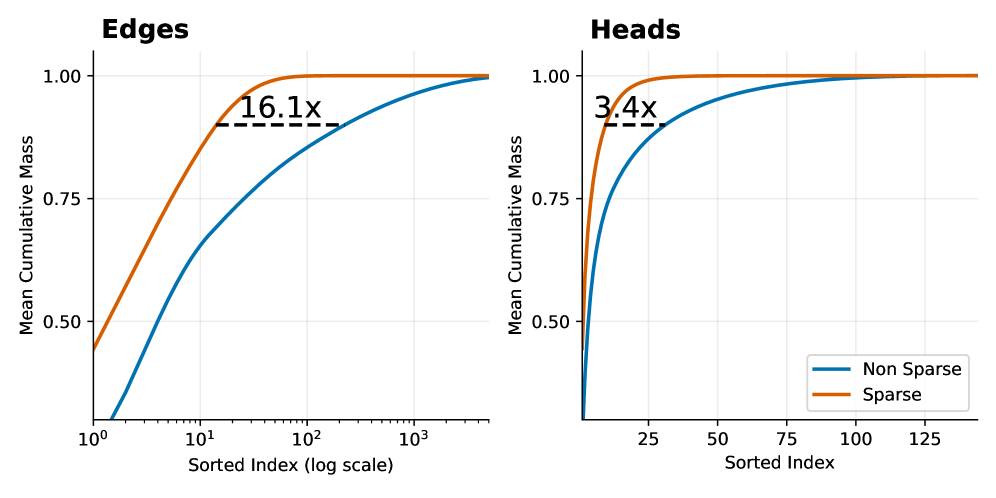
The image displays two side-by-side line charts comparing the "Mean Cumulative Mass" of "Sparse" versus "Non Sparse" methods across two different domains: "Edges" (left chart) and "Heads" (right chart). Both charts plot cumulative mass against a sorted index, demonstrating that the Sparse method achieves higher cumulative mass with fewer elements.
### Components/Axes
**Common Elements:**
* **Y-Axis (Both Charts):** Labeled "Mean Cumulative Mass". The scale ranges from 0.50 to 1.00, with major tick marks at 0.50, 0.75, and 1.00.
* **Legend (Located in bottom-right of the "Heads" chart):**
* **Blue Line:** "Non Sparse"
* **Orange Line:** "Sparse"
**Left Chart: "Edges"**
* **Title:** "Edges" (top-left).
* **X-Axis:** Labeled "Sorted Index (log scale)". It is a logarithmic scale with major tick marks at 10⁰ (1), 10¹ (10), 10² (100), and 10³ (1000).
* **Annotation:** A dashed black horizontal line connects the two curves near the top. The text "16.1x" is placed above this line, indicating a multiplicative factor.
**Right Chart: "Heads"**
* **Title:** "Heads" (top-left).
* **X-Axis:** Labeled "Sorted Index". It is a linear scale with major tick marks at 25, 50, 75, 100, and 125.
* **Annotation:** A dashed black horizontal line connects the two curves near the top. The text "3.4x" is placed above this line, indicating a multiplicative factor.
### Detailed Analysis
**Trend Verification & Data Points:**
* **General Trend (Both Charts):** The "Sparse" (orange) line rises more steeply and plateaus at a cumulative mass of 1.00 much earlier (at a lower sorted index) than the "Non Sparse" (blue) line. This indicates the Sparse method concentrates mass in fewer top-ranked elements.
* **"Edges" Chart (Log Scale):**
* The Sparse line starts at approximately 0.45 at index 1 (10⁰) and reaches near 1.00 by index ~100 (10²).
* The Non Sparse line starts near 0 at index 1 and rises more gradually, reaching near 1.00 by index ~1000 (10³).
* The "16.1x" annotation suggests that to achieve a specific high cumulative mass (visually estimated at ~0.95), the Non Sparse method requires approximately 16.1 times more sorted elements than the Sparse method.
* **"Heads" Chart (Linear Scale):**
* The Sparse line starts at approximately 0.50 at index 0 and reaches near 1.00 by index ~25.
* The Non Sparse line starts near 0 at index 0 and rises more gradually, reaching near 1.00 by index ~125.
* The "3.4x" annotation suggests that to achieve a specific high cumulative mass (visually estimated at ~0.95), the Non Sparse method requires approximately 3.4 times more sorted elements than the Sparse method.
### Key Observations
1. **Consistent Superiority of Sparse:** In both domains (Edges and Heads), the Sparse method demonstrates superior efficiency, accumulating mass significantly faster.
2. **Magnitude of Difference:** The efficiency gain is more dramatic for "Edges" (16.1x) than for "Heads" (3.4x), as indicated by the annotations.
3. **Scale Context:** The "Edges" chart uses a logarithmic x-axis, compressing a wide range of indices (1 to 1000+), while the "Heads" chart uses a linear axis over a narrower range (0 to ~140). This difference in scale is crucial for interpreting the absolute index values.
4. **Convergence:** Both methods in both charts eventually converge to a cumulative mass of 1.00, meaning all mass is accounted for when considering all elements.
### Interpretation
These charts likely visualize the concept of **sparsity** in a technical context, such as neural network pruning, graph theory, or attention mechanisms. The "Mean Cumulative Mass" represents the proportion of a total quantity (e.g., weight magnitude, signal strength, importance score) captured by the top-ranked elements.
* **What the Data Suggests:** The Sparse method is highly effective at identifying and concentrating the most significant elements. A small subset of "Sparse" edges or heads contains the vast majority of the "mass" or importance. The Non Sparse distribution is more diffuse, requiring many more elements to capture the same amount of information.
* **Relationship Between Elements:** The "Edges" and "Heads" likely refer to different components of a system (e.g., edges in a graph neural network, attention heads in a transformer). The analysis shows sparsity is beneficial in both, but the effect is more pronounced for edges.
* **Notable Anomalies/Outliers:** There are no apparent outliers in the smooth curves. The key anomaly is the stark difference in the rate of accumulation between the two methods, which is the central point of the visualization.
* **Practical Implication:** The multipliers (16.1x, 3.4x) quantify potential efficiency gains. For example, if one can achieve 95% of the performance using only the top 10% of elements identified by the Sparse method, this translates to significant computational savings or model compression. The charts provide empirical evidence for the effectiveness of a sparsity-inducing technique.