## Bar Chart: Overall Accuracy Comparison
### Overview
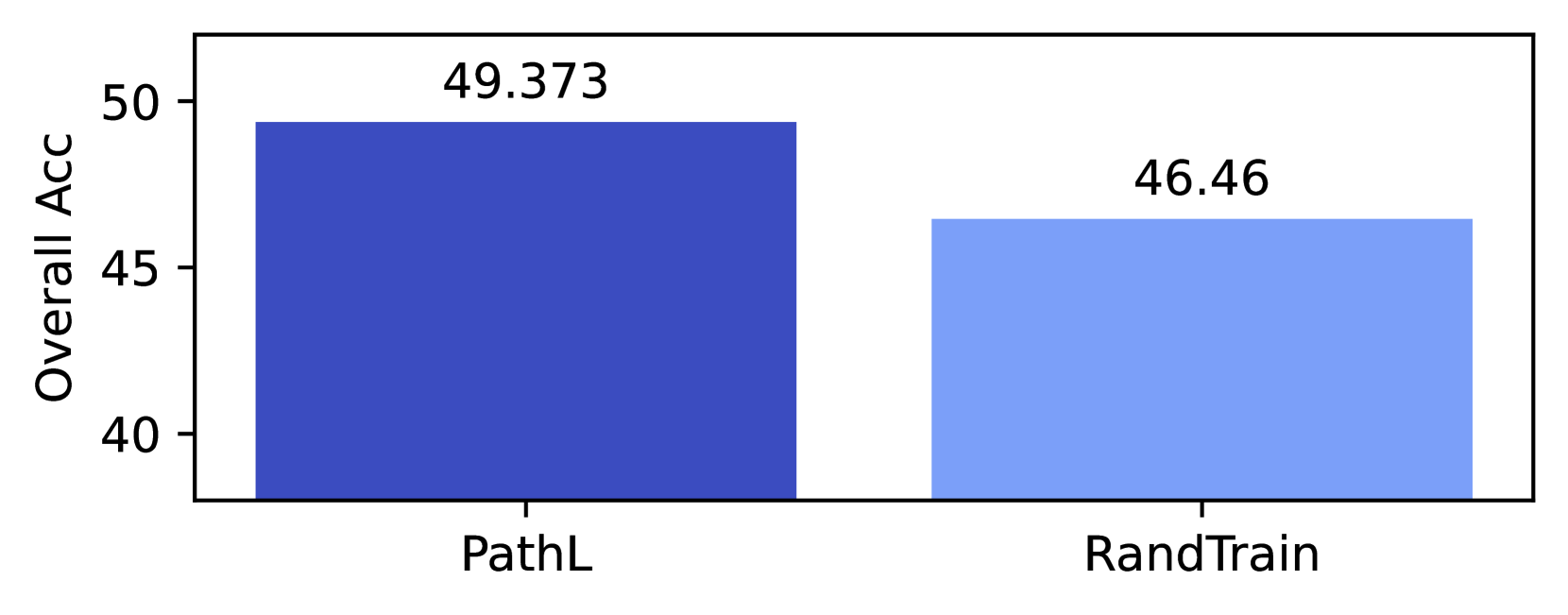
The image is a bar chart comparing the overall accuracy of two methods: PathL and RandTrain. The y-axis represents "Overall Acc" and ranges from 40 to 50. The x-axis represents the two methods being compared. PathL has a higher accuracy than RandTrain.
### Components/Axes
* **Y-axis Title:** Overall Acc
* **Y-axis Scale:** 40, 45, 50
* **X-axis Labels:** PathL, RandTrain
* **Bar 1:** PathL, dark blue color
* **Bar 2:** RandTrain, light blue color
### Detailed Analysis
* **PathL (Dark Blue):** The bar for PathL reaches a value of approximately 49.373.
* **RandTrain (Light Blue):** The bar for RandTrain reaches a value of approximately 46.46.
### Key Observations
* PathL has a higher overall accuracy compared to RandTrain.
* The difference in overall accuracy between PathL and RandTrain is approximately 2.913 (49.373 - 46.46).
### Interpretation
The bar chart visually demonstrates that the PathL method achieves a higher overall accuracy than the RandTrain method. This suggests that PathL is a more effective approach in terms of overall accuracy based on the data presented. The difference in accuracy, while not drastic, is still noticeable and could be significant depending on the application.