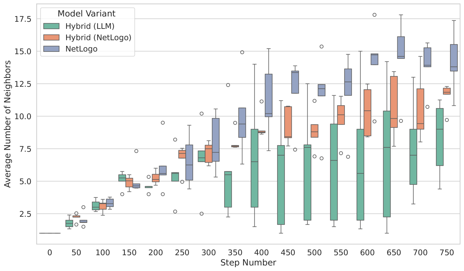
## Box Plot Chart: Average Number of Neighbors by Model Variant Over Simulation Steps
### Overview
This image is a box plot chart comparing the distribution of the "Average Number of Neighbors" across three different model variants at discrete simulation step intervals. The chart tracks how this metric evolves from step 0 to step 750.
### Components/Axes
* **Chart Type:** Grouped Box Plot.
* **X-Axis:** Labeled **"Step Number"**. It represents discrete time steps in a simulation, with major tick marks at intervals of 50, ranging from 0 to 750.
* **Y-Axis:** Labeled **"Average Number of Neighbors"**. It represents a quantitative metric, with a scale from 0 to 17.5, marked at intervals of 2.5.
* **Legend:** Located in the **top-left corner** of the chart area. It defines the three data series by color:
* **Green (Teal):** `Hybrid (LLM)`
* **Orange (Salmon):** `Hybrid (NetLogo)`
* **Blue (Periwinkle):** `NetLogo`
* **Data Representation:** For each step number (0, 50, 100, ..., 750), three box plots are displayed side-by-side, one for each model variant, following the color scheme from the legend. Each box plot shows the median (central line), interquartile range (the box), whiskers (extending to 1.5x the IQR), and individual outlier points (circles).
### Detailed Analysis
The analysis is segmented by model variant, describing the visual trend before extracting approximate data points.
**1. Hybrid (LLM) - Green/Teal Boxes**
* **Trend:** Shows a general upward trend but with extremely high variability (very tall boxes and long whiskers) starting from around step 300. The median increases slowly.
* **Approximate Data Points (Median):**
* Step 0: ~1.5
* Step 50: ~2.0
* Step 100: ~3.0
* Step 150: ~5.0
* Step 200: ~5.0
* Step 250: ~5.5
* Step 300: ~7.0
* Step 350: ~5.5 (Note: Median drops here, but the box spans from ~3 to ~6)
* Step 400: ~6.5
* Step 450: ~7.0
* Step 500: ~7.5
* Step 550: ~6.5
* Step 600: ~5.5
* Step 650: ~7.0
* Step 700: ~7.0
* Step 750: ~9.0
* **Variability:** From step 350 onward, the interquartile range (box height) is very large, often spanning 4-6 units on the y-axis. Whiskers frequently extend from below 2.5 to above 10.0.
**2. Hybrid (NetLogo) - Orange/Salmon Boxes**
* **Trend:** Shows a steady, consistent upward trend with moderate variability. The median increases more reliably than the LLM hybrid.
* **Approximate Data Points (Median):**
* Step 0: ~1.5
* Step 50: ~2.5
* Step 100: ~3.0
* Step 150: ~5.0
* Step 200: ~5.5
* Step 250: ~7.0
* Step 300: ~7.5
* Step 350: ~7.5
* Step 400: ~8.5
* Step 450: ~9.0
* Step 500: ~8.5
* Step 550: ~10.0
* Step 600: ~10.5
* Step 650: ~10.0
* Step 700: ~9.5
* Step 750: ~12.0
* **Variability:** The boxes are generally shorter than the LLM hybrid, indicating less spread in the middle 50% of the data. Whiskers are also shorter.
**3. NetLogo - Blue/Periwinkle Boxes**
* **Trend:** Shows the strongest and most consistent upward trend, achieving the highest median values by the end of the simulation. Variability is moderate.
* **Approximate Data Points (Median):**
* Step 0: ~1.5
* Step 50: ~2.0
* Step 100: ~3.5
* Step 150: ~4.5
* Step 200: ~6.0
* Step 250: ~6.5
* Step 300: ~7.0
* Step 350: ~9.5
* Step 400: ~10.0
* Step 450: ~13.0
* Step 500: ~12.0
* Step 550: ~12.5
* Step 600: ~14.5
* Step 650: ~14.5
* Step 700: ~14.0
* Step 750: ~14.0
* **Variability:** The interquartile ranges are relatively consistent. The highest single outlier point on the chart (a circle near y=17.5) belongs to this series at step 600.
### Key Observations
1. **Diverging Performance:** All models start similarly at step 0 (median ~1.5). By step 750, their median values have diverged significantly: NetLogo (~14.0) > Hybrid (NetLogo) (~12.0) > Hybrid (LLM) (~9.0).
2. **Variability Contrast:** The `Hybrid (LLM)` model exhibits dramatically higher variance (taller boxes, longer whiskers) from step 350 onward compared to the other two models. Its performance is much less predictable.
3. **NetLogo Dominance:** The pure `NetLogo` model consistently achieves the highest median "Average Number of Neighbors" from approximately step 350 onward.
4. **Outliers:** Outlier points (circles) are present for all models across many steps, indicating occasional simulation runs that produced results far from the central distribution.
5. **Step 350 Anomaly:** At step 350, the median for `Hybrid (LLM)` drops noticeably compared to its trend, while the other two models continue their upward trajectory.
### Interpretation
The data suggests a clear hierarchy in the models' ability to generate or maintain neighbor connections over time in this simulation. The pure `NetLogo` model is the most effective and consistent at increasing the average number of neighbors. The `Hybrid (NetLogo)` model performs well, following a similar but slightly lower trajectory. The `Hybrid (LLM)` model, while showing an overall increase, is characterized by high instability and lower final performance.
This could imply that integrating a Large Language Model (LLM) into the hybrid system introduces significant noise or unpredictability into the agent behavior governing neighbor relationships, whereas the rule-based NetLogo environment produces more stable and scalable outcomes for this specific metric. The high variance in the LLM hybrid might be a critical finding, suggesting it requires further tuning or that its decision-making process leads to a wider range of emergent social structures. The chart effectively demonstrates not just the central tendency but the crucial difference in reliability between the modeling approaches.