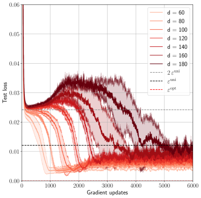
## Line Chart: Test Loss vs. Gradient Updates for Different Model Dimensions (d)
### Overview
The image is a line chart plotting "Test loss" against "Gradient updates" for seven different model dimension values (d). Each line represents a distinct value of `d`, showing how the test loss evolves during training. The chart includes reference lines for specific loss thresholds. The overall trend shows that test loss decreases with more gradient updates, but the rate and final value depend significantly on the model dimension `d`.
### Components/Axes
* **X-Axis:** "Gradient updates" (linear scale). Major ticks are at 0, 1000, 2000, 3000, 4000, 5000, and 6000.
* **Y-Axis:** "Test loss" (linear scale). Major ticks are at 0.00, 0.01, 0.02, 0.03, 0.04, 0.05, and 0.06.
* **Legend (Top-Right Corner):** Contains 10 entries.
* **Solid Lines (Model Dimension `d`):** Seven entries, each with a distinct color gradient from light orange to dark red.
* `d = 60` (Lightest orange)
* `d = 80`
* `d = 100`
* `d = 120`
* `d = 140`
* `d = 160`
* `d = 180` (Darkest red)
* **Reference Lines:** Three dashed/dotted lines.
* `--- 2ε^min` (Black dashed line)
* `... ε^min` (Black dotted line)
* `--- ε^opt` (Red dashed line)
* **Plot Area:** Contains the seven colored data series (solid lines) with shaded regions around each, likely indicating variance or confidence intervals across multiple runs. Three horizontal reference lines are overlaid.
### Detailed Analysis
**Trend Verification & Data Points (Approximate):**
All series begin at a high test loss (~0.06) at 0 gradient updates and show an initial rapid decrease. The behavior diverges significantly after the initial drop.
1. **Low `d` Values (d=60, 80):**
* **Trend:** Steep, smooth decline. They reach a low plateau quickly and remain stable.
* **Key Points:** By ~1000 updates, loss is already below 0.01. They stabilize at the lowest final loss, approximately **0.005 - 0.007**.
2. **Medium `d` Values (d=100, 120, 140):**
* **Trend:** Initial decline is followed by a period of increased volatility (a "bump" or rise in loss) before a second decline to a stable plateau.
* **Key Points:** The volatile "bump" occurs between ~1000-3000 updates. Final stabilized loss is higher than for low `d`, approximately **0.008 - 0.012**.
3. **High `d` Values (d=160, 180):**
* **Trend:** Most pronounced volatility. After the initial drop, loss increases significantly, forming a large hump, before slowly decreasing again. Convergence is much slower.
* **Key Points:** The peak of the volatile hump for `d=180` is near **0.035** at ~2500 updates. By 6000 updates, they are still descending and have not fully stabilized, with loss around **0.010 - 0.015**.
**Reference Lines (Spatial Grounding):**
* `ε^min` (Black dotted): Horizontal line at **y ≈ 0.012**.
* `2ε^min` (Black dashed): Horizontal line at **y ≈ 0.024**.
* `ε^opt` (Red dashed): Horizontal line at **y ≈ 0.024**, overlapping with `2ε^min`.
**Component Isolation - Shaded Regions:** The shaded area around each line represents the spread of results. The spread is visibly larger for higher `d` values (darker red lines), indicating greater variance in training outcomes for larger models.
### Key Observations
1. **Inverse Relationship between `d` and Convergence Speed:** Lower `d` models converge faster to a lower loss.
2. **Volatility Increases with `d`:** Larger models (`d=160, 180`) exhibit a characteristic "double descent" or volatile hump pattern during training, which is absent in smaller models.
3. **Final Loss Hierarchy:** The final test loss at 6000 updates is clearly stratified by `d`: `d=60` < `d=80` < `d=100` < ... < `d=180`.
4. **Reference Line Context:** Most of the training dynamics for all models occur between the `ε^min` (0.012) and `2ε^min`/`ε^opt` (0.024) thresholds. Only the volatile phase of the largest models exceeds the upper threshold.
### Interpretation
This chart demonstrates a critical phenomenon in machine learning model training, likely related to the **"double descent"** or **model size vs. generalization** trade-off.
* **What the data suggests:** Increasing the model dimension (`d`), which corresponds to model capacity or size, does not lead to monotonic improvement in test loss during training. While larger models have the potential for lower loss, their training path is more unstable and, in this specific training regime (6000 updates), they fail to surpass the performance of smaller, more efficiently trained models.
* **How elements relate:** The `d` value directly controls the training dynamics. The reference lines (`ε^min`, `ε^opt`) likely represent theoretical or empirical loss bounds. The fact that smaller models settle near `ε^min` suggests they are reaching an optimal or near-optimal solution for their capacity. The larger models' struggle to pass below `ε^opt` during the observed training window indicates they may require more updates, different hyperparameters, or are experiencing optimization difficulties due to their size.
* **Notable Anomaly:** The most striking anomaly is the pronounced loss increase (the "hump") for `d=160` and `d=180`. This is a counter-intuitive but well-documented effect where over-parameterized models can temporarily perform worse on test data during training before potentially improving again with further training. The chart captures this unstable phase vividly.
* **Peircean Insight (Reading between the lines):** The chart is not just about loss values; it's a visual argument about **optimization difficulty**. It implies that simply making a model bigger (`d`) is not a guaranteed path to better performance and can introduce significant training instability. The optimal model size (`d`) is context-dependent and must be balanced with training duration and methodology. The shaded variance for high `d` further suggests that training such models is less reliable.