\n
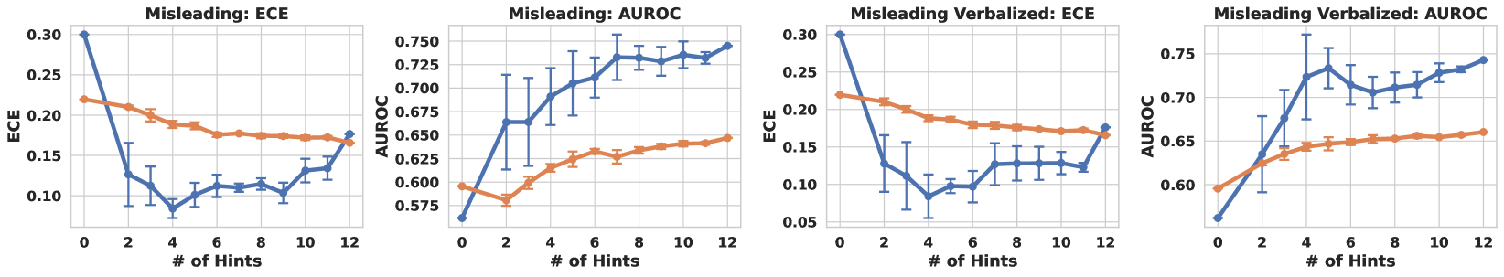
## Line Charts: Model Performance vs. Number of Hints
### Overview
The image presents four line charts, each depicting the relationship between the number of hints provided to a model and its performance metrics. The charts compare two different models (represented by different colored lines) under two different conditions: "Misleading" and "Misleading Verbalized". The performance metrics are ECE (Expected Calibration Error) and AUROC (Area Under the Receiver Operating Characteristic curve). Error bars are included on each data point.
### Components/Axes
Each chart shares the following components:
* **X-axis:** "# of Hints" - ranging from 0 to 12, with markers at 0, 2, 4, 6, 8, 10, and 12.
* **Y-axis:** Varies depending on the chart:
* "Misleading: ECE" and "Misleading Verbalized: ECE" charts: ECE, ranging from approximately 0.05 to 0.30.
* "Misleading: AUROC" and "Misleading Verbalized: AUROC" charts: AUROC, ranging from approximately 0.575 to 0.75.
* **Lines:** Two lines per chart, representing different models.
* Blue line: Represents one model.
* Orange line: Represents another model.
* **Error Bars:** Vertical lines indicating the standard deviation or confidence interval around each data point.
* **Titles:** Each chart has a title indicating the condition ("Misleading" or "Misleading Verbalized") and the metric (ECE or AUROC).
### Detailed Analysis or Content Details
**1. Misleading: ECE**
* **Blue Line:** Starts at approximately 0.11 at 0 hints, decreases to a minimum of around 0.09 at 2 hints, then increases to approximately 0.14 at 12 hints. The line exhibits some oscillation.
* **Orange Line:** Starts at approximately 0.21 at 0 hints, decreases to a minimum of around 0.17 at 4 hints, then increases to approximately 0.20 at 12 hints. The line is relatively stable.
**2. Misleading: AUROC**
* **Blue Line:** Starts at approximately 0.60 at 0 hints, increases to a maximum of around 0.73 at 8 hints, then decreases to approximately 0.71 at 12 hints. The line shows a clear upward trend initially, followed by a slight decline.
* **Orange Line:** Starts at approximately 0.66 at 0 hints, increases to a maximum of around 0.68 at 2 hints, then remains relatively stable around 0.66-0.67 until 12 hints.
**3. Misleading Verbalized: ECE**
* **Blue Line:** Starts at approximately 0.10 at 0 hints, decreases to a minimum of around 0.08 at 2 hints, then increases to approximately 0.15 at 12 hints. The line exhibits some oscillation.
* **Orange Line:** Starts at approximately 0.22 at 0 hints, decreases to a minimum of around 0.18 at 4 hints, then increases to approximately 0.21 at 12 hints. The line is relatively stable.
**4. Misleading Verbalized: AUROC**
* **Blue Line:** Starts at approximately 0.60 at 0 hints, increases to a maximum of around 0.72 at 8 hints, then decreases to approximately 0.71 at 12 hints. The line shows a clear upward trend initially, followed by a slight decline.
* **Orange Line:** Starts at approximately 0.65 at 0 hints, increases to a maximum of around 0.67 at 2 hints, then remains relatively stable around 0.66-0.67 until 12 hints.
### Key Observations
* In all four charts, the blue line generally shows more variation than the orange line.
* For both ECE metrics, the blue line tends to decrease initially with increasing hints, then increase again. The orange line remains relatively stable.
* For both AUROC metrics, the blue line shows a clear upward trend with increasing hints, peaking around 8 hints, then slightly decreasing. The orange line remains relatively stable.
* The "Misleading Verbalized" charts are very similar to the "Misleading" charts, suggesting that verbalization does not significantly alter the observed trends.
### Interpretation
The data suggests that providing hints to the models initially improves their calibration (lower ECE) and discrimination ability (higher AUROC), but beyond a certain point (around 8 hints), the benefits diminish or even reverse. The orange line's stability indicates that one of the models is less sensitive to the number of hints provided, maintaining a consistent level of performance. The blue line's more dynamic behavior suggests that the other model is more adaptable to hints, but also more prone to overfitting or instability as the number of hints increases.
The similarity between the "Misleading" and "Misleading Verbalized" charts implies that the act of verbalizing the misleading information does not fundamentally change the model's behavior or performance. This could indicate that the models are primarily responding to the misleading content itself, rather than the way it is presented.
The peak performance around 8 hints could represent an optimal balance between providing enough information to guide the model and avoiding the negative effects of excessive or redundant hints. The slight decline in performance beyond 8 hints might be due to the model becoming confused or distracted by the additional information.