## Line Charts: WRITE Pulses vs. Epoch for Input, Recurrent, and Output Layers
### Overview
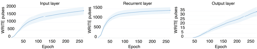
The image presents three line charts side-by-side, each depicting the relationship between "WRITE pulses" and "Epoch" for different layers of a neural network: Input layer, Recurrent layer, and Output layer. Each chart shows a light blue line representing the data, surrounded by a shaded light blue area indicating the variance or confidence interval.
### Components/Axes
* **X-axis (all charts):** "Epoch" ranging from 0 to 250, with tick marks at approximately 50, 100, 150, 200, and 250.
* **Y-axis (Input layer):** "WRITE pulses" ranging from 0 to 2000, with tick marks at 500, 1000, 1500, and 2000.
* **Y-axis (Recurrent layer):** "WRITE pulses" ranging from 0 to 1500, with tick marks at 500, 1000, and 1500.
* **Y-axis (Output layer):** "WRITE pulses" ranging from 0 to 35, with tick marks at 5, 15, 20, 25, 30, and 35.
* **Titles:** "Input layer" (top-left), "Recurrent layer" (top-center), "Output layer" (top-right).
* **Data Series:** A single light blue line with a shaded light blue confidence interval is present in each chart.
### Detailed Analysis
**1. Input Layer Chart:**
* **Trend:** The light blue line starts at approximately 0 WRITE pulses at Epoch 0, increases rapidly until approximately Epoch 50, then continues to increase at a slower rate, reaching approximately 1300 WRITE pulses at Epoch 250.
* **Data Points (approximate):**
* Epoch 0: 0 WRITE pulses
* Epoch 50: 700 WRITE pulses
* Epoch 100: 1100 WRITE pulses
* Epoch 150: 1250 WRITE pulses
* Epoch 200: 1300 WRITE pulses
* Epoch 250: 1350 WRITE pulses
**2. Recurrent Layer Chart:**
* **Trend:** The light blue line starts at approximately 0 WRITE pulses at Epoch 0, increases rapidly until approximately Epoch 50, then plateaus, reaching approximately 1350 WRITE pulses at Epoch 250.
* **Data Points (approximate):**
* Epoch 0: 0 WRITE pulses
* Epoch 50: 1000 WRITE pulses
* Epoch 100: 1250 WRITE pulses
* Epoch 150: 1300 WRITE pulses
* Epoch 200: 1350 WRITE pulses
* Epoch 250: 1350 WRITE pulses
**3. Output Layer Chart:**
* **Trend:** The light blue line starts at approximately 0 WRITE pulses at Epoch 0, increases gradually until approximately Epoch 250, reaching approximately 32 WRITE pulses.
* **Data Points (approximate):**
* Epoch 0: 0 WRITE pulses
* Epoch 50: 3 WRITE pulses
* Epoch 100: 12 WRITE pulses
* Epoch 150: 20 WRITE pulses
* Epoch 200: 26 WRITE pulses
* Epoch 250: 32 WRITE pulses
### Key Observations
* The Input and Recurrent layers show a similar trend of rapid increase in WRITE pulses in the initial epochs, followed by a plateau.
* The Output layer shows a more gradual and linear increase in WRITE pulses over the epochs.
* The scale of WRITE pulses differs significantly between the layers, with the Input and Recurrent layers having much higher values than the Output layer.
### Interpretation
The charts illustrate how the number of WRITE pulses changes over epochs in different layers of a neural network. The initial rapid increase in WRITE pulses in the Input and Recurrent layers suggests that these layers are actively learning and adjusting their weights early in the training process. The plateauing effect indicates that these layers may have reached a point of diminishing returns or have converged to a stable state. The Output layer's gradual increase suggests a more consistent and incremental learning process. The different scales of WRITE pulses across layers likely reflect the varying complexity and function of each layer within the network. The shaded area around each line represents the variability in the data, possibly due to different training runs or variations within a single run.