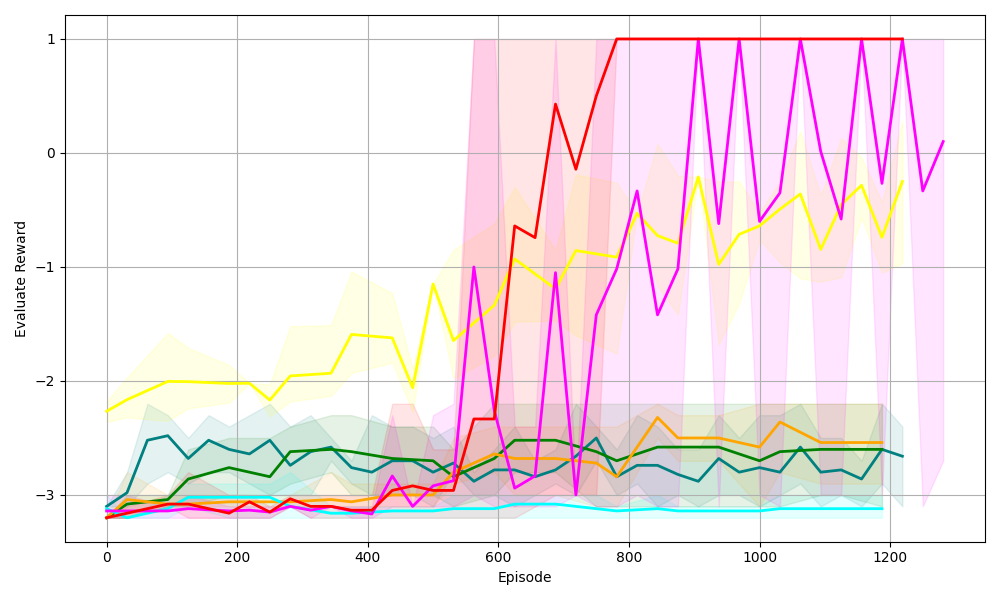
## Line Chart: Evaluate Reward vs. Episode (Reinforcement Learning Performance)
### Overview
The image is a line chart displaying the **Evaluate Reward** (y-axis) of multiple data series (likely reinforcement learning agents/algorithms) over **Episode** (x-axis, training iterations). The chart includes shaded regions (confidence intervals or variance bands) for each series, indicating variability in performance.
### Components/Axes
- **X-axis**: Labeled *“Episode”*, with ticks at 0, 200, 400, 600, 800, 1000, 1200 (range: 0–1200 episodes).
- **Y-axis**: Labeled *“Evaluate Reward”*, with ticks at -3, -2, -1, 0, 1 (range: -3 to 1).
- **Legend**: Implicit (no explicit label), but multiple colored lines (red, yellow, magenta, green, cyan, orange, etc.) with corresponding shaded areas (pink, yellow, green, cyan, etc.).
### Detailed Analysis (Line-by-Line Trends & Values)
We analyze each line by color, trend, and approximate values:
1. **Red Line**
- **Trend**: Starts low (≈-3 at episode 0), *sharply increases* around episode 600, reaches ≈1 by episode 800, then fluctuates between 0–1.
- **Shaded Area**: Pink, covering a wide range (≈-3 to 1) initially, narrowing as reward approaches 1 (lower variability).
2. **Yellow Line**
- **Trend**: Starts ≈-2.5, *gradually increases* with fluctuations, reaching ≈-0.5 to 0 by episode 1200.
- **Shaded Area**: Yellow, covering ≈-3 to 0 (moderate variability).
3. **Magenta Line**
- **Trend**: Starts ≈-3, *sharply increases* around episode 600, reaches ≈1 by episode 800, then fluctuates between 0–1 (similar to red, with more variation).
- **Shaded Area**: Pink (same as red), covering a wide range (≈-3 to 1) initially, narrowing post-episode 800.
4. **Green Line**
- **Trend**: Starts ≈-3, *slightly increases* then stabilizes at ≈-2.5 to -2 (minimal improvement).
- **Shaded Area**: Green, covering a narrow range (≈-3 to -2, low variability).
5. **Cyan Line**
- **Trend**: Starts ≈-3, *remains flat* (or slightly decreases) at ≈-3 (no significant improvement).
- **Shaded Area**: Cyan, covering a narrow range (≈-3 to -2.5, low variability).
6. **Orange Line**
- **Trend**: Starts ≈-3, *slightly increases* then stabilizes at ≈-2.5 to -2 (similar to green, with minor variation).
- **Shaded Area**: Orange, covering a narrow range (≈-3 to -2, low variability).
### Key Observations
- **Breakthrough Performance**: Red and magenta lines show a *sharp increase* in reward around episode 600, reaching near 1 (high task success).
- **Steady Improvement**: The yellow line shows gradual, consistent improvement over episodes.
- **Stagnant Performance**: Green, cyan, and orange lines remain flat or with minimal improvement (low task success).
- **Variability**: Red/magenta have high variability (wide shaded areas) early on, narrowing as they learn (lower variability). Other lines have low variability (narrow shaded areas).
### Interpretation
This chart likely compares **reinforcement learning agents** (or algorithms) on a task, where *“Evaluate Reward”* measures task success. Key insights:
- **Effective Agents**: Red and magenta agents learn rapidly (sharp reward increase) and achieve high performance (≈1), suggesting they are well-suited for the task.
- **Steady Learner**: The yellow agent improves gradually, indicating consistent (but slower) learning.
- **Ineffective Agents**: Green, cyan, and orange agents struggle to learn (flat reward), possibly due to poor algorithm design or task mismatch.
- **Variability Insight**: High early variability in red/magenta suggests initial exploration, while narrowing shaded areas indicate convergence to a stable policy.
This data helps identify which algorithms perform best, guiding future research or deployment of reinforcement learning systems.
(Note: No non-English text is present in the image.)