## Line Chart: Evaluate Reward vs. Episode
### Overview
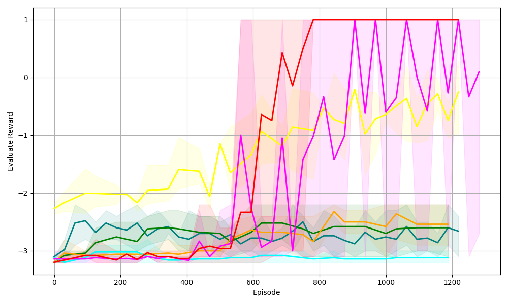
The image is a line chart displaying the "Evaluate Reward" on the y-axis against the "Episode" number on the x-axis. There are multiple lines, each representing a different series, with shaded regions around each line indicating variability or confidence intervals. The chart shows how the reward changes over the course of episodes for different algorithms or configurations.
### Components/Axes
* **X-axis:** "Episode" - Ranges from 0 to 1200, with gridlines at intervals of 200.
* **Y-axis:** "Evaluate Reward" - Ranges from -3 to 1, with gridlines at intervals of 1.
* **Lines:** There are multiple lines of different colors, each with a shaded region of the same color around it. The colors are red, magenta, yellow, orange, teal, dark green, and dark teal. There is no explicit legend.
### Detailed Analysis
Here's a breakdown of each line's trend and approximate values:
* **Red Line:** This line starts around -3 and remains relatively flat until approximately episode 550. It then sharply increases to around 0.75 by episode 650, then reaches 1 around episode 750, and stays at 1 until the end of the chart.
* **Magenta Line:** This line starts around -3 and remains relatively flat until approximately episode 550. It then sharply increases to around -0.5 by episode 650, then oscillates between 0 and 1 for the remainder of the episodes.
* **Yellow Line:** This line starts around -2.25 and gradually increases to around -1.5 by episode 400. It then decreases slightly before sharply increasing to around -0.5 by episode 650, then oscillates between -1 and 0 for the remainder of the episodes.
* **Orange Line:** This line starts around -3 and remains relatively flat, fluctuating slightly between -3 and -2.5, until the end of the chart.
* **Teal Line:** This line starts around -3 and remains relatively flat, fluctuating slightly between -3 and -2.75, until the end of the chart.
* **Dark Green Line:** This line starts around -3 and increases to around -2.5 by episode 200. It then remains relatively flat, fluctuating slightly between -3 and -2.5, until the end of the chart.
* **Dark Teal Line:** This line starts around -3.2 and increases to around -2.5 by episode 200. It then remains relatively flat, fluctuating slightly between -3 and -2.5, until the end of the chart.
### Key Observations
* The red and magenta lines show a significant improvement in reward after approximately episode 550.
* The yellow line also shows improvement, but it is less dramatic than the red and magenta lines.
* The orange, teal, dark green, and dark teal lines remain relatively flat throughout the episodes, indicating little to no improvement in reward.
* The shaded regions around each line indicate the variability in the reward for each episode. The red and magenta lines have larger shaded regions after episode 600, indicating more variability in the reward.
### Interpretation
The chart suggests that some algorithms or configurations (represented by the red, magenta, and yellow lines) are more effective than others (represented by the orange, teal, dark green, and dark teal lines) in improving the reward over the course of episodes. The red and magenta lines show the most significant improvement, indicating that these algorithms or configurations are the most successful. The larger shaded regions around the red and magenta lines after episode 600 suggest that these algorithms or configurations are also more variable in their performance. The flat lines indicate that the corresponding algorithms or configurations are not learning or improving over time.