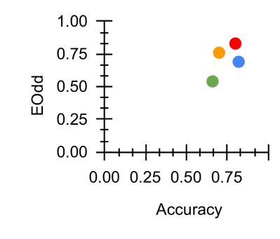
## Scatter Plot: Accuracy vs. EOdd
### Overview
The image is a simple scatter plot with two axes, displaying four data points represented by colored circles. The plot appears to compare two metrics: "Accuracy" on the horizontal axis and "EOdd" on the vertical axis. There is no chart title, legend, or additional explanatory text present in the image.
### Components/Axes
* **X-Axis (Horizontal):**
* **Label:** "Accuracy"
* **Scale:** Linear, ranging from 0.00 to an implied 1.00.
* **Ticks & Markers:** Major ticks are labeled at 0.00, 0.25, 0.50, and 0.75. There are minor ticks between each major tick, suggesting a resolution of 0.05 units. The axis line extends slightly beyond the 0.75 mark.
* **Y-Axis (Vertical):**
* **Label:** "EOdd"
* **Scale:** Linear, ranging from 0.00 to 1.00.
* **Ticks & Markers:** Major ticks are labeled at 0.00, 0.25, 0.50, 0.75, and 1.00. There are minor ticks between each major tick, suggesting a resolution of 0.05 units.
* **Data Points:** Four distinct colored circles are plotted in the upper-right quadrant of the chart. There is no legend to define what each color represents.
### Detailed Analysis
The following data points are estimated based on their visual position relative to the axes. Values are approximate.
1. **Red Circle:**
* **Position:** Top-most and right-most point.
* **Estimated Coordinates:** Accuracy ≈ 0.78, EOdd ≈ 0.85.
2. **Orange Circle:**
* **Position:** Located to the left and slightly below the red point.
* **Estimated Coordinates:** Accuracy ≈ 0.72, EOdd ≈ 0.75.
3. **Blue Circle:**
* **Position:** Located to the right and below the orange point.
* **Estimated Coordinates:** Accuracy ≈ 0.82, EOdd ≈ 0.70.
4. **Green Circle:**
* **Position:** The lowest and left-most point of the cluster.
* **Estimated Coordinates:** Accuracy ≈ 0.65, EOdd ≈ 0.55.
**Visual Trend:** All four data points are clustered in the region where both Accuracy and EOdd are relatively high (above 0.5). There is a general, loose positive correlation visible: points with higher Accuracy tend to have higher EOdd values, though the relationship is not perfectly linear (e.g., the blue point has higher Accuracy but lower EOdd than the orange point).
### Key Observations
* **Clustering:** All data points are concentrated in the upper-right quadrant, indicating that for the entities measured, both metrics are generally above 0.5.
* **Outlier:** The green point is the most distinct outlier, sitting noticeably lower on both axes compared to the tight cluster of the red, orange, and blue points.
* **Missing Context:** The lack of a legend, chart title, or data source makes it impossible to know what the colored points represent (e.g., different models, algorithms, or experimental conditions) or what "EOdd" specifically measures.
### Interpretation
This scatter plot suggests a comparative analysis where four distinct items (represented by color) are evaluated on two performance metrics: Accuracy and EOdd.
* **Relationship Between Metrics:** The data implies a positive association between Accuracy and EOdd. Higher performance on one metric generally coincides with higher performance on the other. This could mean the metrics are related, or that the underlying factors improving Accuracy also improve EOdd.
* **Performance Grouping:** The red, orange, and blue points form a high-performance group with similar scores. The green point represents a lower-performing entity on both dimensions.
* **Investigative Questions:** The plot raises questions for further investigation: What does "EOdd" quantify? Why does the green entity underperform? Is the difference between the blue and orange points (higher Accuracy vs. higher EOdd) meaningful? The visualization effectively highlights performance differences but requires external context to explain the *why* behind the data.